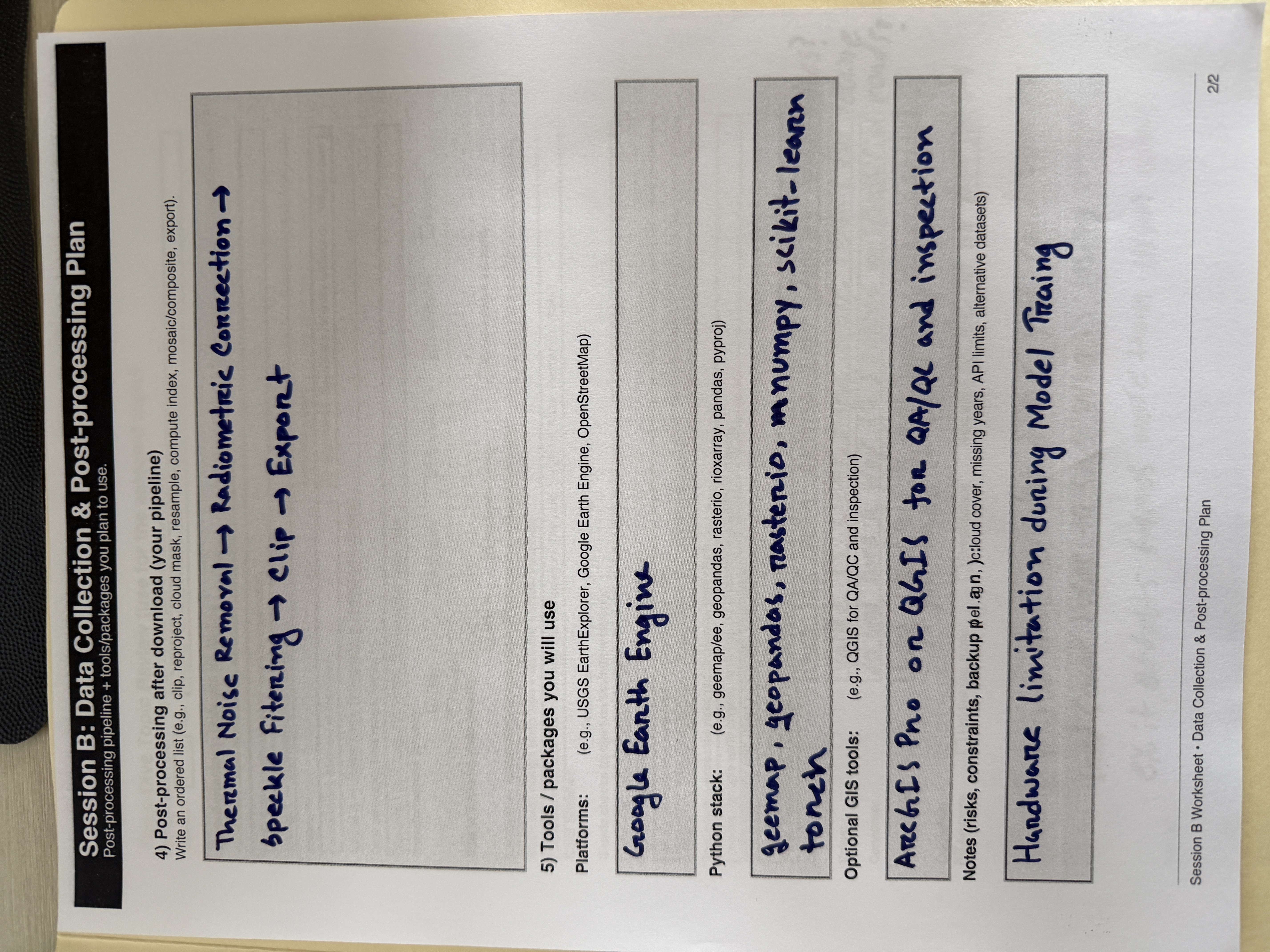
Course Gallery
Week 1
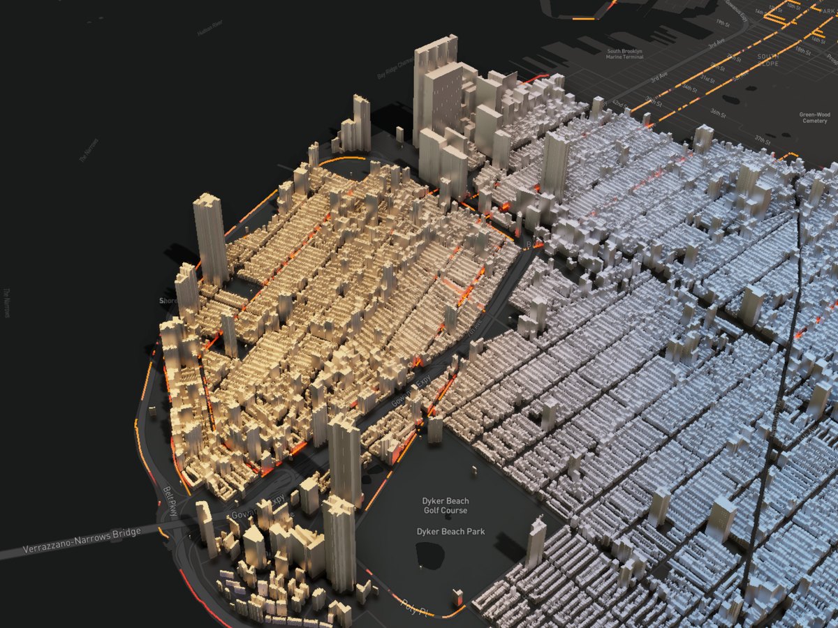
3D Visualization
Description...
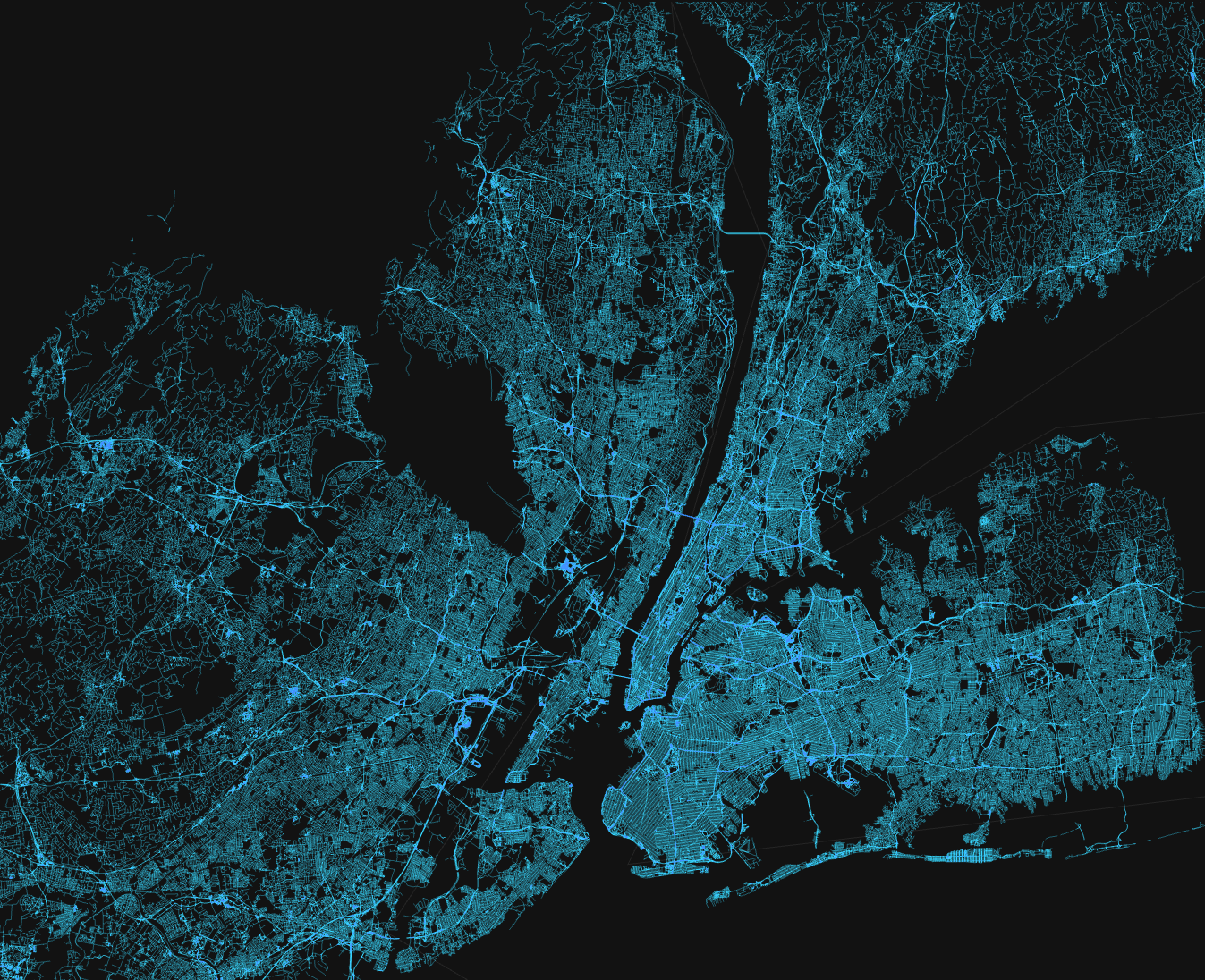
Beautiful Map
Description...
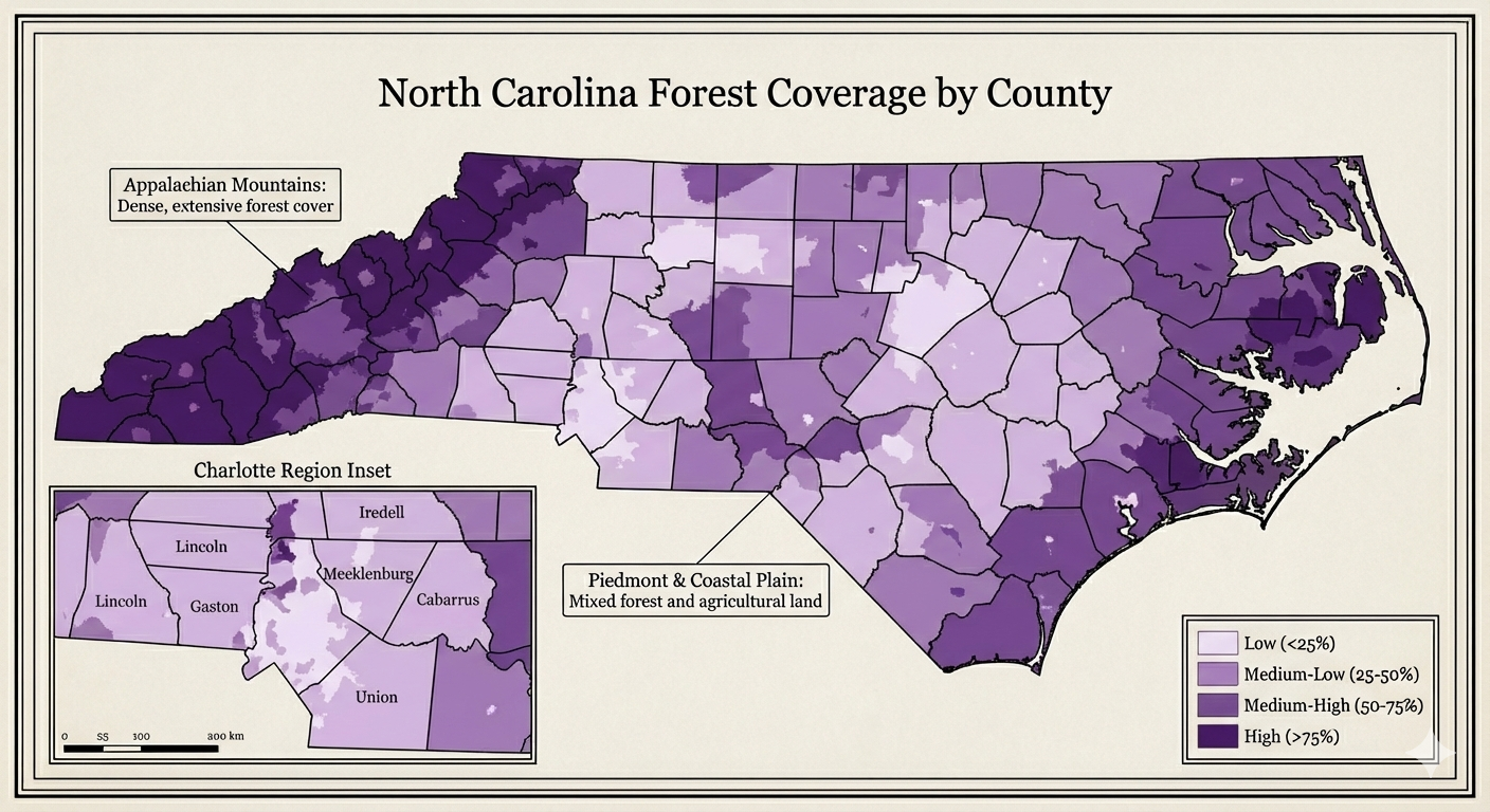
NC Map
Description...
Title
Description...
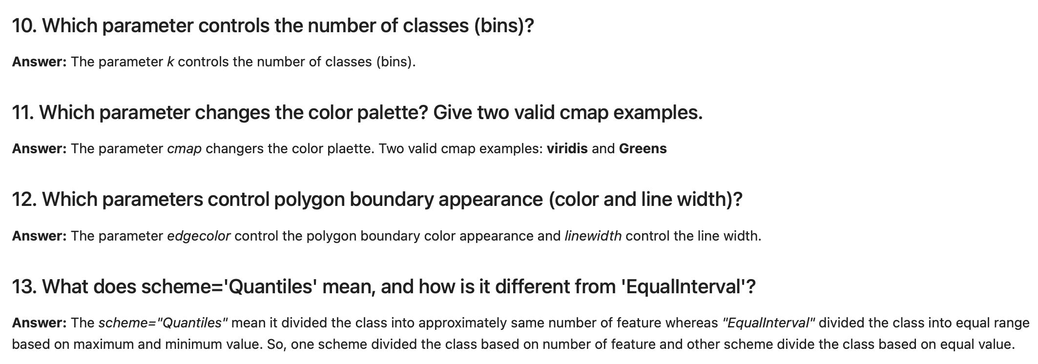
Title
Reflections...
Title
Description...
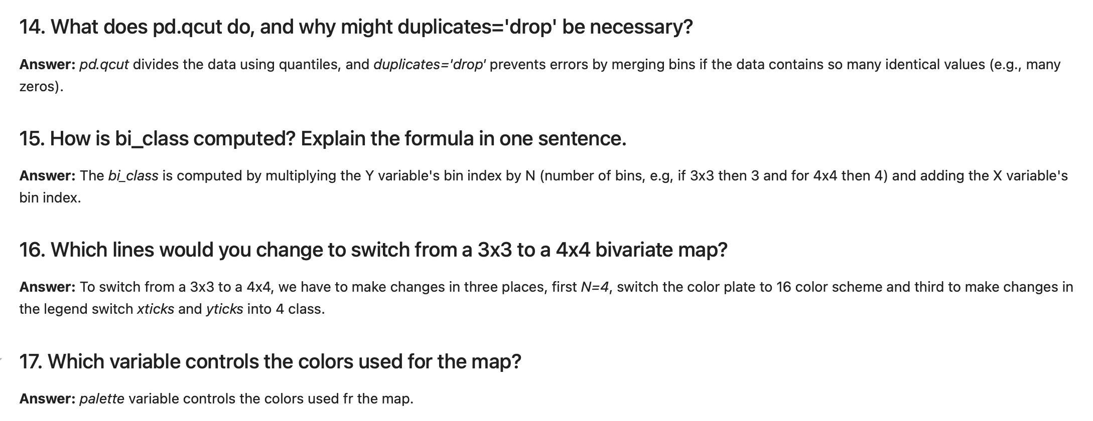
Title
Description...
Week 2
Title
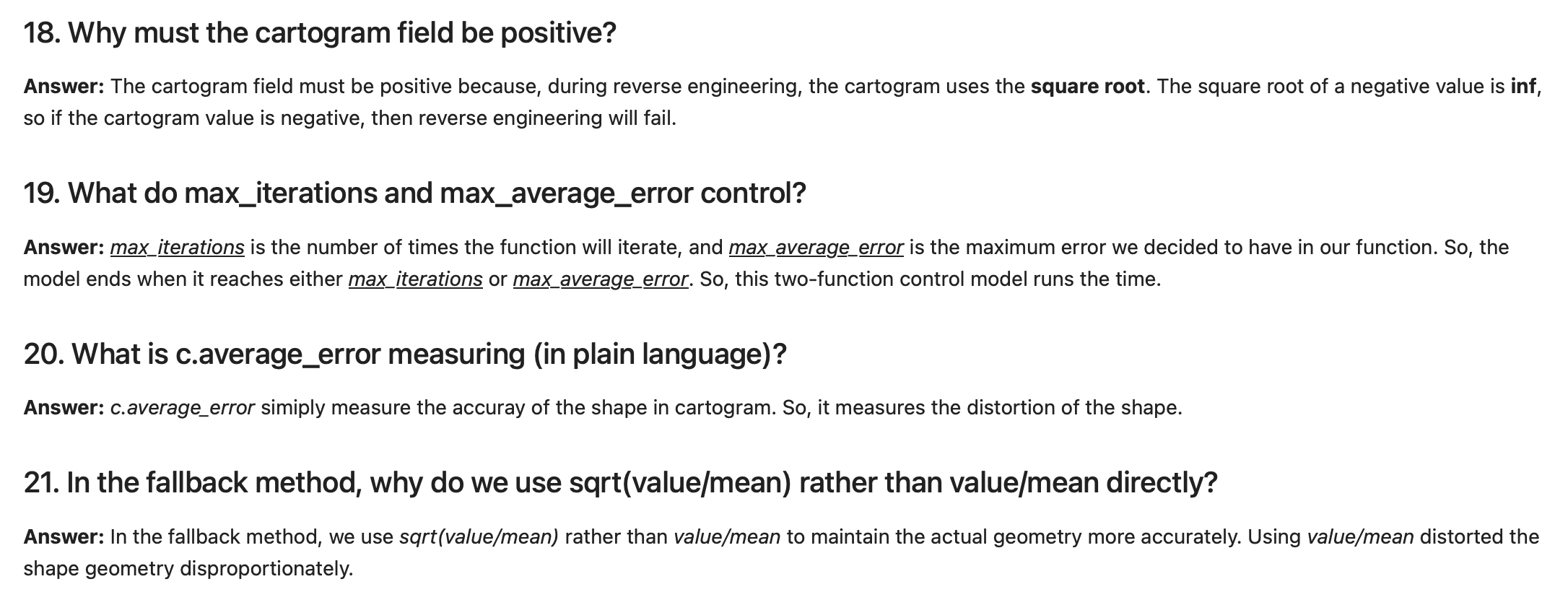
Description...
Title
Description...
Title
Reflections...
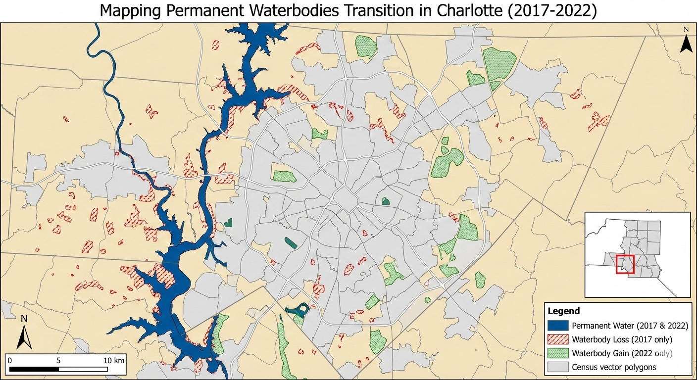
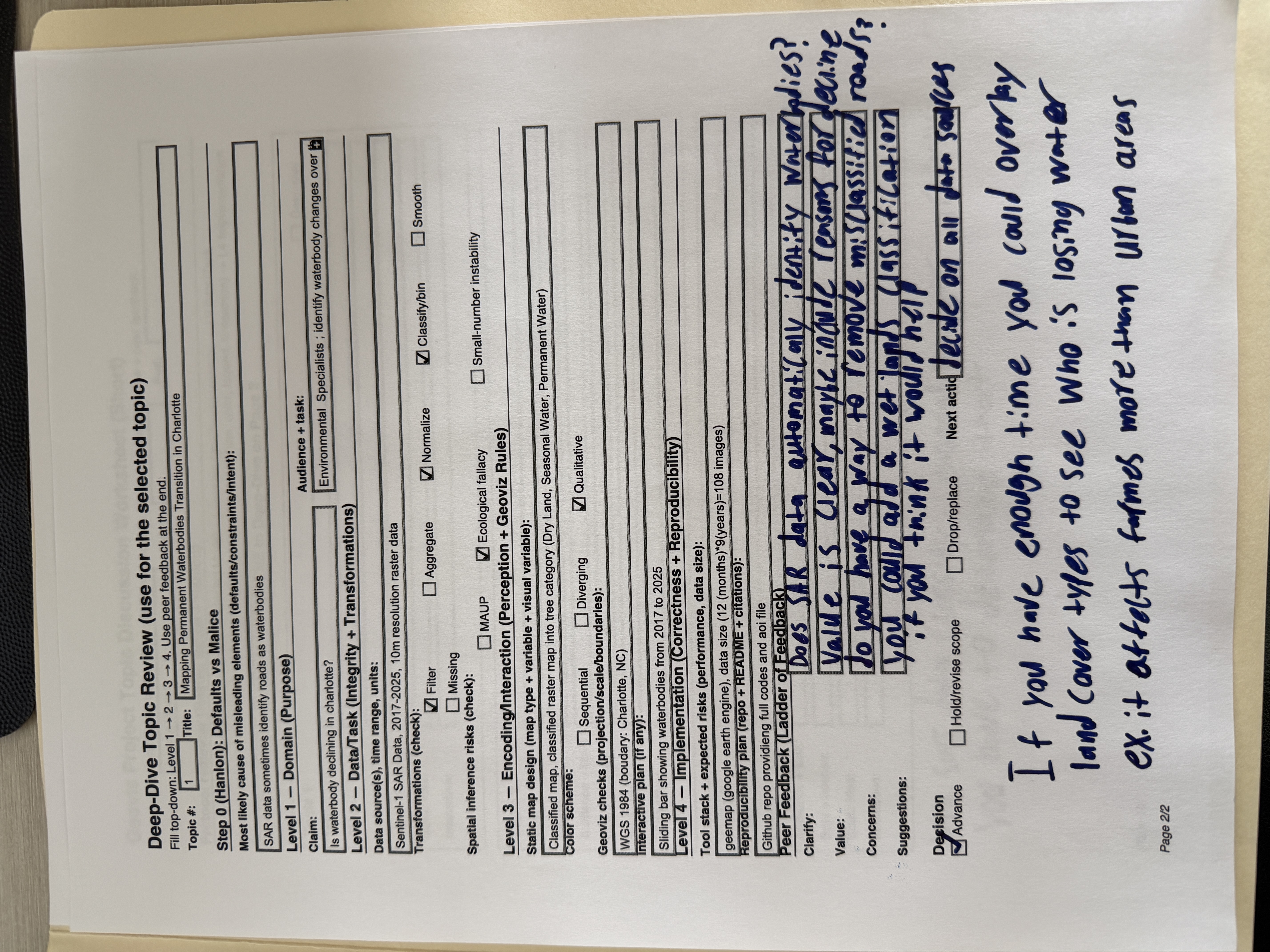
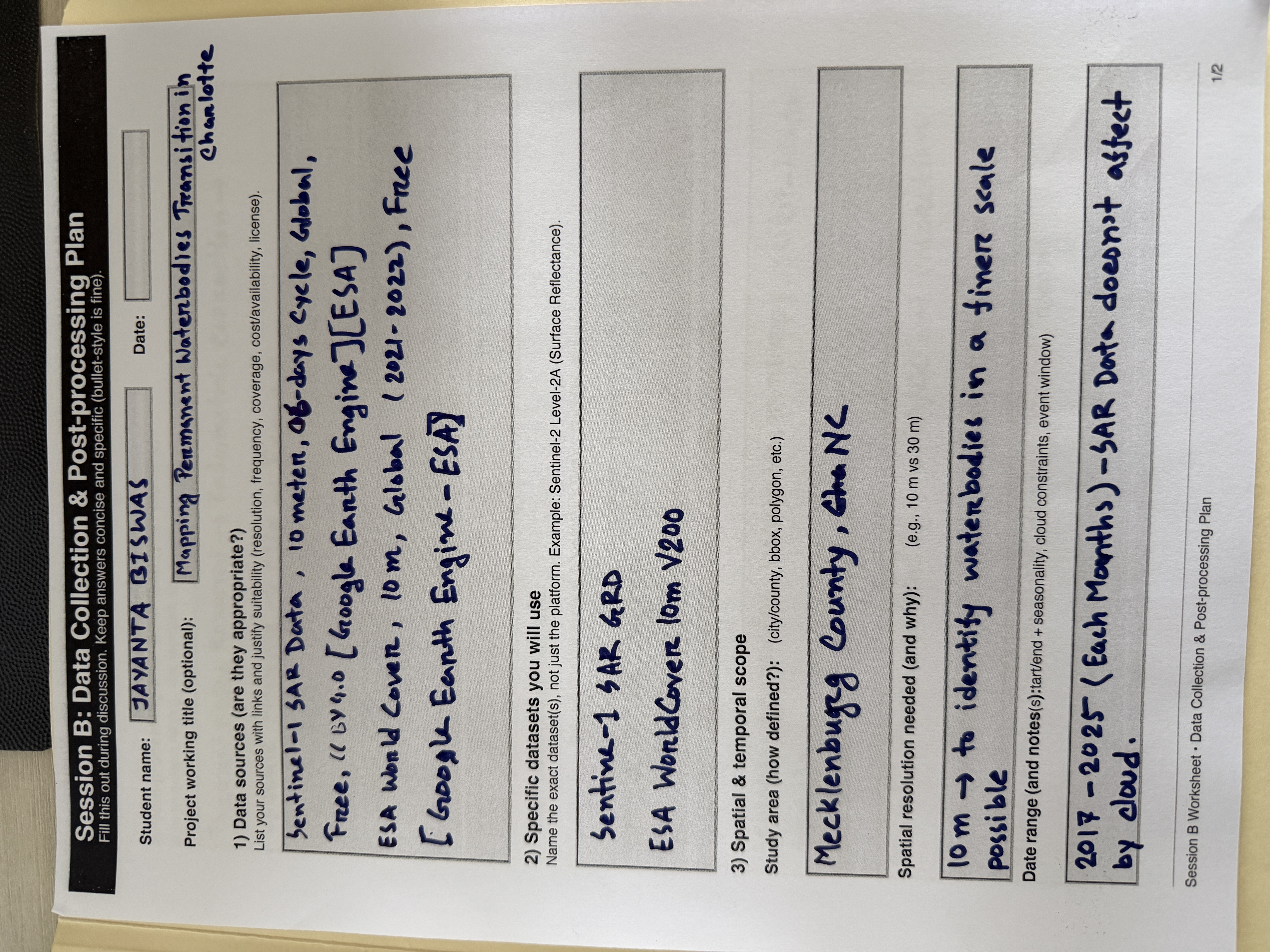
Mapping Permanent Waterbodies Transition in Charlotte (Static Map)
[ROLE] Act as a Lead Cartographer and Scientific Illustrator for a high-impact geospatial journal (e.g., IEEE TVCG or Cartography and Geographic Information Science).
[GOAL] I need you to generate two high-fidelity demo images based on the project definition below. Do not write code. Do not write an essay. Generate the actual images.
[PROJECT DEFINITION]
• Topic: Permanent waterbodies mapping
• Title: Mapping Permanent Waterbodies Transition in Charlotte
• Claim: Visualize how waterbodies increasing/decreasing over time and which area looses or gain waterbodies
• Audience + Task: Urban Planners and Environmental Conservation Agencies
• Data + License: Synthetic Aperture Radar (SAR) data from Sentinel-1 and Census Vector Polygon
• Static Idea: Showing waterbody change map
• Interactive Idea: Dynamic map how waterbodies decrease/increase over time
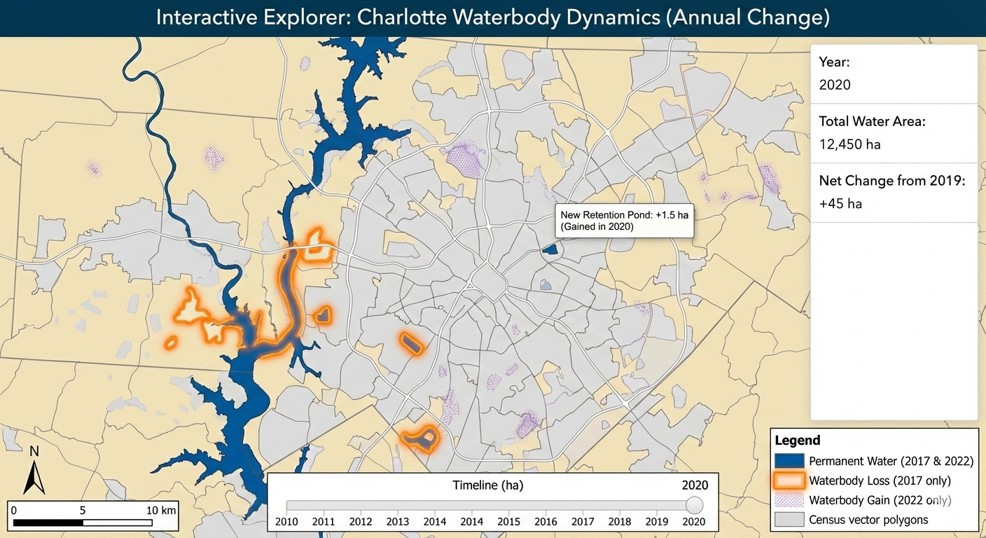
Mapping Permanent Waterbodies Transition in Charlotte (Interactive Map Snapshot)
[ROLE] Act as a Lead Cartographer and Scientific Illustrator for a high-impact geospatial journal (e.g., IEEE TVCG or Cartography and Geographic Information Science).
[GOAL] I need you to generate two high-fidelity demo images based on the project definition below. Do not write code. Do not write an essay. Generate the actual images.
[PROJECT DEFINITION]
• Topic: Permanent waterbodies mapping
• Title: Mapping Permanent Waterbodies Transition in Charlotte
• Claim: Visualize how waterbodies increasing/decreasing over time and which area looses or gain waterbodies
• Audience + Task: Urban Planners and Environmental Conservation Agencies
• Data + License: Synthetic Aperture Radar (SAR) data from Sentinel-1 and Census Vector Polygon
• Static Idea: Showing waterbody change map
• Interactive Idea: Dynamic map how waterbodies decrease/increase over time
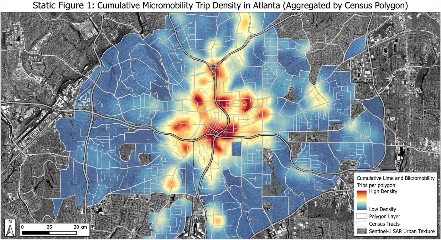
Map Peoples Movement using Ridesharing Services (Lime and Bird) in Atlanta (Static Map)
[ROLE] Act as a Lead Cartographer and Scientific Illustrator for a high-impact geospatial journal (e.g., IEEE TVCG or Cartography and Geographic Information Science).
[GOAL] I need you to generate two high-fidelity demo images based on the project definition below. Do not write code. Do not write an essay. Generate the actual images.
[PROJECT DEFINITION]
• Topic: Transportation Micromobility
• Title: Map Peoples Movement using Ridesharing Services (Lime and Bird) in Atlanta
• Claim: Visualize people movement during different times and day
• Audience + Task: Lime and Bird API (sharing live location of their bikes)
• Data + License: Synthetic Aperture Radar (SAR) data from Sentinel-1 and Census Vector Polygon
• Static Idea: Hotspot map showing where most of the people travel using these bikes
• Interactive Idea: Dynamic map of people movement during different times and day
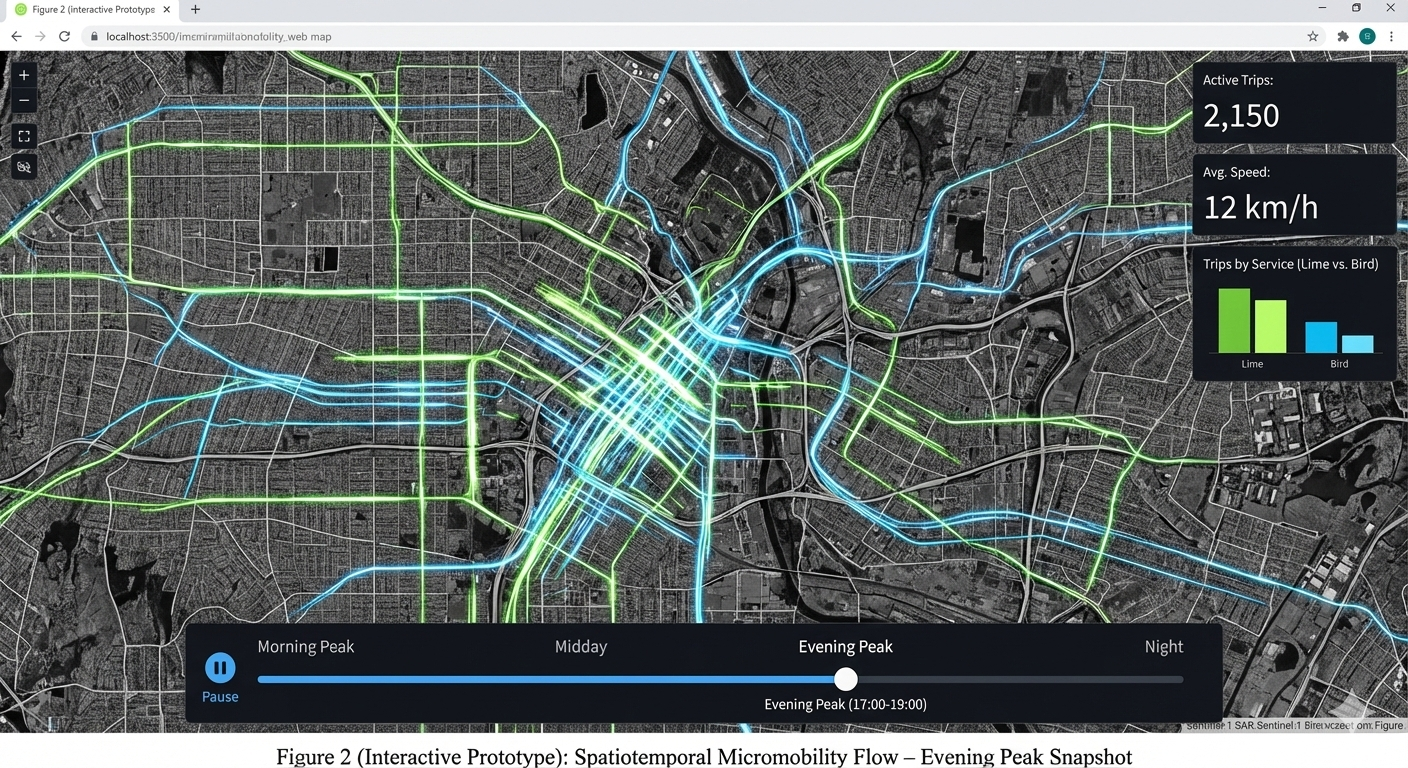
Map Peoples Movement using Ridesharing Services (Lime and Bird) in Atlanta (Interactive Map Snapshot)
[ROLE] Act as a Lead Cartographer and Scientific Illustrator for a high-impact geospatial journal (e.g., IEEE TVCG or Cartography and Geographic Information Science).
[GOAL] I need you to generate two high-fidelity demo images based on the project definition below. Do not write code. Do not write an essay. Generate the actual images.
[PROJECT DEFINITION]
• Topic: Transportation Micromobility
• Title: Map Peoples Movement using Ridesharing Services (Lime and Bird) in Atlanta
• Claim: Visualize people movement during different times and day
• Audience + Task: Lime and Bird API (sharing live location of their bikes)
• Data + License: Synthetic Aperture Radar (SAR) data from Sentinel-1 and Census Vector Polygon
• Static Idea: Hotspot map showing where most of the people travel using these bikes
• Interactive Idea: Dynamic map of people movement during different times and day
Title
Description...
Week 3
Screenshot Part A
Description...
Screenshot Part B
Description...
Screenshot Part C
Description...
Screenshot Part D
Description...
Bad Map
Map Source: Carter Mayhew
Good Map
Map Source: Carter Mayhew
Short Reflection
- Command not found (Typo error): go back and make sure I type the command name correctly.
- Problem during Conda install: forget to put -y during conda install and cannot put y/n during installation in Jupyter lab. I just interrupt the kernel and put -y and re-run the code.
- Package not found: use conda/pip command to install the package which was missing.
- Why does the environment matter?
- Helps to avoid failure during moving code from one machine to another machine.
- Mitigate the package conflicts.
- Sometimes libraries get updates and it might change some functionalities that might conflict with previous versions. The environment helps us to maintain specific versions that we need for our geovisualization task.
- Helps to reproduce the work after months as the documented environment contains the specific version and packages required for the project.
Title
Description...
Title
Description...
Week 4
Screenshot-1
EarthExplorer: Search Criteria page showing your AOI + date range.
Screenshot-2
EarthExplorer: Data Sets page showing the dataset(s) you selected (e.g., Landsat Collection 2 Level-2).
Screenshot-3
EarthExplorer: Results list showing at least one scene selected (include cloud cover/preview).
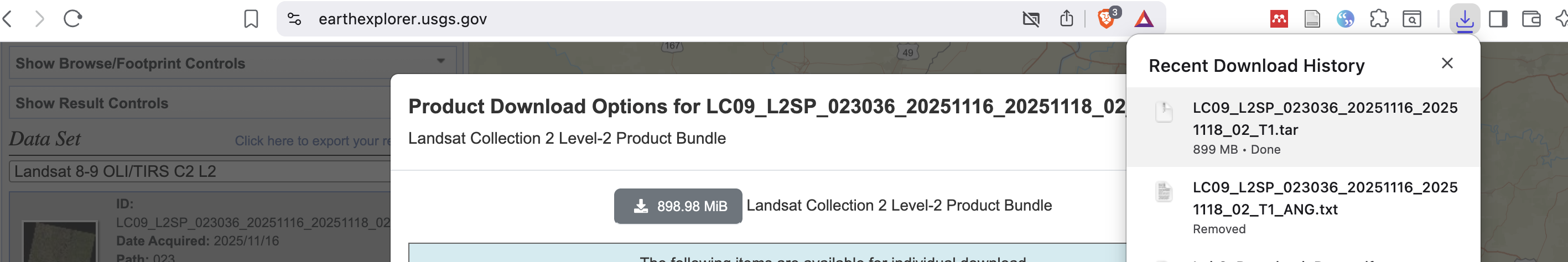
Screenshot-4
EarthExplorer: Download Options page (or your browser downloads list) showing the file is downloading or downloaded.
Screenshot-5
GEE access: Code Editor opens successfully OR a confirmation that your account is enabled (any clear proof).
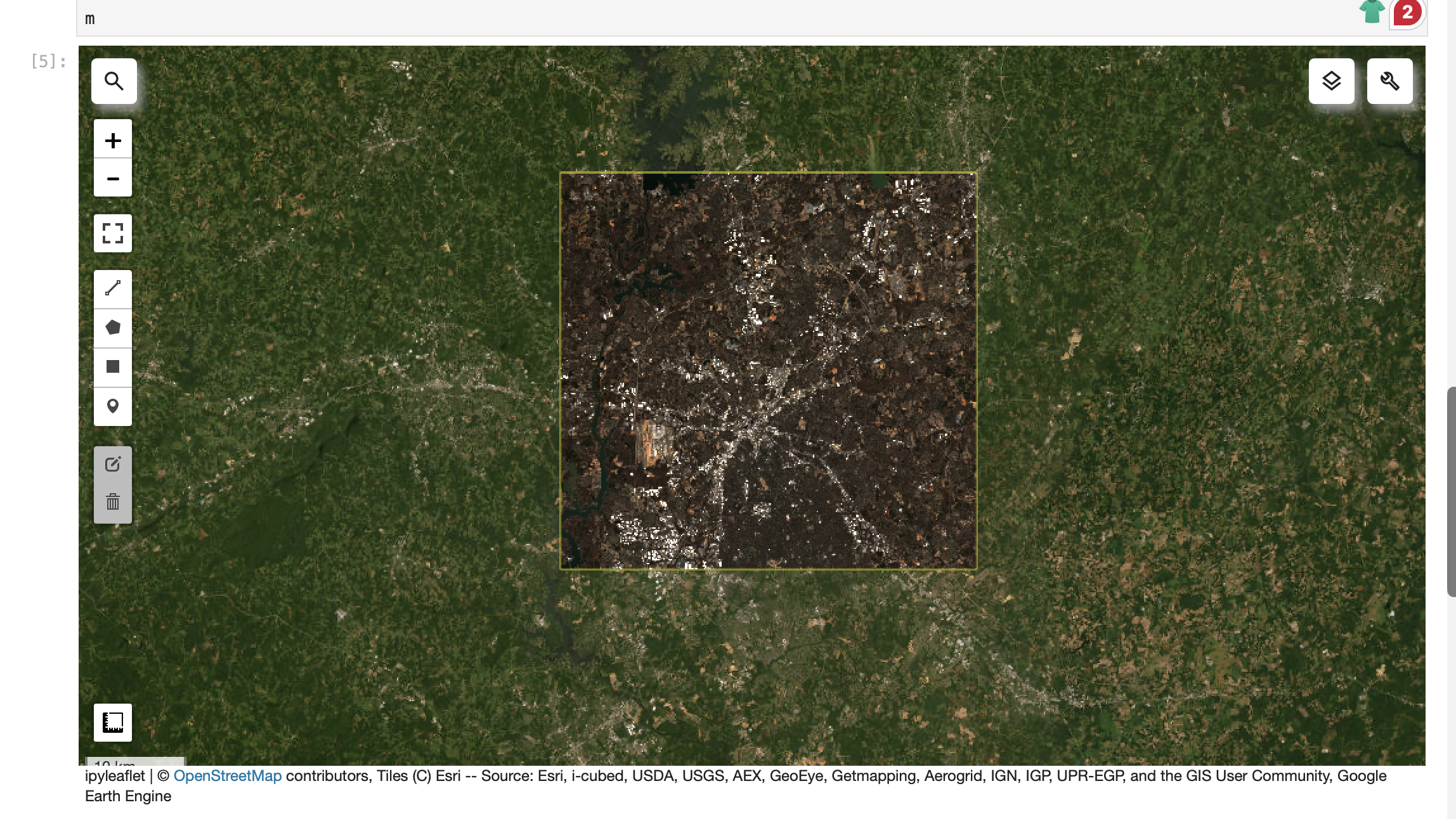
Screenshot-6
JupyterLab: geemap map showing ROI + an imagery layer (e.g., Sentinel-2 RGB).
geemap.ee_initialize()
# 1) ROI (edit if you want)
roi = ee.Geometry.Rectangle([-81.05, 35.10, -80.60, 35.45])
# 2) Map
m = geemap.Map(center=[35.2271, -80.8431], zoom=10)
m.add_basemap("HYBRID")
m.addLayer(roi, {"color": "yellow"}, "ROI", True)
# 3) Sentinel-2 SR (cloud-masked) with timestamp preserved
def mask_s2_sr(img):
scl = img.select("SCL")
mask = (scl.neq(3)
.And(scl.neq(8))
.And(scl.neq(9))
.And(scl.neq(10))
.And(scl.neq(11)))
out = img.updateMask(mask).divide(10000)
return out.copyProperties(img, img.propertyNames())
s2 = (ee.ImageCollection("COPERNICUS/S2_SR_HARMONIZED")
.filterBounds(roi)
.filterDate("2026-01-01", "2026-01-31")
.map(mask_s2_sr)
.filter(ee.Filter.notNull(["system:time_start"])))
s2_median = s2.median().clip(roi)
m.addLayer(s2_median, {"min": 0, "max": 0.3, "bands": ["B4","B3","B2"]}, "Sentinel-2 RGB")
m
import ee
import geemapee.Authenticate()
ee.Initialize(project="ee-jayantakurp17")# quick sanity check (should print a CRS string like 'EPSG:4326' or similar)
img = ee.Image("USGS/SRTMGL1_003")
print(img.projection().crs().getInfo())import numpy as np
import pandas as pd
print("numpy:", np.__version__)
print("pandas:", pd.__version__)
inventory = pd.DataFrame(
[
{
"source": "USGS EarthExplorer",
"dataset": "Landsat C2 L2 (SR)",
"resolution": "30m",
"license": "check metadata",
"notes": "downloaded 1 scene",
},
{
"source": "GEE (via geemap)",
"dataset": "Sentinel-2 SR Harmonized",
"resolution": "10–20 m",
"license": "check collection docs",
"notes": "NDVI + time series",
},
]
)
inventoryfrom geemap import chart
geemap.ee_initialize()
# 1) ROI (edit if you want)
roi = ee.Geometry.Rectangle([-81.05, 35.10, -80.60, 35.45])
# 2) Map
m = geemap.Map(center=[35.2271, -80.8431], zoom=10)
m.add_basemap("HYBRID")
m.addLayer(roi, {"color": "yellow"}, "ROI", True)
# 3) Sentinel-2 SR (cloud-masked) with timestamp preserved
def mask_s2_sr(img):
scl = img.select("SCL")
mask = (scl.neq(3)
.And(scl.neq(8))
.And(scl.neq(9))
.And(scl.neq(10))
.And(scl.neq(11)))
out = img.updateMask(mask).divide(10000)
return out.copyProperties(img, img.propertyNames())
s2 = (ee.ImageCollection("COPERNICUS/S2_SR_HARMONIZED")
.filterBounds(roi)
.filterDate("2026-01-01", "2026-01-31")
.map(mask_s2_sr)
.filter(ee.Filter.notNull(["system:time_start"])))
s2_median = s2.median().clip(roi)
m.addLayer(s2_median, {"min": 0, "max": 0.3, "bands": ["B4","B3","B2"]}, "Sentinel-2 RGB")
m# 4) NDVI
ndvi = s2_median.normalizedDifference(["B8","B4"]).rename("NDVI")
ndvi_vis = {"min": 0, "max": 1, "palette":
["#440154","#3b528b","#21918c","#5ec962","#fde725"]}
m.addLayer(ndvi, ndvi_vis, "NDVI")
m.add_colorbar(ndvi_vis, label="NDVI", layer_name="NDVI")
meemap.ee_export_image_to_drive(
image=ndvi,
description="ndvi_demo_geovis",
folder="geemap_exports",
region=roi,
scale=20,
maxPixels=1e13,
)
print("Export task submitted. Check the Earth Engine Tasks tab.")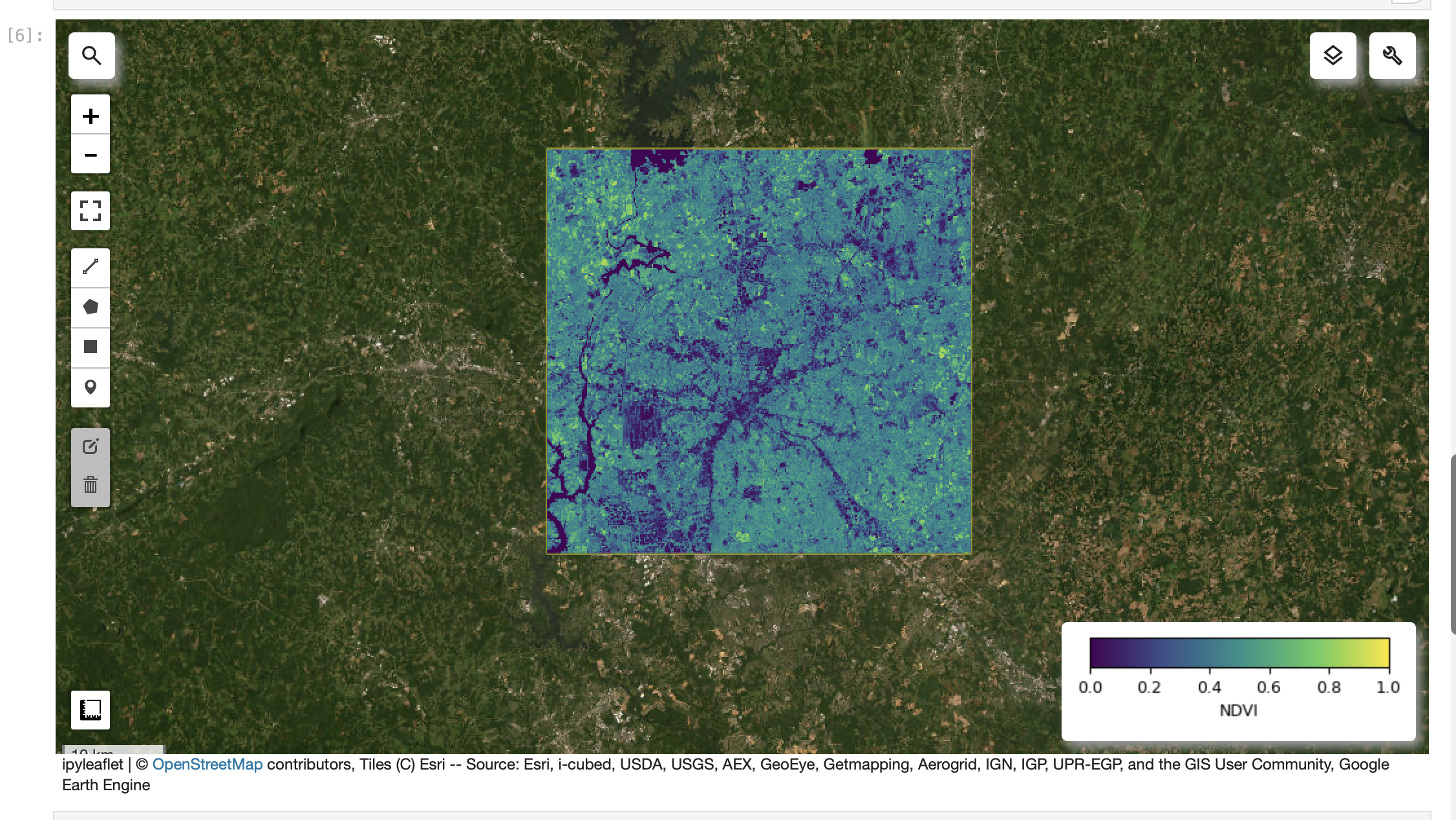
Screenshot-7
JupyterLab: NDVI layer visible with a colorbar/legend.
# 4) NDVI
ndvi = s2_median.normalizedDifference(["B8","B4"]).rename("NDVI")
ndvi_vis = {"min": 0, "max": 1, "palette":
["#440154","#3b528b","#21918c","#5ec962","#fde725"]}
m.addLayer(ndvi, ndvi_vis, "NDVI")
m.add_colorbar(ndvi_vis, label="NDVI", layer_name="NDVI")
m
import ee
import geemapee.Authenticate()
ee.Initialize(project="ee-jayantakurp17")# quick sanity check (should print a CRS string like 'EPSG:4326' or similar)
img = ee.Image("USGS/SRTMGL1_003")
print(img.projection().crs().getInfo())import numpy as np
import pandas as pd
print("numpy:", np.__version__)
print("pandas:", pd.__version__)
inventory = pd.DataFrame(
[
{
"source": "USGS EarthExplorer",
"dataset": "Landsat C2 L2 (SR)",
"resolution": "30m",
"license": "check metadata",
"notes": "downloaded 1 scene",
},
{
"source": "GEE (via geemap)",
"dataset": "Sentinel-2 SR Harmonized",
"resolution": "10–20 m",
"license": "check collection docs",
"notes": "NDVI + time series",
},
]
)
inventoryfrom geemap import chart
geemap.ee_initialize()
# 1) ROI (edit if you want)
roi = ee.Geometry.Rectangle([-81.05, 35.10, -80.60, 35.45])
# 2) Map
m = geemap.Map(center=[35.2271, -80.8431], zoom=10)
m.add_basemap("HYBRID")
m.addLayer(roi, {"color": "yellow"}, "ROI", True)
# 3) Sentinel-2 SR (cloud-masked) with timestamp preserved
def mask_s2_sr(img):
scl = img.select("SCL")
mask = (scl.neq(3)
.And(scl.neq(8))
.And(scl.neq(9))
.And(scl.neq(10))
.And(scl.neq(11)))
out = img.updateMask(mask).divide(10000)
return out.copyProperties(img, img.propertyNames())
s2 = (ee.ImageCollection("COPERNICUS/S2_SR_HARMONIZED")
.filterBounds(roi)
.filterDate("2026-01-01", "2026-01-31")
.map(mask_s2_sr)
.filter(ee.Filter.notNull(["system:time_start"])))
s2_median = s2.median().clip(roi)
m.addLayer(s2_median, {"min": 0, "max": 0.3, "bands": ["B4","B3","B2"]}, "Sentinel-2 RGB")
m# 4) NDVI
ndvi = s2_median.normalizedDifference(["B8","B4"]).rename("NDVI")
ndvi_vis = {"min": 0, "max": 1, "palette":
["#440154","#3b528b","#21918c","#5ec962","#fde725"]}
m.addLayer(ndvi, ndvi_vis, "NDVI")
m.add_colorbar(ndvi_vis, label="NDVI", layer_name="NDVI")
meemap.ee_export_image_to_drive(
image=ndvi,
description="ndvi_demo_geovis",
folder="geemap_exports",
region=roi,
scale=20,
maxPixels=1e13,
)
print("Export task submitted. Check the Earth Engine Tasks tab.")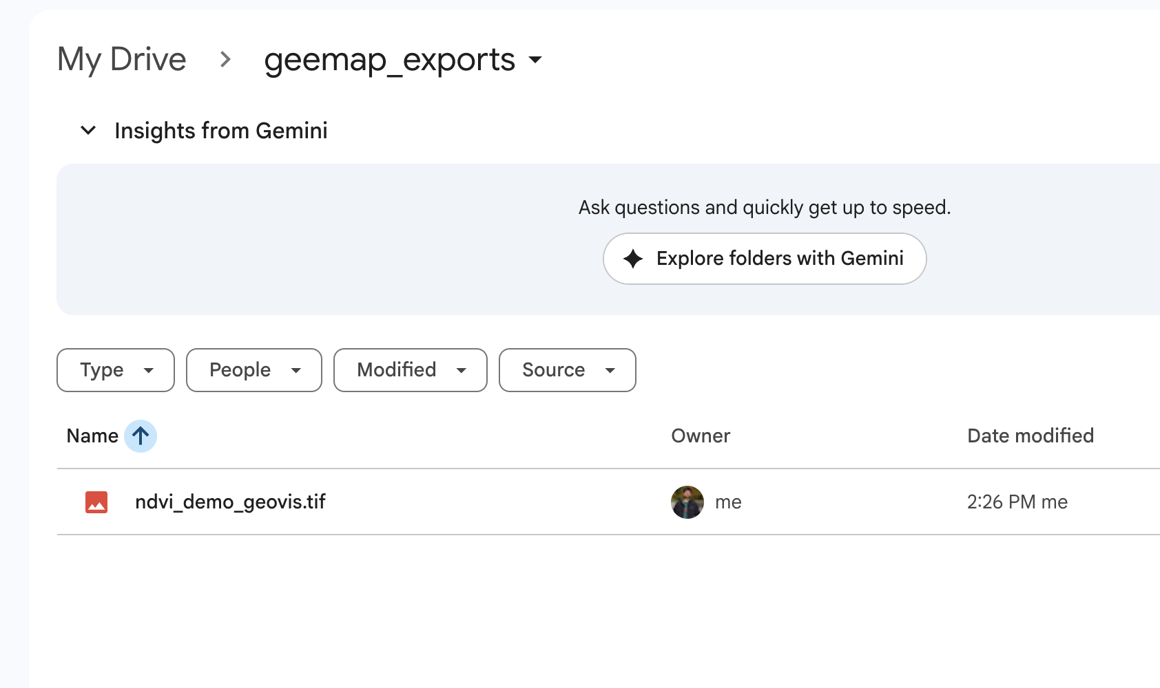
Screenshot-8
JupyterLab: NDVI data export to google drive
eemap.ee_export_image_to_drive(
 image=ndvi,
 description="ndvi_demo_geovis",
 folder="geemap_exports",
 region=roi,
 scale=20,
 maxPixels=1e13,
)
print("Export task submitted. Check the Earth Engine Tasks tab.")
import ee
import geemapee.Authenticate()
ee.Initialize(project="ee-jayantakurp17")# quick sanity check (should print a CRS string like 'EPSG:4326' or similar)
img = ee.Image("USGS/SRTMGL1_003")
print(img.projection().crs().getInfo())import numpy as np
import pandas as pd
print("numpy:", np.__version__)
print("pandas:", pd.__version__)
inventory = pd.DataFrame(
[
{
"source": "USGS EarthExplorer",
"dataset": "Landsat C2 L2 (SR)",
"resolution": "30m",
"license": "check metadata",
"notes": "downloaded 1 scene",
},
{
"source": "GEE (via geemap)",
"dataset": "Sentinel-2 SR Harmonized",
"resolution": "10–20 m",
"license": "check collection docs",
"notes": "NDVI + time series",
},
]
)
inventoryfrom geemap import chart
geemap.ee_initialize()
# 1) ROI (edit if you want)
roi = ee.Geometry.Rectangle([-81.05, 35.10, -80.60, 35.45])
# 2) Map
m = geemap.Map(center=[35.2271, -80.8431], zoom=10)
m.add_basemap("HYBRID")
m.addLayer(roi, {"color": "yellow"}, "ROI", True)
# 3) Sentinel-2 SR (cloud-masked) with timestamp preserved
def mask_s2_sr(img):
scl = img.select("SCL")
mask = (scl.neq(3)
.And(scl.neq(8))
.And(scl.neq(9))
.And(scl.neq(10))
.And(scl.neq(11)))
out = img.updateMask(mask).divide(10000)
return out.copyProperties(img, img.propertyNames())
s2 = (ee.ImageCollection("COPERNICUS/S2_SR_HARMONIZED")
.filterBounds(roi)
.filterDate("2026-01-01", "2026-01-31")
.map(mask_s2_sr)
.filter(ee.Filter.notNull(["system:time_start"])))
s2_median = s2.median().clip(roi)
m.addLayer(s2_median, {"min": 0, "max": 0.3, "bands": ["B4","B3","B2"]}, "Sentinel-2 RGB")
m# 4) NDVI
ndvi = s2_median.normalizedDifference(["B8","B4"]).rename("NDVI")
ndvi_vis = {"min": 0, "max": 1, "palette":
["#440154","#3b528b","#21918c","#5ec962","#fde725"]}
m.addLayer(ndvi, ndvi_vis, "NDVI")
m.add_colorbar(ndvi_vis, label="NDVI", layer_name="NDVI")
meemap.ee_export_image_to_drive(
image=ndvi,
description="ndvi_demo_geovis",
folder="geemap_exports",
region=roi,
scale=20,
maxPixels=1e13,
)
print("Export task submitted. Check the Earth Engine Tasks tab.")Title
Description...
Title
Reflections...
Title
Description...
Title
Description...
Title
Description...
Title
Description...
Title
Description...
Week 5
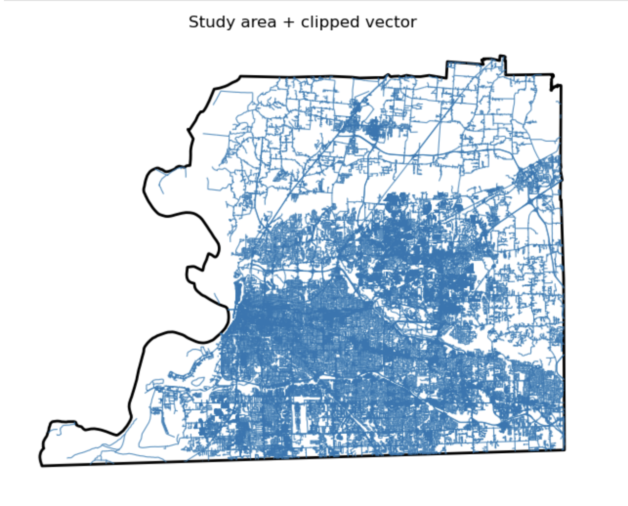
Study area + clipped vector
Description...
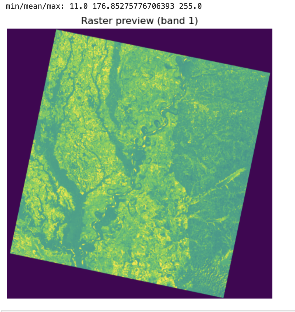
Raster preview (band 1)
Description...
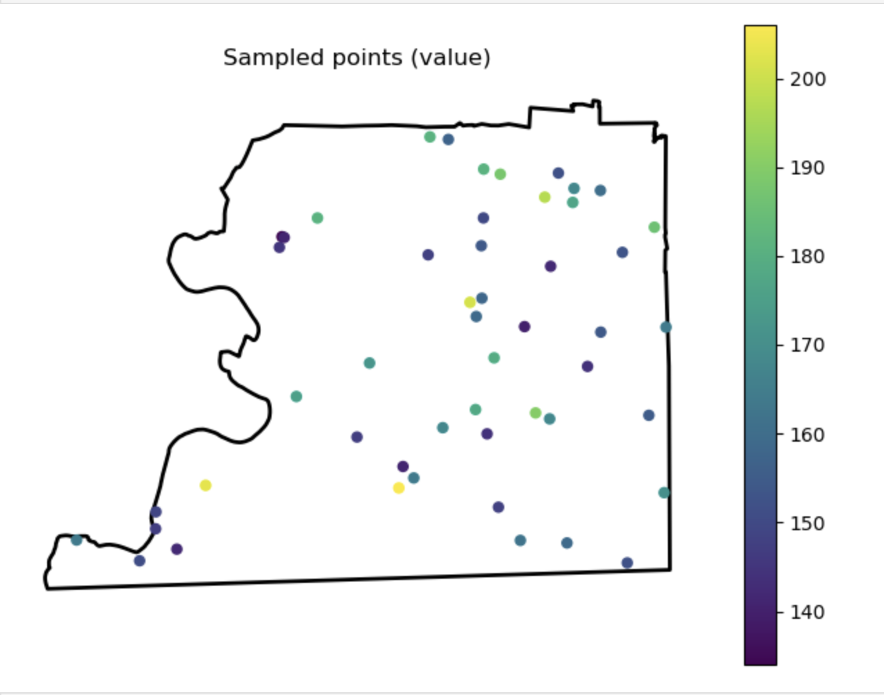
Sampled points (value)
Description...
Output Folder
Description...
Title
Description...
Title
Reflections...
Title
Description...
Title
Description...
Week 6
Importing Required Packages
Description...
import geopandas as gpd
import mapclassify  # required for scheme=... in GeoPandas plots
import matplotlib
import matplotlib.pyplot as plt
import numpy as np
import pandas as pd

print("geopandas:", gpd.__version__)
print("pandas:", pd.__version__)
print("numpy:", np.__version__)
print("matplotlib:", matplotlib.__version__)
print("mapclassify:", mapclassify.__version__)import geopandas as gpd
gdf = gpd.read_file("geovis_labs/lab5/pop.gpkg") # <-- change path
print("CRS:", gdf.crs)
print("Bounds:", gdf.total_bounds)
print("Columns:", list(gdf.columns))
print(gdf.head())VAR = "POPULATION_2021" # <-- change
gdf[VAR] = pd.to_numeric(gdf[VAR], errors="coerce")
print("Missing values:", gdf[VAR].isna().sum())
print(gdf[VAR].describe())import matplotlib.pyplot as plt
ax = gdf.plot(
column=VAR,
scheme="FisherJenks", # try: "EqualInterval", "FisherJenks", "Quantiles"
k=5,
cmap="Blues",
linewidth=0.3,
edgecolor="white",
legend=True,
legend_kwds={"loc": "upper left"},
figsize=(9, 7),
)
ax.set_title(f"Choropleth: {VAR} (FisherJenks, k=5)")
ax.set_axis_off()
plt.show()# Optional basemap (requires: contextily)
import contextily as cx
gdf_web = gdf.to_crs(epsg=3857)
ax = gdf_web.plot(
column=VAR,
scheme="FisherJenks",
k=5,
cmap="Greens",
linewidth=0.3,
edgecolor="white",
legend=True,
legend_kwds={"loc": "upper left"},
figsize=(9, 7),
)
cx.add_basemap(ax, source=cx.providers.CartoDB.Positron)
ax.set_title(f"Choropleth + basemap: {VAR}")
ax.set_axis_off()
plt.show()X = "POP_DENSITY_PER_KM2" # <-- change
Y = "LAND_AREA_KM2" # <-- change
N = 4 # number of bins per variable (3 -> 3x3)
gdf[X] = pd.to_numeric(gdf[X], errors="coerce")
gdf[Y] = pd.to_numeric(gdf[Y], errors="coerce")
# Quantile bins (0..N-1). duplicates='drop' avoids errors if many ties.
gdf["x_bin"] = pd.qcut(gdf[X], N, labels=False, duplicates="drop")
gdf["y_bin"] = pd.qcut(gdf[Y], N, labels=False, duplicates="drop")
# Combine bins into one class ID (row-major)
gdf["bi_class"] = gdf["y_bin"] * N + gdf["x_bin"]# 4x4 bivariate palette (row-major: y from low->high, x from low->high)
palette = [ "#e8e8e8", "#b9dedd", "#8ad4d3", "#5ac8c8",
"#dabcd4", "#b4b6cd", "#8db0c7", "#67aac0",
"#cc90c0", "#ae8ec0", "#908cbf", "#738abe",
"#be64ac", "#9265a4", "#67679c", "#3b4994",
]
def class_to_color(v):
if pd.isna(v):
return "#dddddd"
return palette[int(v)]
gdf["bi_color"] = gdf["bi_class"].apply(class_to_color)
ax = gdf.plot(color=gdf["bi_color"], linewidth=0.3, edgecolor="white", figsize=(9, 7))
ax.set_title(f"Bivariate choropleth: {X} (x) vs {Y} (y)")
ax.set_axis_off()
plt.show()from matplotlib.patches import Rectangle
fig, ax = plt.subplots(figsize=(4, 4))
for y in range(N):
for x in range(N):
idx = y * N + x
ax.add_patch(Rectangle((x, y), 1, 1, facecolor=palette[idx], edgecolor="none"))
ax.set_xlim(0, N)
ax.set_ylim(0, N)
ax.set_aspect("equal")
# Minimal labeling (edit these to match your variables)
ax.set_xticks([0.5, 1.5, 2.5, 3.5])
ax.set_yticks([0.5, 1.5, 2.5, 3.5])
ax.set_xticklabels(["Low", "Med", "High", "Very High"])
ax.set_yticklabels(["Low", "Med", "High", "Very High"])
ax.set_xlabel(X + " →")
ax.set_ylabel(Y + " ↑")
# Clean look
for spine in ax.spines.values():
spine.set_visible(False)
plt.title("Bivariate legend (3x3)")
plt.show()CART_FIELD = "POP_DENSITY_PER_KM2" # <-- change
gdf[CART_FIELD] = pd.to_numeric(gdf[CART_FIELD], errors="coerce")
gdf = gdf.dropna(subset=[CART_FIELD]).copy()
# Cartograms require positive values
gdf = gdf[gdf[CART_FIELD] > 0].copy()
print(gdf[CART_FIELD].describe())# Requires: pip install cartogram
import cartogram
import matplotlib.pyplot as plt
c = cartogram.Cartogram(
gdf,
CART_FIELD,
max_iterations=99, # try: 30, 60, 99
max_average_error=0.01, # try: 0.10 (faster) -> 0.02 (more accurate)
)
print("Average residual area error:", c.average_error)
ax = c.plot(
column=CART_FIELD,
scheme="Quantiles",
k=5,
cmap="Reds",
linewidth=0.3,
edgecolor="white",
legend=True,
legend_kwds={"loc": "upper left"},
figsize=(9, 7),
)
ax.set_title(f"Contiguous cartogram by {CART_FIELD}")
ax.set_axis_off()
plt.show()
# Optional export
c.to_file("geovis_labs/lab5/outputs/cartogram.gpkg", layer="cartogram", driver="GPKG")from shapely.affinity import scale
vals = gdf[CART_FIELD].to_numpy()
factors = np.sqrt(vals / np.nanmean(vals)) # area is ~factor^2
scaled_geoms = [
scale(geom, xfact=f, yfact=f, origin="center")
for geom, f in zip(gdf.geometry, factors)
]
gdf_scaled = gdf.copy()
gdf_scaled["geometry_scaled"] = scaled_geoms
gdf_scaled = gdf_scaled.set_geometry("geometry_scaled")
ax = gdf_scaled.plot(
column=CART_FIELD,
scheme="Quantiles",
k=5,
cmap="Reds",
linewidth=0.3,
edgecolor="white",
legend=True,
legend_kwds={"loc": "upper left"},
figsize=(9, 7),
)
ax.set_title(f"Non-contiguous cartogram (scaled) by {CART_FIELD}")
ax.set_axis_off()
plt.show()from shapely.affinity import scale
vals = gdf[CART_FIELD].to_numpy()
factors = (vals / np.nanmean(vals)) # area is ~factor^2
scaled_geoms = [
scale(geom, xfact=f, yfact=f, origin="center")
for geom, f in zip(gdf.geometry, factors)
]
gdf_scaled = gdf.copy()
gdf_scaled["geometry_scaled"] = scaled_geoms
gdf_scaled = gdf_scaled.set_geometry("geometry_scaled")
ax = gdf_scaled.plot(
column=CART_FIELD,
scheme="Quantiles",
k=5,
cmap="Reds",
linewidth=0.3,
edgecolor="white",
legend=True,
legend_kwds={"loc": "upper left"},
figsize=(9, 7),
)
ax.set_title(f"Non-contiguous cartogram (scaled) by {CART_FIELD}")
ax.set_axis_off()
plt.show()
Checking CRS
Description...
import geopandas as gpd
import mapclassify  # required for scheme=... in GeoPandas plots
import matplotlib
import matplotlib.pyplot as plt
import numpy as np
import pandas as pd

print("geopandas:", gpd.__version__)
print("pandas:", pd.__version__)
print("numpy:", np.__version__)
print("matplotlib:", matplotlib.__version__)
print("mapclassify:", mapclassify.__version__)import geopandas as gpd
gdf = gpd.read_file("geovis_labs/lab5/pop.gpkg") # <-- change path
print("CRS:", gdf.crs)
print("Bounds:", gdf.total_bounds)
print("Columns:", list(gdf.columns))
print(gdf.head())VAR = "POPULATION_2021" # <-- change
gdf[VAR] = pd.to_numeric(gdf[VAR], errors="coerce")
print("Missing values:", gdf[VAR].isna().sum())
print(gdf[VAR].describe())import matplotlib.pyplot as plt
ax = gdf.plot(
column=VAR,
scheme="FisherJenks", # try: "EqualInterval", "FisherJenks", "Quantiles"
k=5,
cmap="Blues",
linewidth=0.3,
edgecolor="white",
legend=True,
legend_kwds={"loc": "upper left"},
figsize=(9, 7),
)
ax.set_title(f"Choropleth: {VAR} (FisherJenks, k=5)")
ax.set_axis_off()
plt.show()# Optional basemap (requires: contextily)
import contextily as cx
gdf_web = gdf.to_crs(epsg=3857)
ax = gdf_web.plot(
column=VAR,
scheme="FisherJenks",
k=5,
cmap="Greens",
linewidth=0.3,
edgecolor="white",
legend=True,
legend_kwds={"loc": "upper left"},
figsize=(9, 7),
)
cx.add_basemap(ax, source=cx.providers.CartoDB.Positron)
ax.set_title(f"Choropleth + basemap: {VAR}")
ax.set_axis_off()
plt.show()X = "POP_DENSITY_PER_KM2" # <-- change
Y = "LAND_AREA_KM2" # <-- change
N = 4 # number of bins per variable (3 -> 3x3)
gdf[X] = pd.to_numeric(gdf[X], errors="coerce")
gdf[Y] = pd.to_numeric(gdf[Y], errors="coerce")
# Quantile bins (0..N-1). duplicates='drop' avoids errors if many ties.
gdf["x_bin"] = pd.qcut(gdf[X], N, labels=False, duplicates="drop")
gdf["y_bin"] = pd.qcut(gdf[Y], N, labels=False, duplicates="drop")
# Combine bins into one class ID (row-major)
gdf["bi_class"] = gdf["y_bin"] * N + gdf["x_bin"]# 4x4 bivariate palette (row-major: y from low->high, x from low->high)
palette = [ "#e8e8e8", "#b9dedd", "#8ad4d3", "#5ac8c8",
"#dabcd4", "#b4b6cd", "#8db0c7", "#67aac0",
"#cc90c0", "#ae8ec0", "#908cbf", "#738abe",
"#be64ac", "#9265a4", "#67679c", "#3b4994",
]
def class_to_color(v):
if pd.isna(v):
return "#dddddd"
return palette[int(v)]
gdf["bi_color"] = gdf["bi_class"].apply(class_to_color)
ax = gdf.plot(color=gdf["bi_color"], linewidth=0.3, edgecolor="white", figsize=(9, 7))
ax.set_title(f"Bivariate choropleth: {X} (x) vs {Y} (y)")
ax.set_axis_off()
plt.show()from matplotlib.patches import Rectangle
fig, ax = plt.subplots(figsize=(4, 4))
for y in range(N):
for x in range(N):
idx = y * N + x
ax.add_patch(Rectangle((x, y), 1, 1, facecolor=palette[idx], edgecolor="none"))
ax.set_xlim(0, N)
ax.set_ylim(0, N)
ax.set_aspect("equal")
# Minimal labeling (edit these to match your variables)
ax.set_xticks([0.5, 1.5, 2.5, 3.5])
ax.set_yticks([0.5, 1.5, 2.5, 3.5])
ax.set_xticklabels(["Low", "Med", "High", "Very High"])
ax.set_yticklabels(["Low", "Med", "High", "Very High"])
ax.set_xlabel(X + " →")
ax.set_ylabel(Y + " ↑")
# Clean look
for spine in ax.spines.values():
spine.set_visible(False)
plt.title("Bivariate legend (3x3)")
plt.show()CART_FIELD = "POP_DENSITY_PER_KM2" # <-- change
gdf[CART_FIELD] = pd.to_numeric(gdf[CART_FIELD], errors="coerce")
gdf = gdf.dropna(subset=[CART_FIELD]).copy()
# Cartograms require positive values
gdf = gdf[gdf[CART_FIELD] > 0].copy()
print(gdf[CART_FIELD].describe())# Requires: pip install cartogram
import cartogram
import matplotlib.pyplot as plt
c = cartogram.Cartogram(
gdf,
CART_FIELD,
max_iterations=99, # try: 30, 60, 99
max_average_error=0.01, # try: 0.10 (faster) -> 0.02 (more accurate)
)
print("Average residual area error:", c.average_error)
ax = c.plot(
column=CART_FIELD,
scheme="Quantiles",
k=5,
cmap="Reds",
linewidth=0.3,
edgecolor="white",
legend=True,
legend_kwds={"loc": "upper left"},
figsize=(9, 7),
)
ax.set_title(f"Contiguous cartogram by {CART_FIELD}")
ax.set_axis_off()
plt.show()
# Optional export
c.to_file("geovis_labs/lab5/outputs/cartogram.gpkg", layer="cartogram", driver="GPKG")from shapely.affinity import scale
vals = gdf[CART_FIELD].to_numpy()
factors = np.sqrt(vals / np.nanmean(vals)) # area is ~factor^2
scaled_geoms = [
scale(geom, xfact=f, yfact=f, origin="center")
for geom, f in zip(gdf.geometry, factors)
]
gdf_scaled = gdf.copy()
gdf_scaled["geometry_scaled"] = scaled_geoms
gdf_scaled = gdf_scaled.set_geometry("geometry_scaled")
ax = gdf_scaled.plot(
column=CART_FIELD,
scheme="Quantiles",
k=5,
cmap="Reds",
linewidth=0.3,
edgecolor="white",
legend=True,
legend_kwds={"loc": "upper left"},
figsize=(9, 7),
)
ax.set_title(f"Non-contiguous cartogram (scaled) by {CART_FIELD}")
ax.set_axis_off()
plt.show()from shapely.affinity import scale
vals = gdf[CART_FIELD].to_numpy()
factors = (vals / np.nanmean(vals)) # area is ~factor^2
scaled_geoms = [
scale(geom, xfact=f, yfact=f, origin="center")
for geom, f in zip(gdf.geometry, factors)
]
gdf_scaled = gdf.copy()
gdf_scaled["geometry_scaled"] = scaled_geoms
gdf_scaled = gdf_scaled.set_geometry("geometry_scaled")
ax = gdf_scaled.plot(
column=CART_FIELD,
scheme="Quantiles",
k=5,
cmap="Reds",
linewidth=0.3,
edgecolor="white",
legend=True,
legend_kwds={"loc": "upper left"},
figsize=(9, 7),
)
ax.set_title(f"Non-contiguous cartogram (scaled) by {CART_FIELD}")
ax.set_axis_off()
plt.show()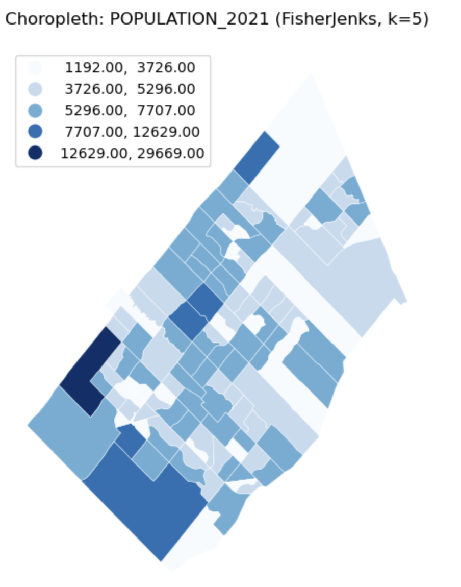
Univariate Choropleth Map
Description...
import geopandas as gpd
import mapclassify  # required for scheme=... in GeoPandas plots
import matplotlib
import matplotlib.pyplot as plt
import numpy as np
import pandas as pd

print("geopandas:", gpd.__version__)
print("pandas:", pd.__version__)
print("numpy:", np.__version__)
print("matplotlib:", matplotlib.__version__)
print("mapclassify:", mapclassify.__version__)import geopandas as gpd
gdf = gpd.read_file("geovis_labs/lab5/pop.gpkg") # <-- change path
print("CRS:", gdf.crs)
print("Bounds:", gdf.total_bounds)
print("Columns:", list(gdf.columns))
print(gdf.head())VAR = "POPULATION_2021" # <-- change
gdf[VAR] = pd.to_numeric(gdf[VAR], errors="coerce")
print("Missing values:", gdf[VAR].isna().sum())
print(gdf[VAR].describe())import matplotlib.pyplot as plt
ax = gdf.plot(
column=VAR,
scheme="FisherJenks", # try: "EqualInterval", "FisherJenks", "Quantiles"
k=5,
cmap="Blues",
linewidth=0.3,
edgecolor="white",
legend=True,
legend_kwds={"loc": "upper left"},
figsize=(9, 7),
)
ax.set_title(f"Choropleth: {VAR} (FisherJenks, k=5)")
ax.set_axis_off()
plt.show()# Optional basemap (requires: contextily)
import contextily as cx
gdf_web = gdf.to_crs(epsg=3857)
ax = gdf_web.plot(
column=VAR,
scheme="FisherJenks",
k=5,
cmap="Greens",
linewidth=0.3,
edgecolor="white",
legend=True,
legend_kwds={"loc": "upper left"},
figsize=(9, 7),
)
cx.add_basemap(ax, source=cx.providers.CartoDB.Positron)
ax.set_title(f"Choropleth + basemap: {VAR}")
ax.set_axis_off()
plt.show()X = "POP_DENSITY_PER_KM2" # <-- change
Y = "LAND_AREA_KM2" # <-- change
N = 4 # number of bins per variable (3 -> 3x3)
gdf[X] = pd.to_numeric(gdf[X], errors="coerce")
gdf[Y] = pd.to_numeric(gdf[Y], errors="coerce")
# Quantile bins (0..N-1). duplicates='drop' avoids errors if many ties.
gdf["x_bin"] = pd.qcut(gdf[X], N, labels=False, duplicates="drop")
gdf["y_bin"] = pd.qcut(gdf[Y], N, labels=False, duplicates="drop")
# Combine bins into one class ID (row-major)
gdf["bi_class"] = gdf["y_bin"] * N + gdf["x_bin"]# 4x4 bivariate palette (row-major: y from low->high, x from low->high)
palette = [ "#e8e8e8", "#b9dedd", "#8ad4d3", "#5ac8c8",
"#dabcd4", "#b4b6cd", "#8db0c7", "#67aac0",
"#cc90c0", "#ae8ec0", "#908cbf", "#738abe",
"#be64ac", "#9265a4", "#67679c", "#3b4994",
]
def class_to_color(v):
if pd.isna(v):
return "#dddddd"
return palette[int(v)]
gdf["bi_color"] = gdf["bi_class"].apply(class_to_color)
ax = gdf.plot(color=gdf["bi_color"], linewidth=0.3, edgecolor="white", figsize=(9, 7))
ax.set_title(f"Bivariate choropleth: {X} (x) vs {Y} (y)")
ax.set_axis_off()
plt.show()from matplotlib.patches import Rectangle
fig, ax = plt.subplots(figsize=(4, 4))
for y in range(N):
for x in range(N):
idx = y * N + x
ax.add_patch(Rectangle((x, y), 1, 1, facecolor=palette[idx], edgecolor="none"))
ax.set_xlim(0, N)
ax.set_ylim(0, N)
ax.set_aspect("equal")
# Minimal labeling (edit these to match your variables)
ax.set_xticks([0.5, 1.5, 2.5, 3.5])
ax.set_yticks([0.5, 1.5, 2.5, 3.5])
ax.set_xticklabels(["Low", "Med", "High", "Very High"])
ax.set_yticklabels(["Low", "Med", "High", "Very High"])
ax.set_xlabel(X + " →")
ax.set_ylabel(Y + " ↑")
# Clean look
for spine in ax.spines.values():
spine.set_visible(False)
plt.title("Bivariate legend (3x3)")
plt.show()CART_FIELD = "POP_DENSITY_PER_KM2" # <-- change
gdf[CART_FIELD] = pd.to_numeric(gdf[CART_FIELD], errors="coerce")
gdf = gdf.dropna(subset=[CART_FIELD]).copy()
# Cartograms require positive values
gdf = gdf[gdf[CART_FIELD] > 0].copy()
print(gdf[CART_FIELD].describe())# Requires: pip install cartogram
import cartogram
import matplotlib.pyplot as plt
c = cartogram.Cartogram(
gdf,
CART_FIELD,
max_iterations=99, # try: 30, 60, 99
max_average_error=0.01, # try: 0.10 (faster) -> 0.02 (more accurate)
)
print("Average residual area error:", c.average_error)
ax = c.plot(
column=CART_FIELD,
scheme="Quantiles",
k=5,
cmap="Reds",
linewidth=0.3,
edgecolor="white",
legend=True,
legend_kwds={"loc": "upper left"},
figsize=(9, 7),
)
ax.set_title(f"Contiguous cartogram by {CART_FIELD}")
ax.set_axis_off()
plt.show()
# Optional export
c.to_file("geovis_labs/lab5/outputs/cartogram.gpkg", layer="cartogram", driver="GPKG")from shapely.affinity import scale
vals = gdf[CART_FIELD].to_numpy()
factors = np.sqrt(vals / np.nanmean(vals)) # area is ~factor^2
scaled_geoms = [
scale(geom, xfact=f, yfact=f, origin="center")
for geom, f in zip(gdf.geometry, factors)
]
gdf_scaled = gdf.copy()
gdf_scaled["geometry_scaled"] = scaled_geoms
gdf_scaled = gdf_scaled.set_geometry("geometry_scaled")
ax = gdf_scaled.plot(
column=CART_FIELD,
scheme="Quantiles",
k=5,
cmap="Reds",
linewidth=0.3,
edgecolor="white",
legend=True,
legend_kwds={"loc": "upper left"},
figsize=(9, 7),
)
ax.set_title(f"Non-contiguous cartogram (scaled) by {CART_FIELD}")
ax.set_axis_off()
plt.show()from shapely.affinity import scale
vals = gdf[CART_FIELD].to_numpy()
factors = (vals / np.nanmean(vals)) # area is ~factor^2
scaled_geoms = [
scale(geom, xfact=f, yfact=f, origin="center")
for geom, f in zip(gdf.geometry, factors)
]
gdf_scaled = gdf.copy()
gdf_scaled["geometry_scaled"] = scaled_geoms
gdf_scaled = gdf_scaled.set_geometry("geometry_scaled")
ax = gdf_scaled.plot(
column=CART_FIELD,
scheme="Quantiles",
k=5,
cmap="Reds",
linewidth=0.3,
edgecolor="white",
legend=True,
legend_kwds={"loc": "upper left"},
figsize=(9, 7),
)
ax.set_title(f"Non-contiguous cartogram (scaled) by {CART_FIELD}")
ax.set_axis_off()
plt.show()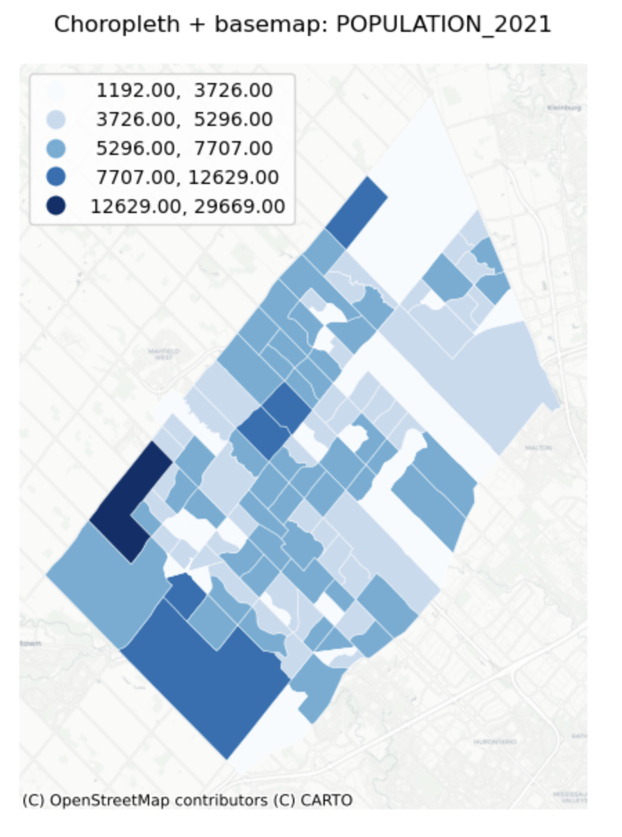
Univariate Choropleth Map with Base map
Description...
import geopandas as gpd
import mapclassify  # required for scheme=... in GeoPandas plots
import matplotlib
import matplotlib.pyplot as plt
import numpy as np
import pandas as pd

print("geopandas:", gpd.__version__)
print("pandas:", pd.__version__)
print("numpy:", np.__version__)
print("matplotlib:", matplotlib.__version__)
print("mapclassify:", mapclassify.__version__)import geopandas as gpd
gdf = gpd.read_file("geovis_labs/lab5/pop.gpkg") # <-- change path
print("CRS:", gdf.crs)
print("Bounds:", gdf.total_bounds)
print("Columns:", list(gdf.columns))
print(gdf.head())VAR = "POPULATION_2021" # <-- change
gdf[VAR] = pd.to_numeric(gdf[VAR], errors="coerce")
print("Missing values:", gdf[VAR].isna().sum())
print(gdf[VAR].describe())import matplotlib.pyplot as plt
ax = gdf.plot(
column=VAR,
scheme="FisherJenks", # try: "EqualInterval", "FisherJenks", "Quantiles"
k=5,
cmap="Blues",
linewidth=0.3,
edgecolor="white",
legend=True,
legend_kwds={"loc": "upper left"},
figsize=(9, 7),
)
ax.set_title(f"Choropleth: {VAR} (FisherJenks, k=5)")
ax.set_axis_off()
plt.show()# Optional basemap (requires: contextily)
import contextily as cx
gdf_web = gdf.to_crs(epsg=3857)
ax = gdf_web.plot(
column=VAR,
scheme="FisherJenks",
k=5,
cmap="Greens",
linewidth=0.3,
edgecolor="white",
legend=True,
legend_kwds={"loc": "upper left"},
figsize=(9, 7),
)
cx.add_basemap(ax, source=cx.providers.CartoDB.Positron)
ax.set_title(f"Choropleth + basemap: {VAR}")
ax.set_axis_off()
plt.show()X = "POP_DENSITY_PER_KM2" # <-- change
Y = "LAND_AREA_KM2" # <-- change
N = 4 # number of bins per variable (3 -> 3x3)
gdf[X] = pd.to_numeric(gdf[X], errors="coerce")
gdf[Y] = pd.to_numeric(gdf[Y], errors="coerce")
# Quantile bins (0..N-1). duplicates='drop' avoids errors if many ties.
gdf["x_bin"] = pd.qcut(gdf[X], N, labels=False, duplicates="drop")
gdf["y_bin"] = pd.qcut(gdf[Y], N, labels=False, duplicates="drop")
# Combine bins into one class ID (row-major)
gdf["bi_class"] = gdf["y_bin"] * N + gdf["x_bin"]# 4x4 bivariate palette (row-major: y from low->high, x from low->high)
palette = [ "#e8e8e8", "#b9dedd", "#8ad4d3", "#5ac8c8",
"#dabcd4", "#b4b6cd", "#8db0c7", "#67aac0",
"#cc90c0", "#ae8ec0", "#908cbf", "#738abe",
"#be64ac", "#9265a4", "#67679c", "#3b4994",
]
def class_to_color(v):
if pd.isna(v):
return "#dddddd"
return palette[int(v)]
gdf["bi_color"] = gdf["bi_class"].apply(class_to_color)
ax = gdf.plot(color=gdf["bi_color"], linewidth=0.3, edgecolor="white", figsize=(9, 7))
ax.set_title(f"Bivariate choropleth: {X} (x) vs {Y} (y)")
ax.set_axis_off()
plt.show()from matplotlib.patches import Rectangle
fig, ax = plt.subplots(figsize=(4, 4))
for y in range(N):
for x in range(N):
idx = y * N + x
ax.add_patch(Rectangle((x, y), 1, 1, facecolor=palette[idx], edgecolor="none"))
ax.set_xlim(0, N)
ax.set_ylim(0, N)
ax.set_aspect("equal")
# Minimal labeling (edit these to match your variables)
ax.set_xticks([0.5, 1.5, 2.5, 3.5])
ax.set_yticks([0.5, 1.5, 2.5, 3.5])
ax.set_xticklabels(["Low", "Med", "High", "Very High"])
ax.set_yticklabels(["Low", "Med", "High", "Very High"])
ax.set_xlabel(X + " →")
ax.set_ylabel(Y + " ↑")
# Clean look
for spine in ax.spines.values():
spine.set_visible(False)
plt.title("Bivariate legend (3x3)")
plt.show()CART_FIELD = "POP_DENSITY_PER_KM2" # <-- change
gdf[CART_FIELD] = pd.to_numeric(gdf[CART_FIELD], errors="coerce")
gdf = gdf.dropna(subset=[CART_FIELD]).copy()
# Cartograms require positive values
gdf = gdf[gdf[CART_FIELD] > 0].copy()
print(gdf[CART_FIELD].describe())# Requires: pip install cartogram
import cartogram
import matplotlib.pyplot as plt
c = cartogram.Cartogram(
gdf,
CART_FIELD,
max_iterations=99, # try: 30, 60, 99
max_average_error=0.01, # try: 0.10 (faster) -> 0.02 (more accurate)
)
print("Average residual area error:", c.average_error)
ax = c.plot(
column=CART_FIELD,
scheme="Quantiles",
k=5,
cmap="Reds",
linewidth=0.3,
edgecolor="white",
legend=True,
legend_kwds={"loc": "upper left"},
figsize=(9, 7),
)
ax.set_title(f"Contiguous cartogram by {CART_FIELD}")
ax.set_axis_off()
plt.show()
# Optional export
c.to_file("geovis_labs/lab5/outputs/cartogram.gpkg", layer="cartogram", driver="GPKG")from shapely.affinity import scale
vals = gdf[CART_FIELD].to_numpy()
factors = np.sqrt(vals / np.nanmean(vals)) # area is ~factor^2
scaled_geoms = [
scale(geom, xfact=f, yfact=f, origin="center")
for geom, f in zip(gdf.geometry, factors)
]
gdf_scaled = gdf.copy()
gdf_scaled["geometry_scaled"] = scaled_geoms
gdf_scaled = gdf_scaled.set_geometry("geometry_scaled")
ax = gdf_scaled.plot(
column=CART_FIELD,
scheme="Quantiles",
k=5,
cmap="Reds",
linewidth=0.3,
edgecolor="white",
legend=True,
legend_kwds={"loc": "upper left"},
figsize=(9, 7),
)
ax.set_title(f"Non-contiguous cartogram (scaled) by {CART_FIELD}")
ax.set_axis_off()
plt.show()from shapely.affinity import scale
vals = gdf[CART_FIELD].to_numpy()
factors = (vals / np.nanmean(vals)) # area is ~factor^2
scaled_geoms = [
scale(geom, xfact=f, yfact=f, origin="center")
for geom, f in zip(gdf.geometry, factors)
]
gdf_scaled = gdf.copy()
gdf_scaled["geometry_scaled"] = scaled_geoms
gdf_scaled = gdf_scaled.set_geometry("geometry_scaled")
ax = gdf_scaled.plot(
column=CART_FIELD,
scheme="Quantiles",
k=5,
cmap="Reds",
linewidth=0.3,
edgecolor="white",
legend=True,
legend_kwds={"loc": "upper left"},
figsize=(9, 7),
)
ax.set_title(f"Non-contiguous cartogram (scaled) by {CART_FIELD}")
ax.set_axis_off()
plt.show()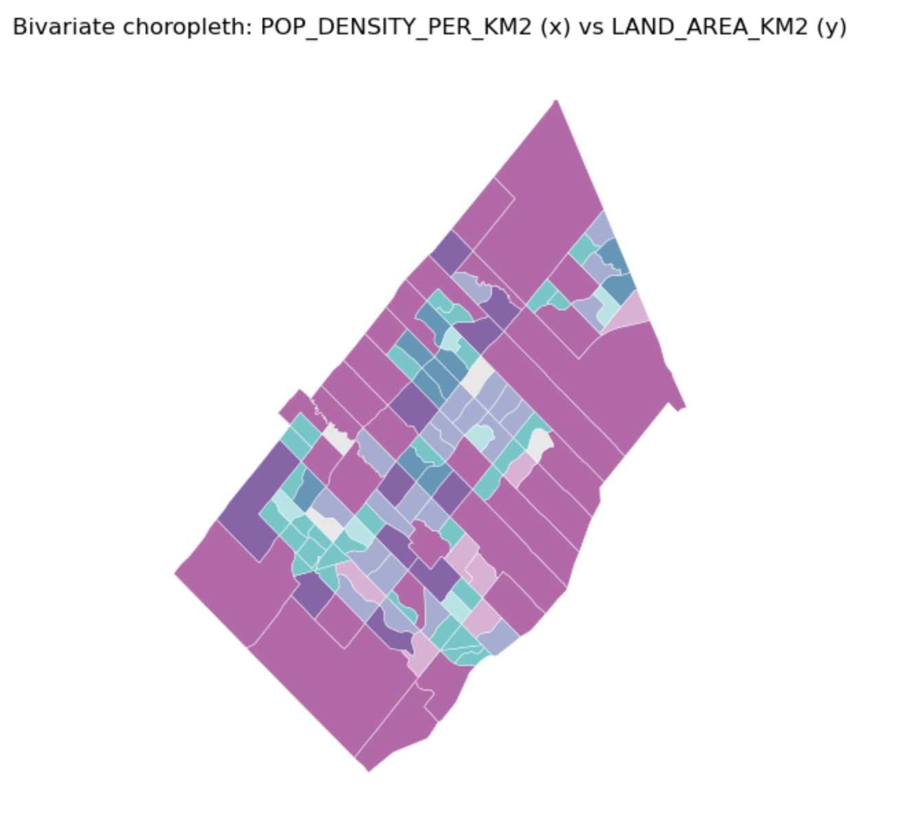
Bivariate Choropleth Map
Description...
import geopandas as gpd
import mapclassify  # required for scheme=... in GeoPandas plots
import matplotlib
import matplotlib.pyplot as plt
import numpy as np
import pandas as pd

print("geopandas:", gpd.__version__)
print("pandas:", pd.__version__)
print("numpy:", np.__version__)
print("matplotlib:", matplotlib.__version__)
print("mapclassify:", mapclassify.__version__)import geopandas as gpd
gdf = gpd.read_file("geovis_labs/lab5/pop.gpkg") # <-- change path
print("CRS:", gdf.crs)
print("Bounds:", gdf.total_bounds)
print("Columns:", list(gdf.columns))
print(gdf.head())VAR = "POPULATION_2021" # <-- change
gdf[VAR] = pd.to_numeric(gdf[VAR], errors="coerce")
print("Missing values:", gdf[VAR].isna().sum())
print(gdf[VAR].describe())import matplotlib.pyplot as plt
ax = gdf.plot(
column=VAR,
scheme="FisherJenks", # try: "EqualInterval", "FisherJenks", "Quantiles"
k=5,
cmap="Blues",
linewidth=0.3,
edgecolor="white",
legend=True,
legend_kwds={"loc": "upper left"},
figsize=(9, 7),
)
ax.set_title(f"Choropleth: {VAR} (FisherJenks, k=5)")
ax.set_axis_off()
plt.show()# Optional basemap (requires: contextily)
import contextily as cx
gdf_web = gdf.to_crs(epsg=3857)
ax = gdf_web.plot(
column=VAR,
scheme="FisherJenks",
k=5,
cmap="Greens",
linewidth=0.3,
edgecolor="white",
legend=True,
legend_kwds={"loc": "upper left"},
figsize=(9, 7),
)
cx.add_basemap(ax, source=cx.providers.CartoDB.Positron)
ax.set_title(f"Choropleth + basemap: {VAR}")
ax.set_axis_off()
plt.show()X = "POP_DENSITY_PER_KM2" # <-- change
Y = "LAND_AREA_KM2" # <-- change
N = 4 # number of bins per variable (3 -> 3x3)
gdf[X] = pd.to_numeric(gdf[X], errors="coerce")
gdf[Y] = pd.to_numeric(gdf[Y], errors="coerce")
# Quantile bins (0..N-1). duplicates='drop' avoids errors if many ties.
gdf["x_bin"] = pd.qcut(gdf[X], N, labels=False, duplicates="drop")
gdf["y_bin"] = pd.qcut(gdf[Y], N, labels=False, duplicates="drop")
# Combine bins into one class ID (row-major)
gdf["bi_class"] = gdf["y_bin"] * N + gdf["x_bin"]# 4x4 bivariate palette (row-major: y from low->high, x from low->high)
palette = [ "#e8e8e8", "#b9dedd", "#8ad4d3", "#5ac8c8",
"#dabcd4", "#b4b6cd", "#8db0c7", "#67aac0",
"#cc90c0", "#ae8ec0", "#908cbf", "#738abe",
"#be64ac", "#9265a4", "#67679c", "#3b4994",
]
def class_to_color(v):
if pd.isna(v):
return "#dddddd"
return palette[int(v)]
gdf["bi_color"] = gdf["bi_class"].apply(class_to_color)
ax = gdf.plot(color=gdf["bi_color"], linewidth=0.3, edgecolor="white", figsize=(9, 7))
ax.set_title(f"Bivariate choropleth: {X} (x) vs {Y} (y)")
ax.set_axis_off()
plt.show()from matplotlib.patches import Rectangle
fig, ax = plt.subplots(figsize=(4, 4))
for y in range(N):
for x in range(N):
idx = y * N + x
ax.add_patch(Rectangle((x, y), 1, 1, facecolor=palette[idx], edgecolor="none"))
ax.set_xlim(0, N)
ax.set_ylim(0, N)
ax.set_aspect("equal")
# Minimal labeling (edit these to match your variables)
ax.set_xticks([0.5, 1.5, 2.5, 3.5])
ax.set_yticks([0.5, 1.5, 2.5, 3.5])
ax.set_xticklabels(["Low", "Med", "High", "Very High"])
ax.set_yticklabels(["Low", "Med", "High", "Very High"])
ax.set_xlabel(X + " →")
ax.set_ylabel(Y + " ↑")
# Clean look
for spine in ax.spines.values():
spine.set_visible(False)
plt.title("Bivariate legend (3x3)")
plt.show()CART_FIELD = "POP_DENSITY_PER_KM2" # <-- change
gdf[CART_FIELD] = pd.to_numeric(gdf[CART_FIELD], errors="coerce")
gdf = gdf.dropna(subset=[CART_FIELD]).copy()
# Cartograms require positive values
gdf = gdf[gdf[CART_FIELD] > 0].copy()
print(gdf[CART_FIELD].describe())# Requires: pip install cartogram
import cartogram
import matplotlib.pyplot as plt
c = cartogram.Cartogram(
gdf,
CART_FIELD,
max_iterations=99, # try: 30, 60, 99
max_average_error=0.01, # try: 0.10 (faster) -> 0.02 (more accurate)
)
print("Average residual area error:", c.average_error)
ax = c.plot(
column=CART_FIELD,
scheme="Quantiles",
k=5,
cmap="Reds",
linewidth=0.3,
edgecolor="white",
legend=True,
legend_kwds={"loc": "upper left"},
figsize=(9, 7),
)
ax.set_title(f"Contiguous cartogram by {CART_FIELD}")
ax.set_axis_off()
plt.show()
# Optional export
c.to_file("geovis_labs/lab5/outputs/cartogram.gpkg", layer="cartogram", driver="GPKG")from shapely.affinity import scale
vals = gdf[CART_FIELD].to_numpy()
factors = np.sqrt(vals / np.nanmean(vals)) # area is ~factor^2
scaled_geoms = [
scale(geom, xfact=f, yfact=f, origin="center")
for geom, f in zip(gdf.geometry, factors)
]
gdf_scaled = gdf.copy()
gdf_scaled["geometry_scaled"] = scaled_geoms
gdf_scaled = gdf_scaled.set_geometry("geometry_scaled")
ax = gdf_scaled.plot(
column=CART_FIELD,
scheme="Quantiles",
k=5,
cmap="Reds",
linewidth=0.3,
edgecolor="white",
legend=True,
legend_kwds={"loc": "upper left"},
figsize=(9, 7),
)
ax.set_title(f"Non-contiguous cartogram (scaled) by {CART_FIELD}")
ax.set_axis_off()
plt.show()from shapely.affinity import scale
vals = gdf[CART_FIELD].to_numpy()
factors = (vals / np.nanmean(vals)) # area is ~factor^2
scaled_geoms = [
scale(geom, xfact=f, yfact=f, origin="center")
for geom, f in zip(gdf.geometry, factors)
]
gdf_scaled = gdf.copy()
gdf_scaled["geometry_scaled"] = scaled_geoms
gdf_scaled = gdf_scaled.set_geometry("geometry_scaled")
ax = gdf_scaled.plot(
column=CART_FIELD,
scheme="Quantiles",
k=5,
cmap="Reds",
linewidth=0.3,
edgecolor="white",
legend=True,
legend_kwds={"loc": "upper left"},
figsize=(9, 7),
)
ax.set_title(f"Non-contiguous cartogram (scaled) by {CART_FIELD}")
ax.set_axis_off()
plt.show()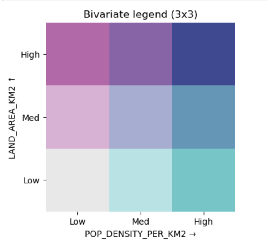
Bivariate Choropleth Legend
Description...
import geopandas as gpd
import mapclassify  # required for scheme=... in GeoPandas plots
import matplotlib
import matplotlib.pyplot as plt
import numpy as np
import pandas as pd

print("geopandas:", gpd.__version__)
print("pandas:", pd.__version__)
print("numpy:", np.__version__)
print("matplotlib:", matplotlib.__version__)
print("mapclassify:", mapclassify.__version__)import geopandas as gpd
gdf = gpd.read_file("geovis_labs/lab5/pop.gpkg") # <-- change path
print("CRS:", gdf.crs)
print("Bounds:", gdf.total_bounds)
print("Columns:", list(gdf.columns))
print(gdf.head())VAR = "POPULATION_2021" # <-- change
gdf[VAR] = pd.to_numeric(gdf[VAR], errors="coerce")
print("Missing values:", gdf[VAR].isna().sum())
print(gdf[VAR].describe())import matplotlib.pyplot as plt
ax = gdf.plot(
column=VAR,
scheme="FisherJenks", # try: "EqualInterval", "FisherJenks", "Quantiles"
k=5,
cmap="Blues",
linewidth=0.3,
edgecolor="white",
legend=True,
legend_kwds={"loc": "upper left"},
figsize=(9, 7),
)
ax.set_title(f"Choropleth: {VAR} (FisherJenks, k=5)")
ax.set_axis_off()
plt.show()# Optional basemap (requires: contextily)
import contextily as cx
gdf_web = gdf.to_crs(epsg=3857)
ax = gdf_web.plot(
column=VAR,
scheme="FisherJenks",
k=5,
cmap="Greens",
linewidth=0.3,
edgecolor="white",
legend=True,
legend_kwds={"loc": "upper left"},
figsize=(9, 7),
)
cx.add_basemap(ax, source=cx.providers.CartoDB.Positron)
ax.set_title(f"Choropleth + basemap: {VAR}")
ax.set_axis_off()
plt.show()X = "POP_DENSITY_PER_KM2" # <-- change
Y = "LAND_AREA_KM2" # <-- change
N = 4 # number of bins per variable (3 -> 3x3)
gdf[X] = pd.to_numeric(gdf[X], errors="coerce")
gdf[Y] = pd.to_numeric(gdf[Y], errors="coerce")
# Quantile bins (0..N-1). duplicates='drop' avoids errors if many ties.
gdf["x_bin"] = pd.qcut(gdf[X], N, labels=False, duplicates="drop")
gdf["y_bin"] = pd.qcut(gdf[Y], N, labels=False, duplicates="drop")
# Combine bins into one class ID (row-major)
gdf["bi_class"] = gdf["y_bin"] * N + gdf["x_bin"]# 4x4 bivariate palette (row-major: y from low->high, x from low->high)
palette = [ "#e8e8e8", "#b9dedd", "#8ad4d3", "#5ac8c8",
"#dabcd4", "#b4b6cd", "#8db0c7", "#67aac0",
"#cc90c0", "#ae8ec0", "#908cbf", "#738abe",
"#be64ac", "#9265a4", "#67679c", "#3b4994",
]
def class_to_color(v):
if pd.isna(v):
return "#dddddd"
return palette[int(v)]
gdf["bi_color"] = gdf["bi_class"].apply(class_to_color)
ax = gdf.plot(color=gdf["bi_color"], linewidth=0.3, edgecolor="white", figsize=(9, 7))
ax.set_title(f"Bivariate choropleth: {X} (x) vs {Y} (y)")
ax.set_axis_off()
plt.show()from matplotlib.patches import Rectangle
fig, ax = plt.subplots(figsize=(4, 4))
for y in range(N):
for x in range(N):
idx = y * N + x
ax.add_patch(Rectangle((x, y), 1, 1, facecolor=palette[idx], edgecolor="none"))
ax.set_xlim(0, N)
ax.set_ylim(0, N)
ax.set_aspect("equal")
# Minimal labeling (edit these to match your variables)
ax.set_xticks([0.5, 1.5, 2.5, 3.5])
ax.set_yticks([0.5, 1.5, 2.5, 3.5])
ax.set_xticklabels(["Low", "Med", "High", "Very High"])
ax.set_yticklabels(["Low", "Med", "High", "Very High"])
ax.set_xlabel(X + " →")
ax.set_ylabel(Y + " ↑")
# Clean look
for spine in ax.spines.values():
spine.set_visible(False)
plt.title("Bivariate legend (3x3)")
plt.show()CART_FIELD = "POP_DENSITY_PER_KM2" # <-- change
gdf[CART_FIELD] = pd.to_numeric(gdf[CART_FIELD], errors="coerce")
gdf = gdf.dropna(subset=[CART_FIELD]).copy()
# Cartograms require positive values
gdf = gdf[gdf[CART_FIELD] > 0].copy()
print(gdf[CART_FIELD].describe())# Requires: pip install cartogram
import cartogram
import matplotlib.pyplot as plt
c = cartogram.Cartogram(
gdf,
CART_FIELD,
max_iterations=99, # try: 30, 60, 99
max_average_error=0.01, # try: 0.10 (faster) -> 0.02 (more accurate)
)
print("Average residual area error:", c.average_error)
ax = c.plot(
column=CART_FIELD,
scheme="Quantiles",
k=5,
cmap="Reds",
linewidth=0.3,
edgecolor="white",
legend=True,
legend_kwds={"loc": "upper left"},
figsize=(9, 7),
)
ax.set_title(f"Contiguous cartogram by {CART_FIELD}")
ax.set_axis_off()
plt.show()
# Optional export
c.to_file("geovis_labs/lab5/outputs/cartogram.gpkg", layer="cartogram", driver="GPKG")from shapely.affinity import scale
vals = gdf[CART_FIELD].to_numpy()
factors = np.sqrt(vals / np.nanmean(vals)) # area is ~factor^2
scaled_geoms = [
scale(geom, xfact=f, yfact=f, origin="center")
for geom, f in zip(gdf.geometry, factors)
]
gdf_scaled = gdf.copy()
gdf_scaled["geometry_scaled"] = scaled_geoms
gdf_scaled = gdf_scaled.set_geometry("geometry_scaled")
ax = gdf_scaled.plot(
column=CART_FIELD,
scheme="Quantiles",
k=5,
cmap="Reds",
linewidth=0.3,
edgecolor="white",
legend=True,
legend_kwds={"loc": "upper left"},
figsize=(9, 7),
)
ax.set_title(f"Non-contiguous cartogram (scaled) by {CART_FIELD}")
ax.set_axis_off()
plt.show()from shapely.affinity import scale
vals = gdf[CART_FIELD].to_numpy()
factors = (vals / np.nanmean(vals)) # area is ~factor^2
scaled_geoms = [
scale(geom, xfact=f, yfact=f, origin="center")
for geom, f in zip(gdf.geometry, factors)
]
gdf_scaled = gdf.copy()
gdf_scaled["geometry_scaled"] = scaled_geoms
gdf_scaled = gdf_scaled.set_geometry("geometry_scaled")
ax = gdf_scaled.plot(
column=CART_FIELD,
scheme="Quantiles",
k=5,
cmap="Reds",
linewidth=0.3,
edgecolor="white",
legend=True,
legend_kwds={"loc": "upper left"},
figsize=(9, 7),
)
ax.set_title(f"Non-contiguous cartogram (scaled) by {CART_FIELD}")
ax.set_axis_off()
plt.show()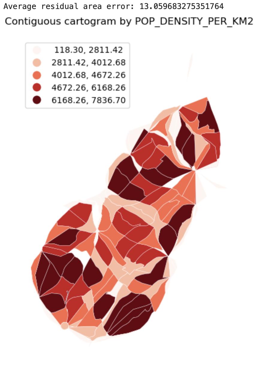
Cartograms
Description...
import geopandas as gpd
import mapclassify  # required for scheme=... in GeoPandas plots
import matplotlib
import matplotlib.pyplot as plt
import numpy as np
import pandas as pd

print("geopandas:", gpd.__version__)
print("pandas:", pd.__version__)
print("numpy:", np.__version__)
print("matplotlib:", matplotlib.__version__)
print("mapclassify:", mapclassify.__version__)import geopandas as gpd
gdf = gpd.read_file("geovis_labs/lab5/pop.gpkg") # <-- change path
print("CRS:", gdf.crs)
print("Bounds:", gdf.total_bounds)
print("Columns:", list(gdf.columns))
print(gdf.head())VAR = "POPULATION_2021" # <-- change
gdf[VAR] = pd.to_numeric(gdf[VAR], errors="coerce")
print("Missing values:", gdf[VAR].isna().sum())
print(gdf[VAR].describe())import matplotlib.pyplot as plt
ax = gdf.plot(
column=VAR,
scheme="FisherJenks", # try: "EqualInterval", "FisherJenks", "Quantiles"
k=5,
cmap="Blues",
linewidth=0.3,
edgecolor="white",
legend=True,
legend_kwds={"loc": "upper left"},
figsize=(9, 7),
)
ax.set_title(f"Choropleth: {VAR} (FisherJenks, k=5)")
ax.set_axis_off()
plt.show()# Optional basemap (requires: contextily)
import contextily as cx
gdf_web = gdf.to_crs(epsg=3857)
ax = gdf_web.plot(
column=VAR,
scheme="FisherJenks",
k=5,
cmap="Greens",
linewidth=0.3,
edgecolor="white",
legend=True,
legend_kwds={"loc": "upper left"},
figsize=(9, 7),
)
cx.add_basemap(ax, source=cx.providers.CartoDB.Positron)
ax.set_title(f"Choropleth + basemap: {VAR}")
ax.set_axis_off()
plt.show()X = "POP_DENSITY_PER_KM2" # <-- change
Y = "LAND_AREA_KM2" # <-- change
N = 4 # number of bins per variable (3 -> 3x3)
gdf[X] = pd.to_numeric(gdf[X], errors="coerce")
gdf[Y] = pd.to_numeric(gdf[Y], errors="coerce")
# Quantile bins (0..N-1). duplicates='drop' avoids errors if many ties.
gdf["x_bin"] = pd.qcut(gdf[X], N, labels=False, duplicates="drop")
gdf["y_bin"] = pd.qcut(gdf[Y], N, labels=False, duplicates="drop")
# Combine bins into one class ID (row-major)
gdf["bi_class"] = gdf["y_bin"] * N + gdf["x_bin"]# 4x4 bivariate palette (row-major: y from low->high, x from low->high)
palette = [ "#e8e8e8", "#b9dedd", "#8ad4d3", "#5ac8c8",
"#dabcd4", "#b4b6cd", "#8db0c7", "#67aac0",
"#cc90c0", "#ae8ec0", "#908cbf", "#738abe",
"#be64ac", "#9265a4", "#67679c", "#3b4994",
]
def class_to_color(v):
if pd.isna(v):
return "#dddddd"
return palette[int(v)]
gdf["bi_color"] = gdf["bi_class"].apply(class_to_color)
ax = gdf.plot(color=gdf["bi_color"], linewidth=0.3, edgecolor="white", figsize=(9, 7))
ax.set_title(f"Bivariate choropleth: {X} (x) vs {Y} (y)")
ax.set_axis_off()
plt.show()from matplotlib.patches import Rectangle
fig, ax = plt.subplots(figsize=(4, 4))
for y in range(N):
for x in range(N):
idx = y * N + x
ax.add_patch(Rectangle((x, y), 1, 1, facecolor=palette[idx], edgecolor="none"))
ax.set_xlim(0, N)
ax.set_ylim(0, N)
ax.set_aspect("equal")
# Minimal labeling (edit these to match your variables)
ax.set_xticks([0.5, 1.5, 2.5, 3.5])
ax.set_yticks([0.5, 1.5, 2.5, 3.5])
ax.set_xticklabels(["Low", "Med", "High", "Very High"])
ax.set_yticklabels(["Low", "Med", "High", "Very High"])
ax.set_xlabel(X + " →")
ax.set_ylabel(Y + " ↑")
# Clean look
for spine in ax.spines.values():
spine.set_visible(False)
plt.title("Bivariate legend (3x3)")
plt.show()CART_FIELD = "POP_DENSITY_PER_KM2" # <-- change
gdf[CART_FIELD] = pd.to_numeric(gdf[CART_FIELD], errors="coerce")
gdf = gdf.dropna(subset=[CART_FIELD]).copy()
# Cartograms require positive values
gdf = gdf[gdf[CART_FIELD] > 0].copy()
print(gdf[CART_FIELD].describe())# Requires: pip install cartogram
import cartogram
import matplotlib.pyplot as plt
c = cartogram.Cartogram(
gdf,
CART_FIELD,
max_iterations=99, # try: 30, 60, 99
max_average_error=0.01, # try: 0.10 (faster) -> 0.02 (more accurate)
)
print("Average residual area error:", c.average_error)
ax = c.plot(
column=CART_FIELD,
scheme="Quantiles",
k=5,
cmap="Reds",
linewidth=0.3,
edgecolor="white",
legend=True,
legend_kwds={"loc": "upper left"},
figsize=(9, 7),
)
ax.set_title(f"Contiguous cartogram by {CART_FIELD}")
ax.set_axis_off()
plt.show()
# Optional export
c.to_file("geovis_labs/lab5/outputs/cartogram.gpkg", layer="cartogram", driver="GPKG")from shapely.affinity import scale
vals = gdf[CART_FIELD].to_numpy()
factors = np.sqrt(vals / np.nanmean(vals)) # area is ~factor^2
scaled_geoms = [
scale(geom, xfact=f, yfact=f, origin="center")
for geom, f in zip(gdf.geometry, factors)
]
gdf_scaled = gdf.copy()
gdf_scaled["geometry_scaled"] = scaled_geoms
gdf_scaled = gdf_scaled.set_geometry("geometry_scaled")
ax = gdf_scaled.plot(
column=CART_FIELD,
scheme="Quantiles",
k=5,
cmap="Reds",
linewidth=0.3,
edgecolor="white",
legend=True,
legend_kwds={"loc": "upper left"},
figsize=(9, 7),
)
ax.set_title(f"Non-contiguous cartogram (scaled) by {CART_FIELD}")
ax.set_axis_off()
plt.show()from shapely.affinity import scale
vals = gdf[CART_FIELD].to_numpy()
factors = (vals / np.nanmean(vals)) # area is ~factor^2
scaled_geoms = [
scale(geom, xfact=f, yfact=f, origin="center")
for geom, f in zip(gdf.geometry, factors)
]
gdf_scaled = gdf.copy()
gdf_scaled["geometry_scaled"] = scaled_geoms
gdf_scaled = gdf_scaled.set_geometry("geometry_scaled")
ax = gdf_scaled.plot(
column=CART_FIELD,
scheme="Quantiles",
k=5,
cmap="Reds",
linewidth=0.3,
edgecolor="white",
legend=True,
legend_kwds={"loc": "upper left"},
figsize=(9, 7),
)
ax.set_title(f"Non-contiguous cartogram (scaled) by {CART_FIELD}")
ax.set_axis_off()
plt.show()
Fallback: simple non-contiguous cartogram (scale polygons)
Description...
import geopandas as gpd
import mapclassify  # required for scheme=... in GeoPandas plots
import matplotlib
import matplotlib.pyplot as plt
import numpy as np
import pandas as pd

print("geopandas:", gpd.__version__)
print("pandas:", pd.__version__)
print("numpy:", np.__version__)
print("matplotlib:", matplotlib.__version__)
print("mapclassify:", mapclassify.__version__)import geopandas as gpd
gdf = gpd.read_file("geovis_labs/lab5/pop.gpkg") # <-- change path
print("CRS:", gdf.crs)
print("Bounds:", gdf.total_bounds)
print("Columns:", list(gdf.columns))
print(gdf.head())VAR = "POPULATION_2021" # <-- change
gdf[VAR] = pd.to_numeric(gdf[VAR], errors="coerce")
print("Missing values:", gdf[VAR].isna().sum())
print(gdf[VAR].describe())import matplotlib.pyplot as plt
ax = gdf.plot(
column=VAR,
scheme="FisherJenks", # try: "EqualInterval", "FisherJenks", "Quantiles"
k=5,
cmap="Blues",
linewidth=0.3,
edgecolor="white",
legend=True,
legend_kwds={"loc": "upper left"},
figsize=(9, 7),
)
ax.set_title(f"Choropleth: {VAR} (FisherJenks, k=5)")
ax.set_axis_off()
plt.show()# Optional basemap (requires: contextily)
import contextily as cx
gdf_web = gdf.to_crs(epsg=3857)
ax = gdf_web.plot(
column=VAR,
scheme="FisherJenks",
k=5,
cmap="Greens",
linewidth=0.3,
edgecolor="white",
legend=True,
legend_kwds={"loc": "upper left"},
figsize=(9, 7),
)
cx.add_basemap(ax, source=cx.providers.CartoDB.Positron)
ax.set_title(f"Choropleth + basemap: {VAR}")
ax.set_axis_off()
plt.show()X = "POP_DENSITY_PER_KM2" # <-- change
Y = "LAND_AREA_KM2" # <-- change
N = 4 # number of bins per variable (3 -> 3x3)
gdf[X] = pd.to_numeric(gdf[X], errors="coerce")
gdf[Y] = pd.to_numeric(gdf[Y], errors="coerce")
# Quantile bins (0..N-1). duplicates='drop' avoids errors if many ties.
gdf["x_bin"] = pd.qcut(gdf[X], N, labels=False, duplicates="drop")
gdf["y_bin"] = pd.qcut(gdf[Y], N, labels=False, duplicates="drop")
# Combine bins into one class ID (row-major)
gdf["bi_class"] = gdf["y_bin"] * N + gdf["x_bin"]# 4x4 bivariate palette (row-major: y from low->high, x from low->high)
palette = [ "#e8e8e8", "#b9dedd", "#8ad4d3", "#5ac8c8",
"#dabcd4", "#b4b6cd", "#8db0c7", "#67aac0",
"#cc90c0", "#ae8ec0", "#908cbf", "#738abe",
"#be64ac", "#9265a4", "#67679c", "#3b4994",
]
def class_to_color(v):
if pd.isna(v):
return "#dddddd"
return palette[int(v)]
gdf["bi_color"] = gdf["bi_class"].apply(class_to_color)
ax = gdf.plot(color=gdf["bi_color"], linewidth=0.3, edgecolor="white", figsize=(9, 7))
ax.set_title(f"Bivariate choropleth: {X} (x) vs {Y} (y)")
ax.set_axis_off()
plt.show()from matplotlib.patches import Rectangle
fig, ax = plt.subplots(figsize=(4, 4))
for y in range(N):
for x in range(N):
idx = y * N + x
ax.add_patch(Rectangle((x, y), 1, 1, facecolor=palette[idx], edgecolor="none"))
ax.set_xlim(0, N)
ax.set_ylim(0, N)
ax.set_aspect("equal")
# Minimal labeling (edit these to match your variables)
ax.set_xticks([0.5, 1.5, 2.5, 3.5])
ax.set_yticks([0.5, 1.5, 2.5, 3.5])
ax.set_xticklabels(["Low", "Med", "High", "Very High"])
ax.set_yticklabels(["Low", "Med", "High", "Very High"])
ax.set_xlabel(X + " →")
ax.set_ylabel(Y + " ↑")
# Clean look
for spine in ax.spines.values():
spine.set_visible(False)
plt.title("Bivariate legend (3x3)")
plt.show()CART_FIELD = "POP_DENSITY_PER_KM2" # <-- change
gdf[CART_FIELD] = pd.to_numeric(gdf[CART_FIELD], errors="coerce")
gdf = gdf.dropna(subset=[CART_FIELD]).copy()
# Cartograms require positive values
gdf = gdf[gdf[CART_FIELD] > 0].copy()
print(gdf[CART_FIELD].describe())# Requires: pip install cartogram
import cartogram
import matplotlib.pyplot as plt
c = cartogram.Cartogram(
gdf,
CART_FIELD,
max_iterations=99, # try: 30, 60, 99
max_average_error=0.01, # try: 0.10 (faster) -> 0.02 (more accurate)
)
print("Average residual area error:", c.average_error)
ax = c.plot(
column=CART_FIELD,
scheme="Quantiles",
k=5,
cmap="Reds",
linewidth=0.3,
edgecolor="white",
legend=True,
legend_kwds={"loc": "upper left"},
figsize=(9, 7),
)
ax.set_title(f"Contiguous cartogram by {CART_FIELD}")
ax.set_axis_off()
plt.show()
# Optional export
c.to_file("geovis_labs/lab5/outputs/cartogram.gpkg", layer="cartogram", driver="GPKG")from shapely.affinity import scale
vals = gdf[CART_FIELD].to_numpy()
factors = np.sqrt(vals / np.nanmean(vals)) # area is ~factor^2
scaled_geoms = [
scale(geom, xfact=f, yfact=f, origin="center")
for geom, f in zip(gdf.geometry, factors)
]
gdf_scaled = gdf.copy()
gdf_scaled["geometry_scaled"] = scaled_geoms
gdf_scaled = gdf_scaled.set_geometry("geometry_scaled")
ax = gdf_scaled.plot(
column=CART_FIELD,
scheme="Quantiles",
k=5,
cmap="Reds",
linewidth=0.3,
edgecolor="white",
legend=True,
legend_kwds={"loc": "upper left"},
figsize=(9, 7),
)
ax.set_title(f"Non-contiguous cartogram (scaled) by {CART_FIELD}")
ax.set_axis_off()
plt.show()from shapely.affinity import scale
vals = gdf[CART_FIELD].to_numpy()
factors = (vals / np.nanmean(vals)) # area is ~factor^2
scaled_geoms = [
scale(geom, xfact=f, yfact=f, origin="center")
for geom, f in zip(gdf.geometry, factors)
]
gdf_scaled = gdf.copy()
gdf_scaled["geometry_scaled"] = scaled_geoms
gdf_scaled = gdf_scaled.set_geometry("geometry_scaled")
ax = gdf_scaled.plot(
column=CART_FIELD,
scheme="Quantiles",
k=5,
cmap="Reds",
linewidth=0.3,
edgecolor="white",
legend=True,
legend_kwds={"loc": "upper left"},
figsize=(9, 7),
)
ax.set_title(f"Non-contiguous cartogram (scaled) by {CART_FIELD}")
ax.set_axis_off()
plt.show()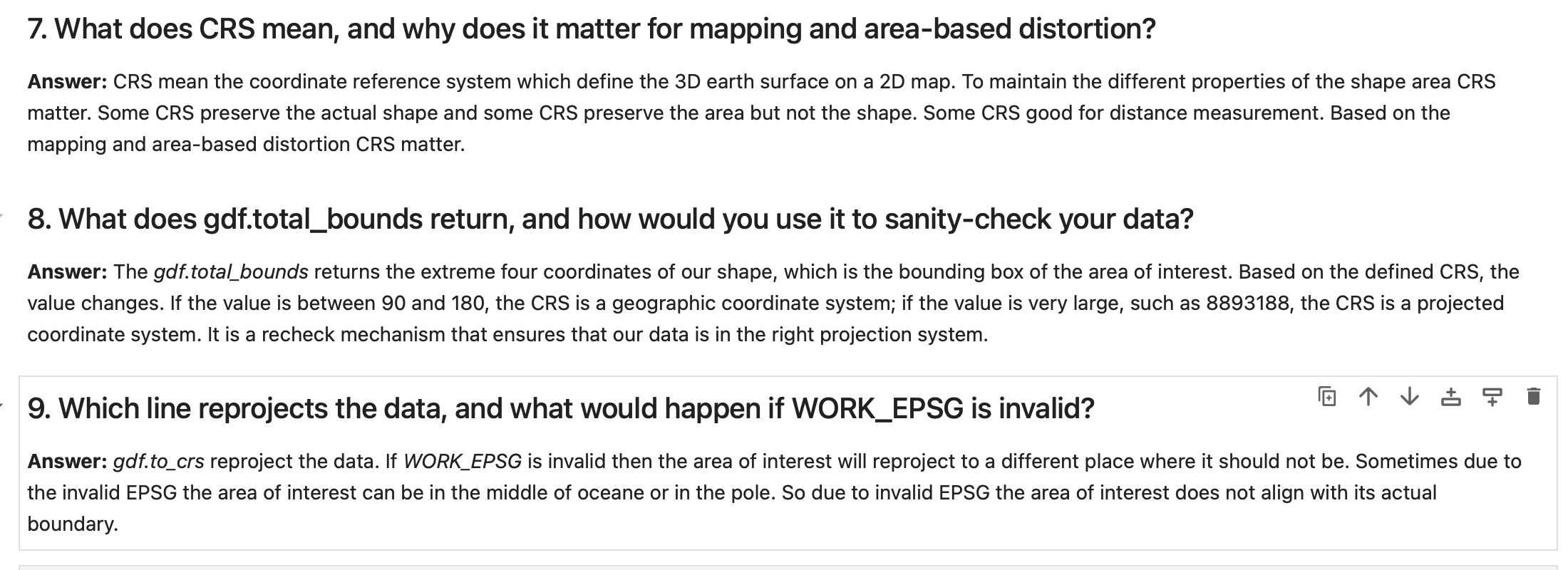
Questions-Answers
Description...
Questions-Answers
Description...
Questions-Answers
Description...
Questions-Answers
Description...
Title
Description...
Title
Reflections...
Title
Description...
Title
Description...
Week 7
Title
Description...
Title
Description...
Title
Description...
Title
Description...
Title
Description...
Title
Description...
Title
Description...
Title
Description...
Title
Description...
Title
Description...
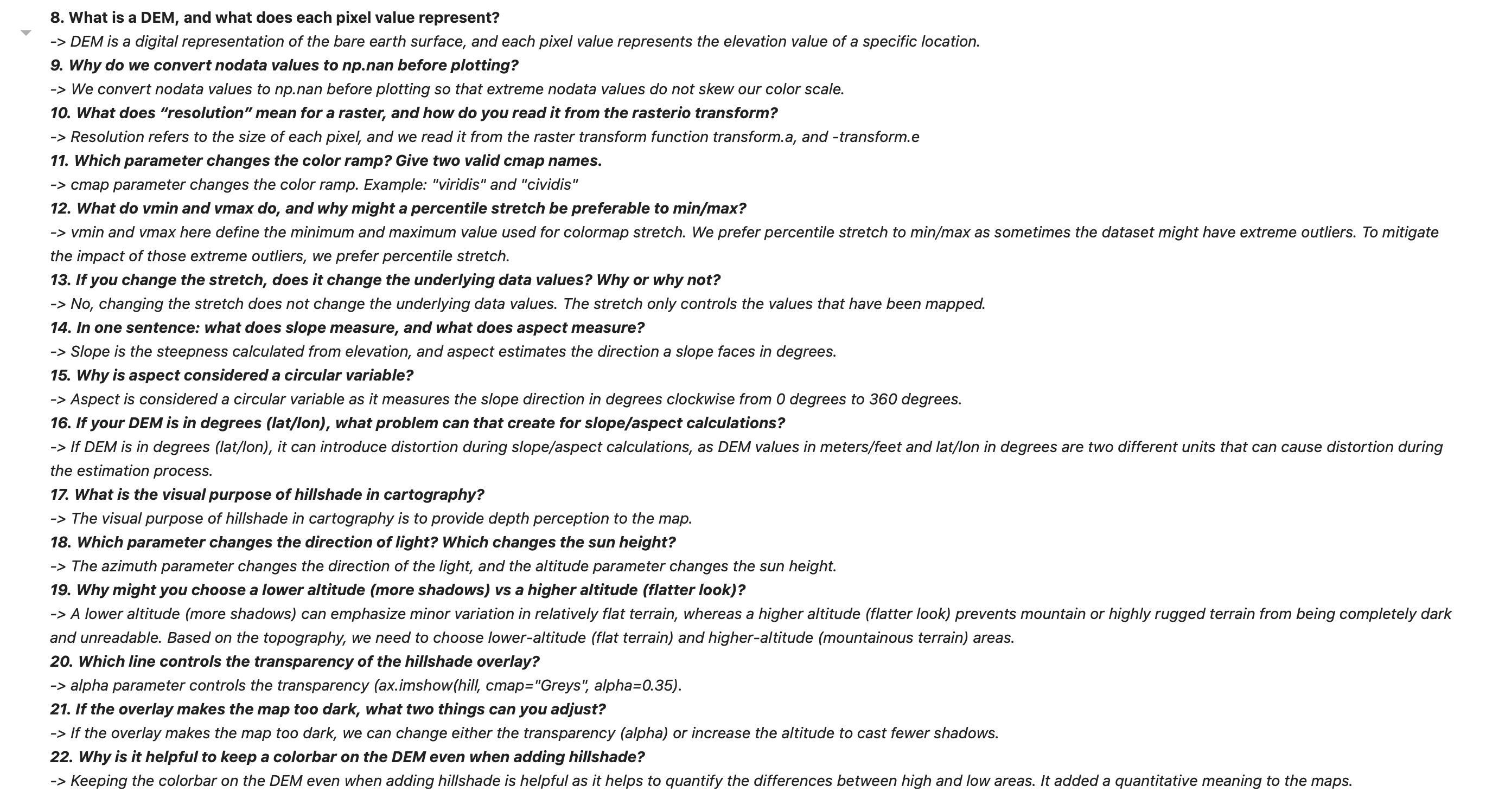
Question Answer
Description...
DEM + Hillshade Map
Description...
import sys
import types
from pathlib import Path

pkg = types.ModuleType("pkg_resources")

def resource_string(package, resource):
    import importlib
    mod = importlib.import_module(package)
    mod_path = Path(mod.__file__).parent
    return (mod_path / resource).read_bytes()

pkg.resource_string = resource_string
sys.modules["pkg_resources"] = pkg

import earthpy as etimport os
import earthpy as et
# Downloads sample data to your local earth-analytics directory
data_dir = et.data.get_data("vignette-elevation")
# The example DEM file (pre_DTM.tif) lives inside that folder
dem_path = os.path.join(data_dir, "pre_DTM.tif")
print(dem_path)import elevation
import os
os.makedirs("data/raw", exist_ok=True)
bounds = (-82.59, 35.36, -82.56, 35.43)
out_dem = os.path.abspath("data/raw/srtm_clip.tif") # absolute path
elevation.clip(bounds=bounds, output=out_dem, product="SRTM1")
print("Wrote:", out_dem)import os
import numpy as np
import matplotlib
import matplotlib.pyplot as plt
import rasterio as rio
import earthpy as et
import earthpy.plot as ep
import earthpy.spatial as es
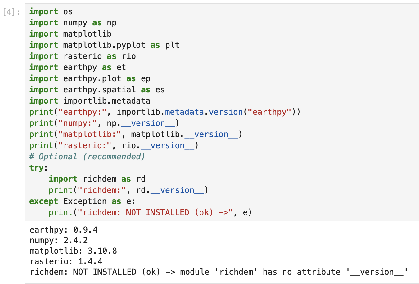
import importlib.metadata
print("earthpy:", importlib.metadata.version("earthpy"))
print("numpy:", np.__version__)
print("matplotlib:", matplotlib.__version__)
print("rasterio:", rio.__version__)
# Optional (recommended)
try:
import richdem as rd
print("richdem:", rd.__version__)
except Exception as e:
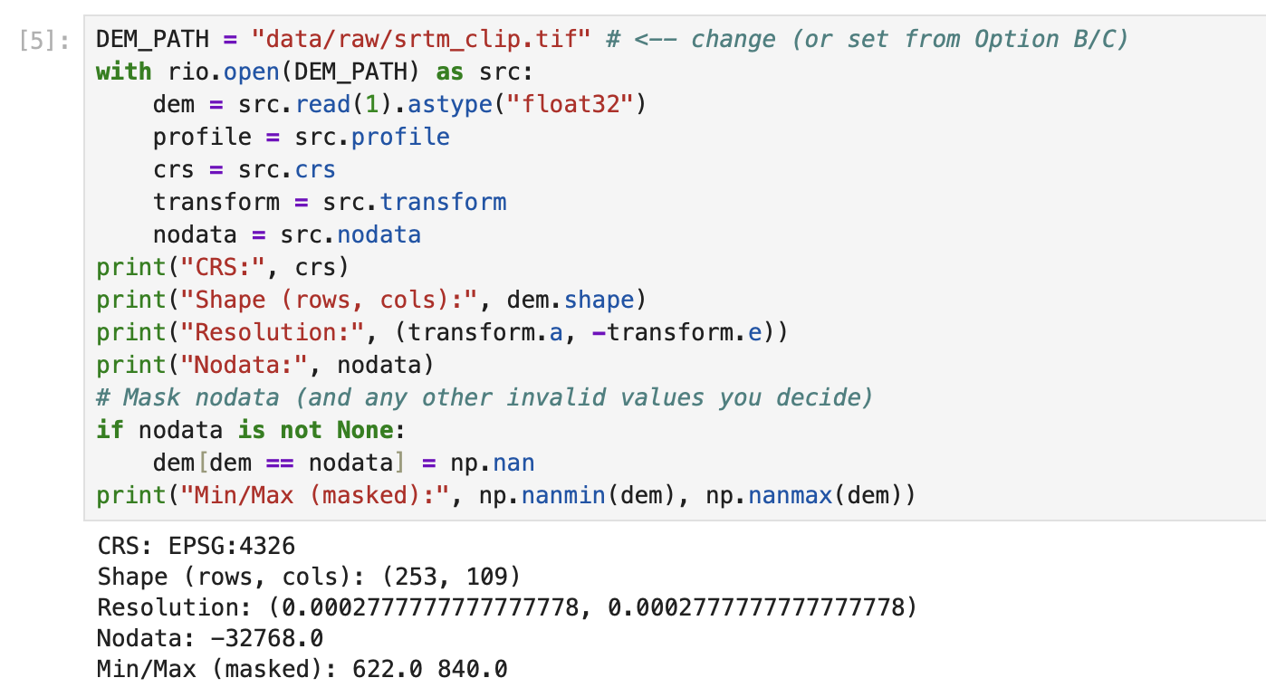
print("richdem: NOT INSTALLED (ok) ->", e)DEM_PATH = "data/raw/srtm_clip.tif" # <-- change (or set from Option B/C)
with rio.open(DEM_PATH) as src:
dem = src.read(1).astype("float32")
profile = src.profile
crs = src.crs
transform = src.transform
nodata = src.nodata
print("CRS:", crs)
print("Shape (rows, cols):", dem.shape)
print("Resolution:", (transform.a, -transform.e))
print("Nodata:", nodata)
# Mask nodata (and any other invalid values you decide)
if nodata is not None:
dem[dem == nodata] = np.nan
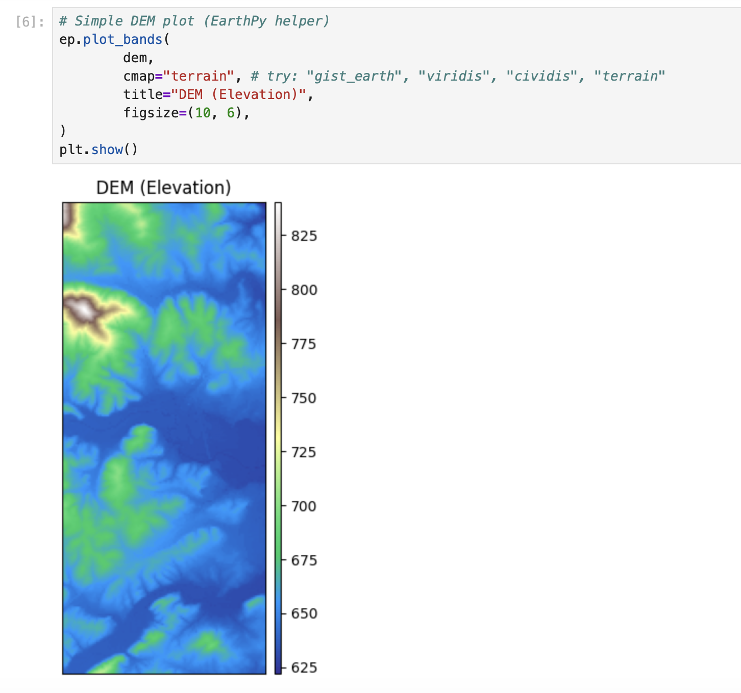
print("Min/Max (masked):", np.nanmin(dem), np.nanmax(dem))# Simple DEM plot (EarthPy helper)
ep.plot_bands(
dem,
cmap="terrain", # try: "gist_earth", "viridis", "cividis", "terrain"
title="DEM (Elevation)",
figsize=(10, 6),
)
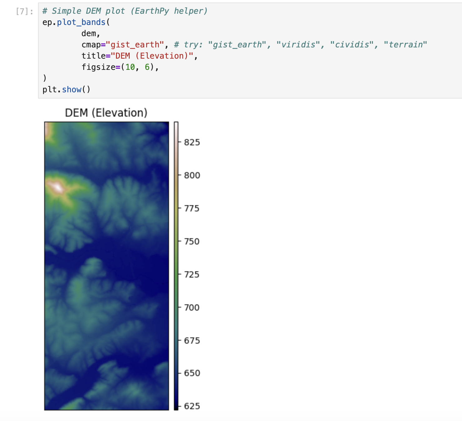
plt.show()# Simple DEM plot (EarthPy helper)
ep.plot_bands(
dem,
cmap="gist_earth", # try: "gist_earth", "viridis", "cividis", "terrain"
title="DEM (Elevation)",
figsize=(10, 6),
)
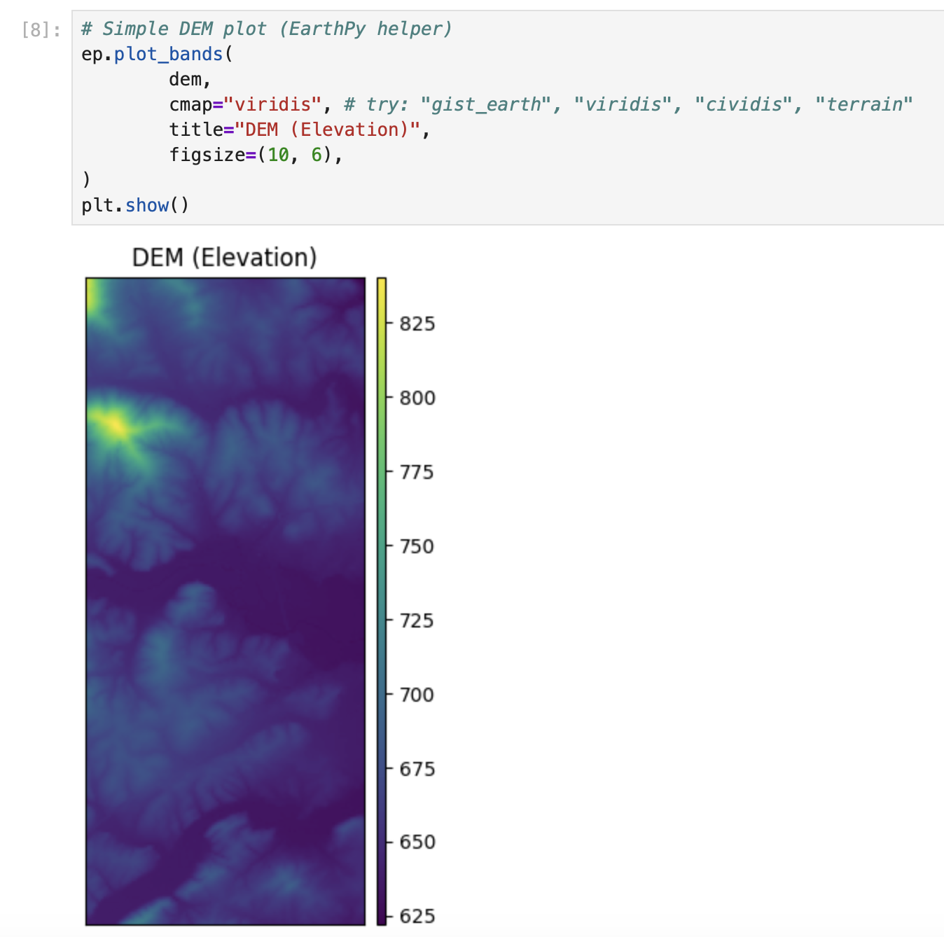
plt.show()# Simple DEM plot (EarthPy helper)
ep.plot_bands(
dem,
cmap="viridis", # try: "gist_earth", "viridis", "cividis", "terrain"
title="DEM (Elevation)",
figsize=(10, 6),
)
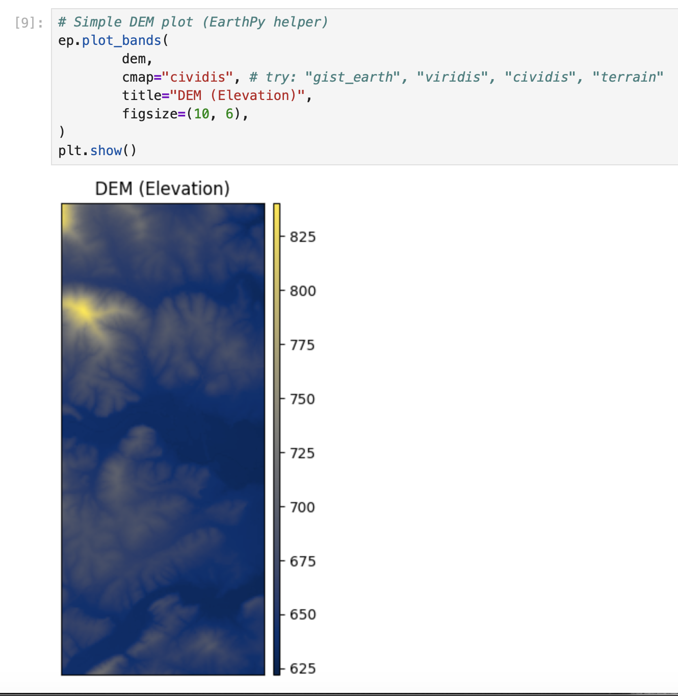
plt.show()# Simple DEM plot (EarthPy helper)
ep.plot_bands(
dem,
cmap="cividis", # try: "gist_earth", "viridis", "cividis", "terrain"
title="DEM (Elevation)",
figsize=(10, 6),
)
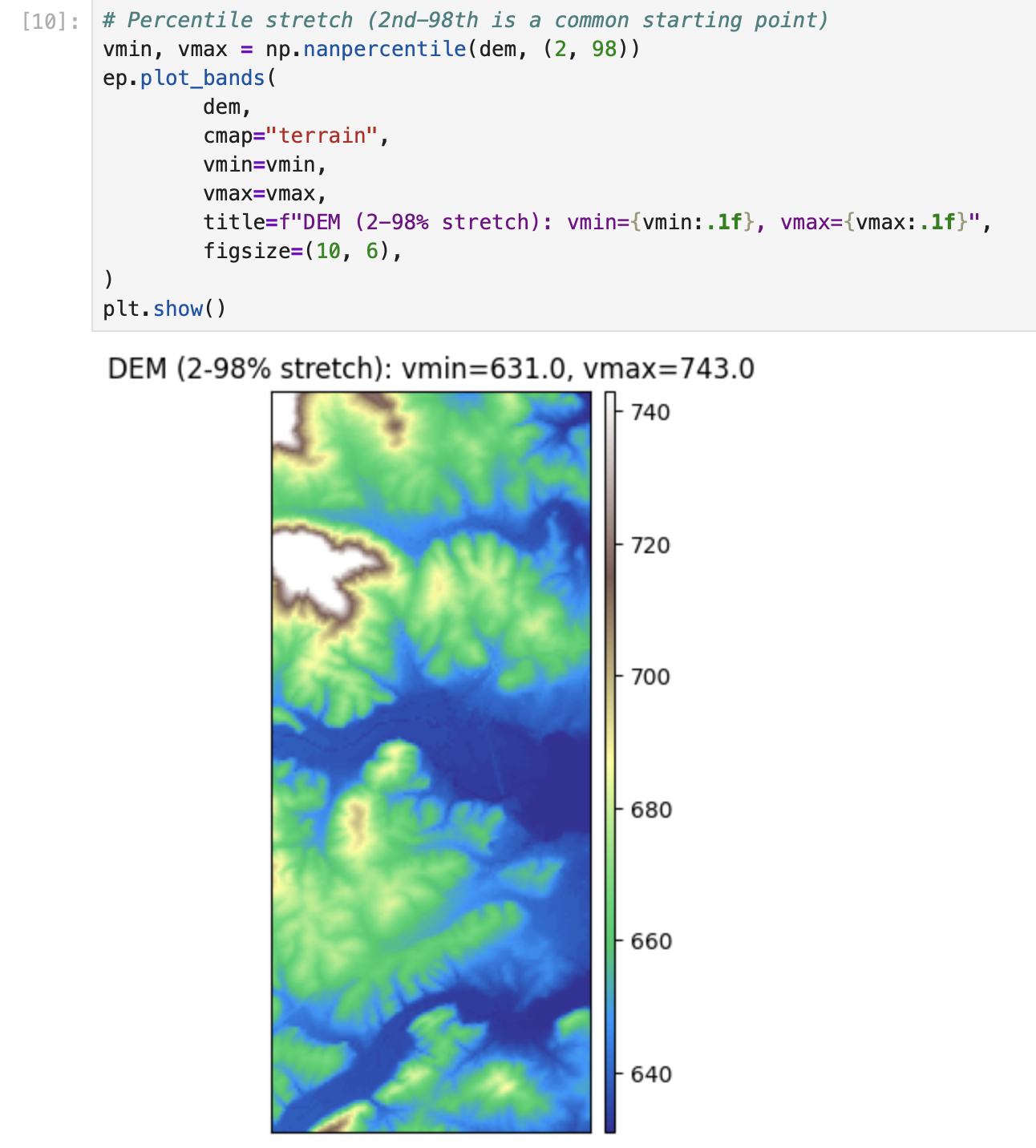
plt.show()# Percentile stretch (2nd-98th is a common starting point)
vmin, vmax = np.nanpercentile(dem, (2, 98))
ep.plot_bands(
dem,
cmap="terrain",
vmin=vmin,
vmax=vmax,
title=f"DEM (2-98% stretch): vmin={vmin:.1f}, vmax={vmax:.1f}",
figsize=(10, 6),
)
plt.show()vals = dem[np.isfinite(dem)]
plt.figure(figsize=(8, 4))
plt.hist(vals, bins=60)
plt.title("Elevation histogram (masked)")
plt.xlabel("Elevation")
plt.ylabel("Pixel count")
plt.show()import richdem as rd
# Load DEM with georeferencing (best practice)
# dem_rd = rd.LoadGDAL(DEM_PATH) this one is not working for some reason
dem_rd = rd.rdarray(dem, no_data= nodata)
# Slope options:
# - 'slope_degrees' (0-90) is easy to interpret
# - 'slope_riserun' (rise/run) can be converted to percent slope
slope_deg = rd.TerrainAttribute(dem_rd, attrib="slope_degrees")
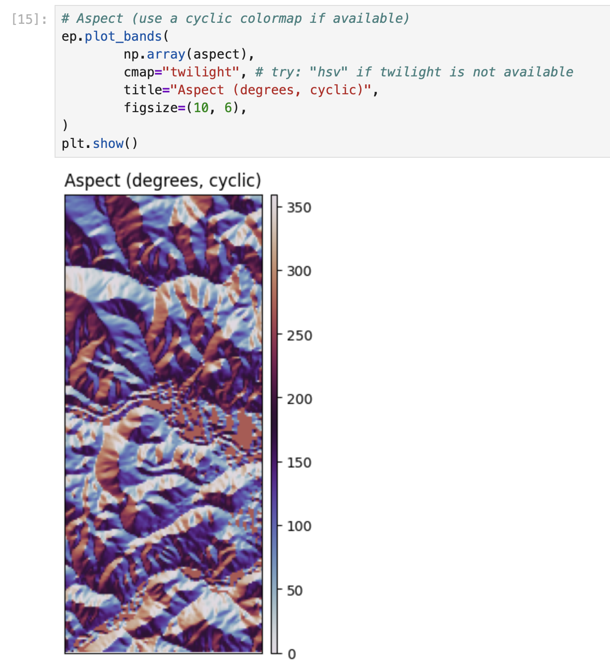
# Aspect is a circular direction (0-360 degrees, often 0/360 = North)
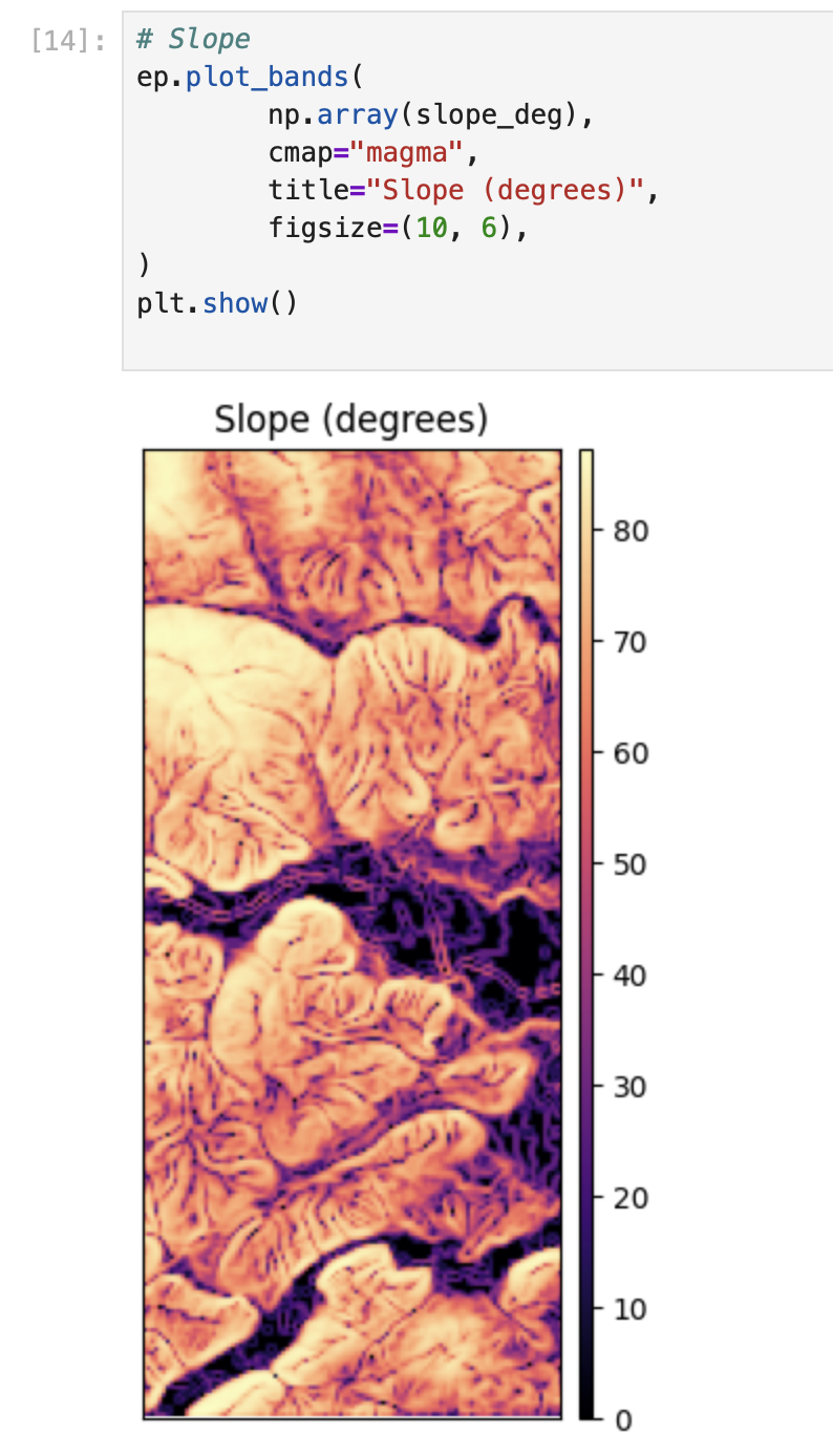
aspect = rd.TerrainAttribute(dem_rd, attrib="aspect")# Slope
ep.plot_bands(
np.array(slope_deg),
cmap="magma",
title="Slope (degrees)",
figsize=(10, 6),
)
plt.show()
# Aspect (use a cyclic colormap if available)
ep.plot_bands(
        np.array(aspect),
        cmap="twilight", # try: "hsv" if twilight is not available
        title="Aspect (degrees, cyclic)",
        figsize=(10, 6),
)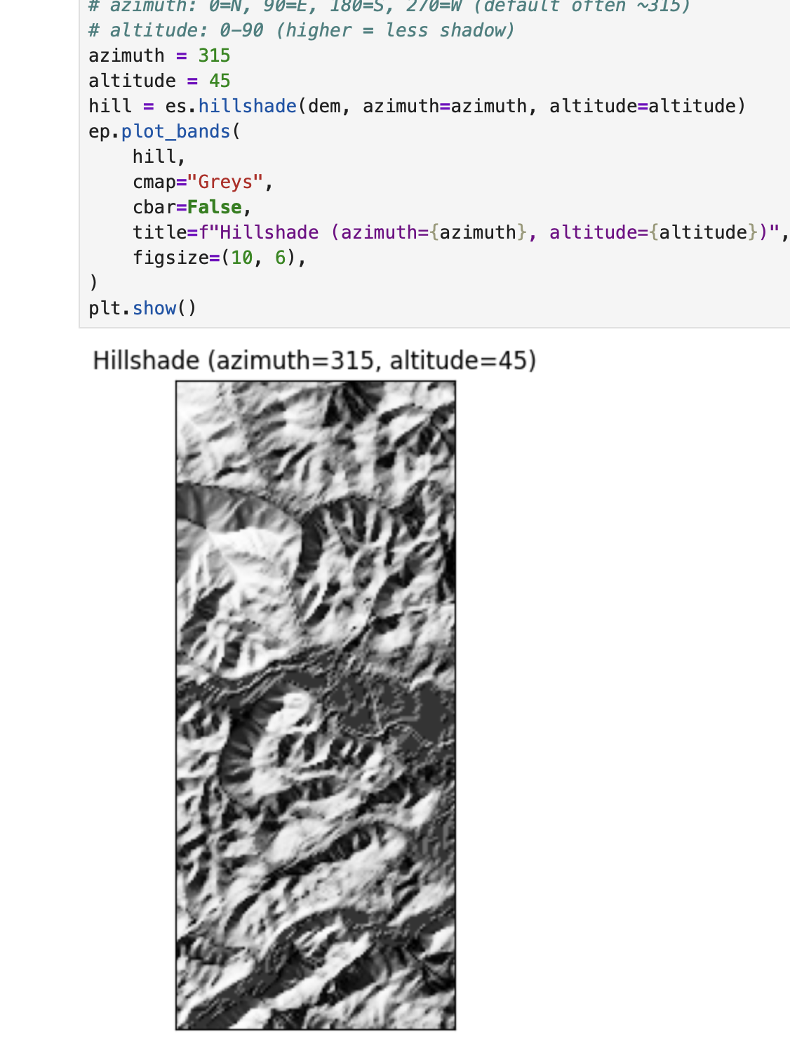
plt.show()# EarthPy hillshade from the DEM array
# azimuth: 0=N, 90=E, 180=S, 270=W (default often ~315)
# altitude: 0-90 (higher = less shadow)
azimuth = 315
altitude = 45
hill = es.hillshade(dem, azimuth=azimuth, altitude=altitude)
ep.plot_bands(
hill,
cmap="Greys",
cbar=False,
title=f"Hillshade (azimuth={azimuth}, altitude={altitude})",
figsize=(10, 6),
)
plt.show()# Compare 4 lighting settings (small multiples)
settings = [(315, 45), (45, 45), (315, 25), (315, 70)]
fig, axes = plt.subplots(2, 2, figsize=(12, 9))
axes = axes.ravel()
for ax, (az, alt) in zip(axes, settings):
hs = es.hillshade(dem, azimuth=az, altitude=alt)
ax.imshow(hs, cmap="Greys")
ax.set_title(f"az={az}, alt={alt}")
ax.set_axis_off()
plt.tight_layout()
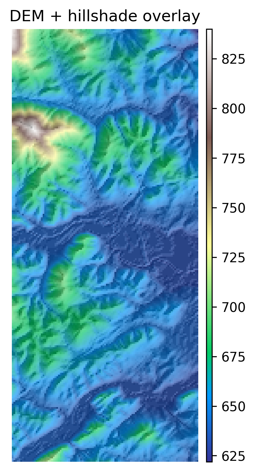
plt.show()# 1) Plot the DEM as the base (color)
fig, ax = plt.subplots(figsize=(10, 6))
ep.plot_bands(
dem,
ax=ax,
cmap="terrain",
title="DEM + hillshade overlay",
cbar=True,
)
# 2) Overlay hillshade (grayscale) with transparency
ax.imshow(hill, cmap="Greys", alpha=0.35) # try alpha: 0.2 -> 0.6
ax.set_axis_off()
plt.show()# Save at high resolution for reports / portfolio
out_png = "outputs/dem_hillshade.png"
os.makedirs("outputs", exist_ok=True)
fig.savefig(out_png, dpi=300, bbox_inches="tight")
print("Saved:", out_png)# Write GeoTIFFs with rasterio (keeps CRS, transform, etc.)
os.makedirs("outputs", exist_ok=True)
def write_tif(path, arr, profile):
prof = profile.copy()
prof.update(dtype="float32", count=1, nodata=np.nan)
with rio.open(path, "w", **prof) as dst:
dst.write(arr.astype("float32"), 1)
write_tif("outputs/slope_degrees.tif", np.array(slope_deg), profile)
write_tif("outputs/aspect_degrees.tif", np.array(aspect), profile)
write_tif("outputs/hillshade.tif", hill.astype("float32"), profile)
print("Wrote GeoTIFFs to outputs/")Title
Description...
Title
Reflections...
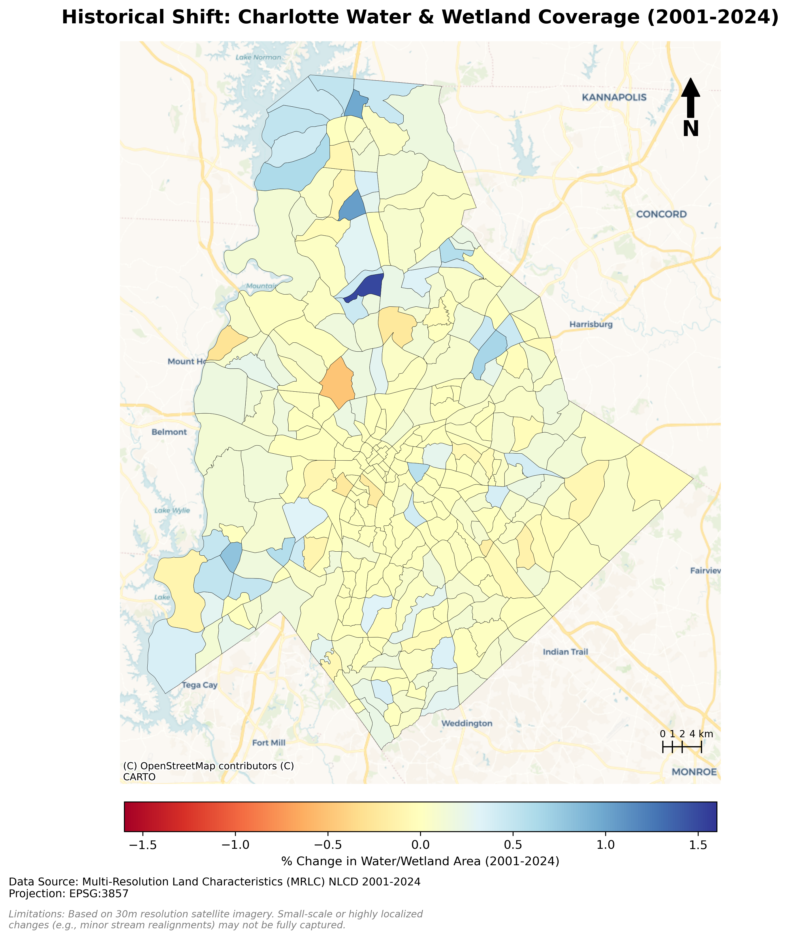
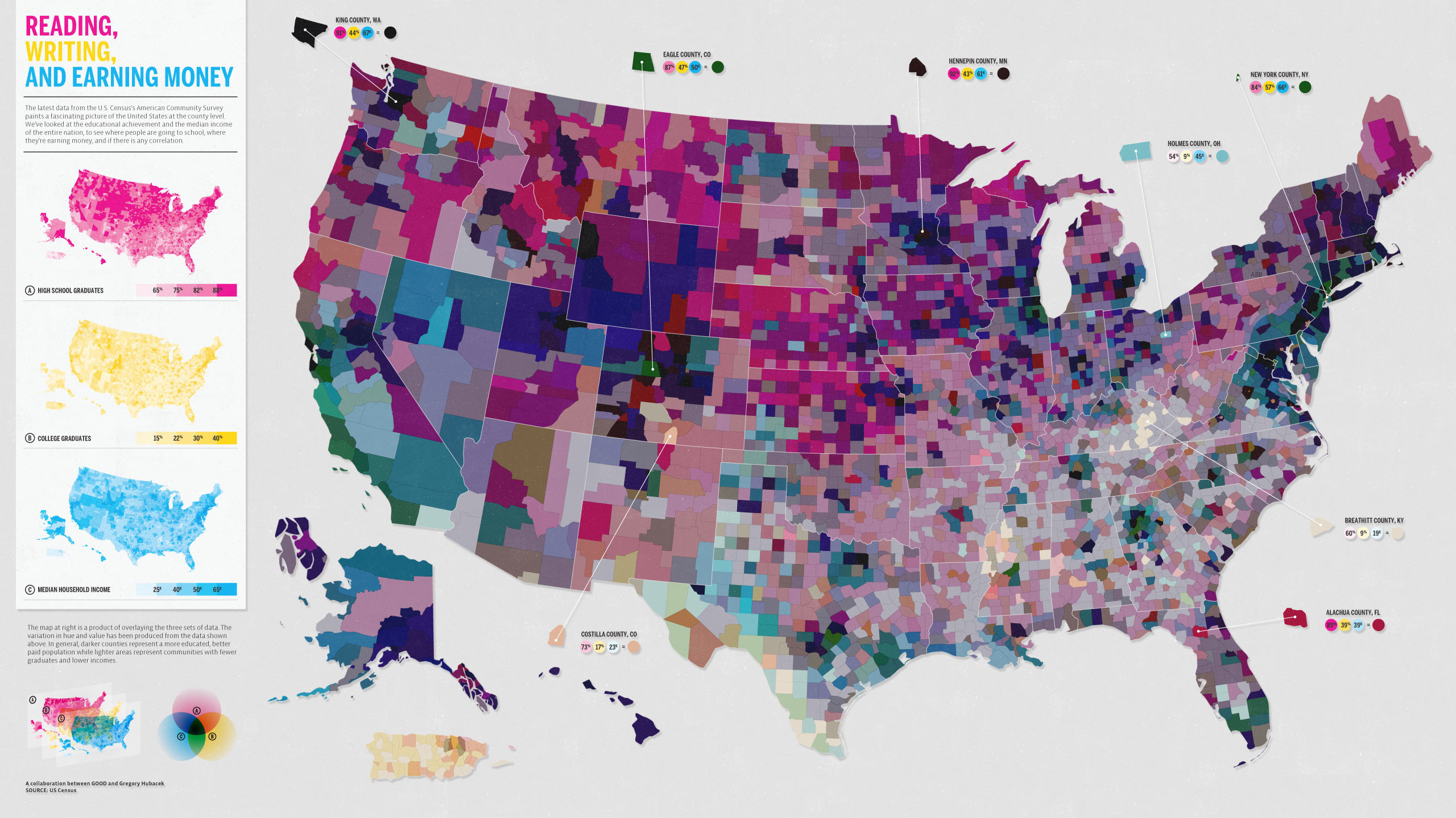
Charlotte Historical Waterbody Shifts (2001-2024)
- This map illustrates the shifting distribution of water and wetland coverage across Charlotte from 2001 to 2024.
- Total proportional changes in area strictly constrained between a 1% loss and a 1.5% gain.
- While the vast majority of the region remains ecologically stable.
- The 24-year historical summary demonstrates that Charlotte's water and wetland dynamics are currently characterized by micro-level geographic shifts rather than widespread, systemic transformation.
Limitation: It should be noted that because this analysis relies on 30-meter spatial resolution imagery, highly localized changes like minor stream realignments may fall below the detection threshold.
!pip install geopandas pygris tifffile mapclassify matplotlib contextily matplotlib_scalebarimport geopandas as gpd
import pandas as pd
from pygris import blocks
import glob
import os
import tifffile
import mapclassify
import numpy as np
import matplotlib.pyplot as plt
import contextily as cx
from matplotlib_scalebar.scalebar import ScaleBar# 2. Load your Charlotte Census Tract Shapefile
tracts = gpd.read_file('chalotte_blocks.gpkg')
df = pd.read_csv('total_wet_area_wide.csv')print("CRS:", tracts.crs)tracts = tracts.to_crs(epsg=3857)tracts.dtypestracts['GEOID'] = tracts['GEOID'].astype(int)tracts.dtypestracts.head()df.head()merged = tracts.merge(df, left_on='GEOID', right_on='GEOID20')merged.head()merged["Area_PCT_2001"]= (merged['2001']/merged['Area'])*100
merged["Area_PCT_2002"]= (merged['2002']/merged['Area'])*100
merged["Area_PCT_2003"]= (merged['2003']/merged['Area'])*100
merged["Area_PCT_2004"]= (merged['2004']/merged['Area'])*100
merged["Area_PCT_2005"]= (merged['2005']/merged['Area'])*100
merged["Area_PCT_2006"]= (merged['2006']/merged['Area'])*100
merged["Area_PCT_2007"]= (merged['2007']/merged['Area'])*100
merged["Area_PCT_2008"]= (merged['2008']/merged['Area'])*100
merged["Area_PCT_2009"]= (merged['2009']/merged['Area'])*100
merged["Area_PCT_2010"]= (merged['2010']/merged['Area'])*100
merged["Area_PCT_2011"]= (merged['2011']/merged['Area'])*100
merged["Area_PCT_2012"]= (merged['2012']/merged['Area'])*100
merged["Area_PCT_2013"]= (merged['2013']/merged['Area'])*100
merged["Area_PCT_2014"]= (merged['2014']/merged['Area'])*100
merged["Area_PCT_2015"]= (merged['2015']/merged['Area'])*100
merged["Area_PCT_2016"]= (merged['2016']/merged['Area'])*100
merged["Area_PCT_2017"]= (merged['2017']/merged['Area'])*100
merged["Area_PCT_2018"]= (merged['2018']/merged['Area'])*100
merged["Area_PCT_2019"]= (merged['2019']/merged['Area'])*100
merged["Area_PCT_2020"]= (merged['2020']/merged['Area'])*100
merged["Area_PCT_2021"]= (merged['2021']/merged['Area'])*100
merged["Area_PCT_2022"]= (merged['2022']/merged['Area'])*100
merged["Area_PCT_2023"]= (merged['2023']/merged['Area'])*100
merged["Area_PCT_2024"]= (merged['2024']/merged['Area'])*100merged["Historical_Shift_2001_2024"] = merged["Area_PCT_2001"]-merged["Area_PCT_2024"]
merged["Yearly_Shift_2001_2002"] = merged["Area_PCT_2001"]-merged["Area_PCT_2002"]
merged["Yearly_Shift_2002_2003"] = merged["Area_PCT_2002"]-merged["Area_PCT_2003"]
merged["Yearly_Shift_2003_2004"] = merged["Area_PCT_2003"]-merged["Area_PCT_2004"]
merged["Yearly_Shift_2004_2005"] = merged["Area_PCT_2004"]-merged["Area_PCT_2005"]
merged["Yearly_Shift_2005_2006"] = merged["Area_PCT_2005"]-merged["Area_PCT_2006"]
merged["Yearly_Shift_2006_2007"] = merged["Area_PCT_2006"]-merged["Area_PCT_2007"]
merged["Yearly_Shift_2007_2008"] = merged["Area_PCT_2007"]-merged["Area_PCT_2008"]
merged["Yearly_Shift_2008_2009"] = merged["Area_PCT_2008"]-merged["Area_PCT_2009"]
merged["Yearly_Shift_2009_2010"] = merged["Area_PCT_2009"]-merged["Area_PCT_2010"]
merged["Yearly_Shift_2010_2011"] = merged["Area_PCT_2010"]-merged["Area_PCT_2011"]
merged["Yearly_Shift_2011_2012"] = merged["Area_PCT_2011"]-merged["Area_PCT_2012"]
merged["Yearly_Shift_2012_2013"] = merged["Area_PCT_2012"]-merged["Area_PCT_2013"]
merged["Yearly_Shift_2013_2014"] = merged["Area_PCT_2013"]-merged["Area_PCT_2014"]
merged["Yearly_Shift_2014_2015"] = merged["Area_PCT_2014"]-merged["Area_PCT_2015"]
merged["Yearly_Shift_2015_2016"] = merged["Area_PCT_2015"]-merged["Area_PCT_2016"]
merged["Yearly_Shift_2016_2017"] = merged["Area_PCT_2016"]-merged["Area_PCT_2017"]
merged["Yearly_Shift_2017_2018"] = merged["Area_PCT_2017"]-merged["Area_PCT_2018"]
merged["Yearly_Shift_2018_2019"] = merged["Area_PCT_2018"]-merged["Area_PCT_2019"]
merged["Yearly_Shift_2019_2020"] = merged["Area_PCT_2019"]-merged["Area_PCT_2020"]
merged["Yearly_Shift_2020_2021"] = merged["Area_PCT_2020"]-merged["Area_PCT_2021"]
merged["Yearly_Shift_2021_2022"] = merged["Area_PCT_2021"]-merged["Area_PCT_2022"]
merged["Yearly_Shift_2022_2023"] = merged["Area_PCT_2022"]-merged["Area_PCT_2023"]
merged["Yearly_Shift_2023_2024"] = merged["Area_PCT_2023"]-merged["Area_PCT_2024"]
merged["Five_Years_Shift_2001_2005"] = merged["Area_PCT_2001"]-merged["Area_PCT_2005"]
merged["Five_Years_Shift_2005_2010"] = merged["Area_PCT_2005"]-merged["Area_PCT_2010"]
merged["Five_Years_Shift_2010_2015"] = merged["Area_PCT_2010"]-merged["Area_PCT_2015"]
merged["Five_Years_Shift_2015_2020"] = merged["Area_PCT_2015"]-merged["Area_PCT_2020"]
merged["Five_Years_Shift_2020_2024"] = merged["Area_PCT_2020"]-merged["Area_PCT_2024"]merged.head()VAR = "Historical_Shift_2001_2024" # <-- change
merged[VAR] = pd.to_numeric(merged[VAR], errors="coerce")
print("Missing values:", merged[VAR].isna().sum())
print(merged[VAR].describe())VAR = "Five_Years_Shift_2001_2005" # <-- change
merged[VAR] = pd.to_numeric(merged[VAR], errors="coerce")
print("Missing values:", merged[VAR].isna().sum())
print(merged[VAR].describe())VAR = "Five_Years_Shift_2005_2010" # <-- change
merged[VAR] = pd.to_numeric(merged[VAR], errors="coerce")
print("Missing values:", merged[VAR].isna().sum())
print(merged[VAR].describe())VAR = "Five_Years_Shift_2015_2020" # <-- change
merged[VAR] = pd.to_numeric(merged[VAR], errors="coerce")
print("Missing values:", merged[VAR].isna().sum())
print(merged[VAR].describe())VAR = "Five_Years_Shift_2020_2024" # <-- change
merged[VAR] = pd.to_numeric(merged[VAR], errors="coerce")
print("Missing values:", merged[VAR].isna().sum())
print(merged[VAR].describe())# 1. Replace 'inf' values with NaN so they don't break the classification
# We also handle -inf just in case
merged[VAR] = merged[VAR].replace([np.inf, -np.inf], np.nan)
# 2. Create the plot with 'missing_kwds'
ax = merged.plot(
column=VAR,
scheme="EqualInterval",
k=5,
cmap="managua",
linewidth=0.3,
edgecolor="white",
legend=True,
legend_kwds={"loc": "upper left"},
figsize=(9, 7),
# This block handles the NaN / Inf values
missing_kwds={
"color": "lightgrey", # Color for tracts with no data/inf
"edgecolor": "white", # Border color
"label": "New Water / No Previous Water", # Label in legend
"hatch": "///" # Optional: adds a pattern to distinguish
}
)
ax.set_title(f"Choropleth: {VAR} (EqualInterval, k=5)")
ax.set_axis_off()
# Move the legend to a better position if needed
leg = ax.get_legend()
if leg:
leg.set_bbox_to_anchor((1.15, 0.5))
plt.show()fig, ax = plt.subplots(1, 1, figsize=(14, 12))
# 1. Plotting the percentage change
plot = merged.plot(column='Historical_Shift_2001_2024',
cmap='RdYlBu',
linewidth=0.2,
edgecolor='black',
ax=ax,
legend=True,
vmin=-1.6, vmax=1.6, # Focus on significant changes
legend_kwds={'label': "% Change in Water/Wetland Area (2001-2024)",
'orientation': "horizontal",
'pad': 0.02,
'shrink': 0.5})
# 2. Add Basemap
# We use CartoDB Positron for a clean, light background that makes colors pop
cx.add_basemap(ax, source=cx.providers.CartoDB.Voyager)
# Set title and turn off standard axes
ax.set_title("Historical Shift: Charlotte Water & Wetland Coverage (2001-2024)", fontsize=16, fontweight='bold', pad=15)
ax.axis('off')
# 3. Add Scalebar
xmin, xmax = ax.get_xlim()
ymin, ymax = ax.get_ylim()
scale_length_meters = 5000
# Position it in the bottom right corner
x_start = xmax - 6000
y_start = ymin + ((ymax - ymin) * 0.05)
tick_height = (ymax - ymin) * 0.015
# Draw the main horizontal line (total length = 4000 meters / 4 km)
ax.plot([x_start, x_start + 4000], [y_start, y_start], color='black', linewidth=1)
# Define the sections in kilometers
sections_km = [0, 1, 2, 4]
# Loop through each section to draw a vertical tick and a label
for km in sections_km:
x_pos = x_start + (km * 1000) # Convert km to meters
# Draw vertical tick mark
ax.plot([x_pos, x_pos], [y_start - tick_height/2, y_start + tick_height/2], color='black', linewidth=1)
# Label the tick mark (add "km" only to the last label)
label = f"{km} km" if km == 4 else f"{km}"
ax.text(x_pos, y_start + tick_height/1.5, label,
ha='center', va='bottom', fontsize=8) #fontweight='bold')
# 4. Add North Arrow (Top Right)
ax.annotate('N', xy=(0.95, 0.95), xytext=(0.95, 0.88),
xycoords='axes fraction', ha='center', va='center',
fontsize=18, fontweight='bold',
arrowprops=dict(facecolor='black', width=5, headwidth=15, headlength=15))
# 5. Add Data Source (Bottom Left below the map)
plt.figtext(0.16, 0.13,
"Data Source: Multi-Resolution Land Characteristics (MRLC) NLCD 2001-2024\n"
"Projection: EPSG:3857",
ha="left", fontsize=9, color="black")
# 6. Add Limitations
plt.figtext(0.16, 0.10,
"Limitations: Based on 30m resolution satellite imagery. Small-scale or highly localized\n"
"changes (e.g., minor stream realignments) may not be fully captured.",
ha="left", fontsize=8, color="gray", style='italic')
# Adjust spacing between the map and the plot so they don't overlap
plt.tight_layout(rect=[0, 0.08, 1, 1])
# Save and show
plt.savefig('clt_historical_shift_map3.png', dpi=300, bbox_inches='tight')
plt.show()fig, ax = plt.subplots(1, 1, figsize=(14, 12))
# 1. Plotting the percentage change
plot = merged.plot(column='Five_Years_Shift_2001_2005',
cmap='RdYlBu',
linewidth=0.2,
edgecolor='black',
ax=ax,
legend=True,
vmin=-1, vmax=1, # Focus on significant changes
legend_kwds={'label': "% Change in Water/Wetland Area (2001-2005)",
'orientation': "horizontal",
'pad': 0.02,
'shrink': 0.5})
# 2. Add Basemap
# We use CartoDB Positron for a clean, light background that makes colors pop
cx.add_basemap(ax, source=cx.providers.CartoDB.Voyager)
# Set title and turn off standard axes
ax.set_title("Five Years Shift: Charlotte Water & Wetland Coverage (2001-2005)", fontsize=16, fontweight='bold', pad=15)
ax.axis('off')
# 3. Add Scale Bar
xmin, xmax = ax.get_xlim()
ymin, ymax = ax.get_ylim()
scale_length_meters = 5000
# Position it in the bottom right corner
x_start = xmax - 6000
y_start = ymin + ((ymax - ymin) * 0.05)
tick_height = (ymax - ymin) * 0.015
# Draw the main horizontal line (total length = 4000 meters / 4 km)
ax.plot([x_start, x_start + 4000], [y_start, y_start], color='black', linewidth=1)
# Define the sections in kilometers
sections_km = [0, 1, 2, 4]
# Loop through each section to draw a vertical tick and a label
for km in sections_km:
x_pos = x_start + (km * 1000) # Convert km to meters
# Draw vertical tick mark
ax.plot([x_pos, x_pos], [y_start - tick_height/2, y_start + tick_height/2], color='black', linewidth=1)
# Label the tick mark (add "km" only to the last label)
label = f"{km} km" if km == 4 else f"{km}"
ax.text(x_pos, y_start + tick_height/1.5, label,
ha='center', va='bottom', fontsize=8) #fontweight='bold')
# 4. Add North Arrow (Top Right)
ax.annotate('N', xy=(0.95, 0.95), xytext=(0.95, 0.88),
xycoords='axes fraction', ha='center', va='center',
fontsize=18, fontweight='bold',
arrowprops=dict(facecolor='black', width=5, headwidth=15, headlength=15))
# 5. Add Data Source (Bottom Left below the map)
plt.figtext(0.16, 0.13,
"Data Source: Multi-Resolution Land Characteristics (MRLC) NLCD 2001-2024\n"
"Projection: EPSG:3857",
ha="left", fontsize=9, color="black")
# 6. Add Limitations
plt.figtext(0.16, 0.10,
"Limitations: Based on 30m resolution satellite imagery. Small-scale or highly localized\n"
"changes (e.g., minor stream realignments) may not be fully captured.",
ha="left", fontsize=8, color="gray", style='italic')
# Adjust spacing between the map and the plot so they don't overlap
plt.tight_layout(rect=[0, 0.08, 1, 1])
# Save and show
plt.savefig('clt_five_years_shift_01_05.png', dpi=300, bbox_inches='tight')
plt.show()fig, ax = plt.subplots(1, 1, figsize=(14, 12))
# 1. Plotting the percentage change
plot = merged.plot(column='Five_Years_Shift_2005_2010',
cmap='RdYlBu',
linewidth=0.2,
edgecolor='black',
ax=ax,
legend=True,
vmin=-1, vmax=1, # Focus on significant changes
legend_kwds={'label': "% Change in Water/Wetland Area (2005-2010)",
'orientation': "horizontal",
'pad': 0.02,
'shrink': 0.5})
# 2. Add Basemap
# We use CartoDB Positron for a clean, light background that makes colors pop
cx.add_basemap(ax, source=cx.providers.CartoDB.Voyager)
# Set title and turn off standard axes
ax.set_title("Five Years Shift: Charlotte Water & Wetland Coverage (2005-2010)", fontsize=16, fontweight='bold', pad=15)
ax.axis('off')
# 3. Add Scale Bar
xmin, xmax = ax.get_xlim()
ymin, ymax = ax.get_ylim()
scale_length_meters = 5000
# Position it in the bottom right corner
x_start = xmax - 6000
y_start = ymin + ((ymax - ymin) * 0.05)
tick_height = (ymax - ymin) * 0.015
# Draw the main horizontal line (total length = 4000 meters / 4 km)
ax.plot([x_start, x_start + 4000], [y_start, y_start], color='black', linewidth=1)
# Define the sections in kilometers
sections_km = [0, 1, 2, 4]
# Loop through each section to draw a vertical tick and a label
for km in sections_km:
x_pos = x_start + (km * 1000) # Convert km to meters
# Draw vertical tick mark
ax.plot([x_pos, x_pos], [y_start - tick_height/2, y_start + tick_height/2], color='black', linewidth=1)
# Label the tick mark (add "km" only to the last label)
label = f"{km} km" if km == 4 else f"{km}"
ax.text(x_pos, y_start + tick_height/1.5, label,
ha='center', va='bottom', fontsize=8) #fontweight='bold')
# 4. Add North Arrow (Top Right)
ax.annotate('N', xy=(0.95, 0.95), xytext=(0.95, 0.88),
xycoords='axes fraction', ha='center', va='center',
fontsize=18, fontweight='bold',
arrowprops=dict(facecolor='black', width=5, headwidth=15, headlength=15))
# 5. Add Data Source (Bottom Left below the map)
plt.figtext(0.16, 0.13,
"Data Source: Multi-Resolution Land Characteristics (MRLC) NLCD 2001-2024\n"
"Projection: EPSG:3857",
ha="left", fontsize=9, color="black")
# 6. Add Limitations
plt.figtext(0.16, 0.10,
"Limitations: Based on 30m resolution satellite imagery. Small-scale or highly localized\n"
"changes (e.g., minor stream realignments) may not be fully captured.",
ha="left", fontsize=8, color="gray", style='italic')
# Adjust spacing between the map and the plot so they don't overlap
plt.tight_layout(rect=[0, 0.08, 1, 1])
# Save and show
plt.savefig('clt_five_years_shift_05_10.png', dpi=300, bbox_inches='tight')
plt.show()fig, ax = plt.subplots(1, 1, figsize=(14, 12))
# 1. Plotting the percentage change
plot = merged.plot(column='Five_Years_Shift_2010_2015',
cmap='RdYlBu',
linewidth=0.2,
edgecolor='black',
ax=ax,
legend=True,
vmin=-1, vmax=1, # Focus on significant changes
legend_kwds={'label': "% Change in Water/Wetland Area (2010-2015)",
'orientation': "horizontal",
'pad': 0.02,
'shrink': 0.5})
# 2. Add Basemap
# We use CartoDB Positron for a clean, light background that makes colors pop
cx.add_basemap(ax, source=cx.providers.CartoDB.Voyager)
# Set title and turn off standard axes
ax.set_title("Five Years Shift: Charlotte Water & Wetland Coverage (2010-2015)", fontsize=16, fontweight='bold', pad=15)
ax.axis('off')
# 3. Add Scale Bar
xmin, xmax = ax.get_xlim()
ymin, ymax = ax.get_ylim()
scale_length_meters = 5000
# Position it in the bottom right corner
x_start = xmax - 6000
y_start = ymin + ((ymax - ymin) * 0.05)
tick_height = (ymax - ymin) * 0.015
# Draw the main horizontal line (total length = 4000 meters / 4 km)
ax.plot([x_start, x_start + 4000], [y_start, y_start], color='black', linewidth=1)
# Define the sections in kilometers
sections_km = [0, 1, 2, 4]
# Loop through each section to draw a vertical tick and a label
for km in sections_km:
x_pos = x_start + (km * 1000) # Convert km to meters
# Draw vertical tick mark
ax.plot([x_pos, x_pos], [y_start - tick_height/2, y_start + tick_height/2], color='black', linewidth=1)
# Label the tick mark (add "km" only to the last label)
label = f"{km} km" if km == 4 else f"{km}"
ax.text(x_pos, y_start + tick_height/1.5, label,
ha='center', va='bottom', fontsize=8) #fontweight='bold')
# 4. Add North Arrow (Top Right)
ax.annotate('N', xy=(0.95, 0.95), xytext=(0.95, 0.88),
xycoords='axes fraction', ha='center', va='center',
fontsize=18, fontweight='bold',
arrowprops=dict(facecolor='black', width=5, headwidth=15, headlength=15))
# 5. Add Data Source (Bottom Left below the map)
plt.figtext(0.16, 0.13,
"Data Source: Multi-Resolution Land Characteristics (MRLC) NLCD 2001-2024\n"
"Projection: EPSG:3857",
ha="left", fontsize=9, color="black")
# 6. Add Limitations
plt.figtext(0.16, 0.10,
"Limitations: Based on 30m resolution satellite imagery. Small-scale or highly localized\n"
"changes (e.g., minor stream realignments) may not be fully captured.",
ha="left", fontsize=8, color="gray", style='italic')
# Adjust spacing between the map and the plot so they don't overlap
plt.tight_layout(rect=[0, 0.08, 1, 1])
# Save and show
plt.savefig('clt_five_years_shift_10_15.png', dpi=300, bbox_inches='tight')
plt.show()fig, ax = plt.subplots(1, 1, figsize=(14, 12))
# 1. Plotting the percentage change
plot = merged.plot(column='Five_Years_Shift_2015_2020',
cmap='RdYlBu',
linewidth=0.2,
edgecolor='black',
ax=ax,
legend=True,
vmin=-1, vmax=1, # Focus on significant changes
legend_kwds={'label': "% Change in Water/Wetland Area (2015-2020)",
'orientation': "horizontal",
'pad': 0.02,
'shrink': 0.5})
# 2. Add Basemap
# We use CartoDB Positron for a clean, light background that makes colors pop
cx.add_basemap(ax, source=cx.providers.CartoDB.Voyager)
# Set title and turn off standard axes
ax.set_title("Five Years Shift: Charlotte Water & Wetland Coverage (2015-2020)", fontsize=16, fontweight='bold', pad=15)
ax.axis('off')
# 3. Add Scale Bar
xmin, xmax = ax.get_xlim()
ymin, ymax = ax.get_ylim()
scale_length_meters = 5000
# Position it in the bottom right corner
x_start = xmax - 6000
y_start = ymin + ((ymax - ymin) * 0.05)
tick_height = (ymax - ymin) * 0.015
# Draw the main horizontal line (total length = 4000 meters / 4 km)
ax.plot([x_start, x_start + 4000], [y_start, y_start], color='black', linewidth=1)
# Define the sections in kilometers
sections_km = [0, 1, 2, 4]
# Loop through each section to draw a vertical tick and a label
for km in sections_km:
x_pos = x_start + (km * 1000) # Convert km to meters
# Draw vertical tick mark
ax.plot([x_pos, x_pos], [y_start - tick_height/2, y_start + tick_height/2], color='black', linewidth=1)
# Label the tick mark (add "km" only to the last label)
label = f"{km} km" if km == 4 else f"{km}"
ax.text(x_pos, y_start + tick_height/1.5, label,
ha='center', va='bottom', fontsize=8) #fontweight='bold')
# 4. Add North Arrow (Top Right)
ax.annotate('N', xy=(0.95, 0.95), xytext=(0.95, 0.88),
xycoords='axes fraction', ha='center', va='center',
fontsize=18, fontweight='bold',
arrowprops=dict(facecolor='black', width=5, headwidth=15, headlength=15))
# 5. Add Data Source (Bottom Left below the map)
plt.figtext(0.16, 0.13,
"Data Source: Multi-Resolution Land Characteristics (MRLC) NLCD 2001-2024\n"
"Projection: EPSG:3857",
ha="left", fontsize=9, color="black")
# 6. Add Limitations
plt.figtext(0.16, 0.10,
"Limitations: Based on 30m resolution satellite imagery. Small-scale or highly localized\n"
"changes (e.g., minor stream realignments) may not be fully captured.",
ha="left", fontsize=8, color="gray", style='italic')
# Adjust spacing between the map and the plot so they don't overlap
plt.tight_layout(rect=[0, 0.08, 1, 1])
# Save and show
plt.savefig('clt_five_years_shift_15_20.png', dpi=300, bbox_inches='tight')
plt.show()fig, ax = plt.subplots(1, 1, figsize=(14, 12))
# 1. Plotting the percentage change
plot = merged.plot(column='Five_Years_Shift_2020_2024',
cmap='RdYlBu',
linewidth=0.2,
edgecolor='black',
ax=ax,
legend=True,
vmin=-1, vmax=1, # Focus on significant changes
legend_kwds={'label': "% Change in Water/Wetland Area (2020-2024)",
'orientation': "horizontal",
'pad': 0.02,
'shrink': 0.5})
# 2. Add Basemap
# We use CartoDB Positron for a clean, light background that makes colors pop
cx.add_basemap(ax, source=cx.providers.CartoDB.Voyager)
# Set title and turn off standard axes
ax.set_title("Five Years Shift: Charlotte Water & Wetland Coverage (2020-2024)", fontsize=16, fontweight='bold', pad=15)
ax.axis('off')
# 3. Add Scale Bar
xmin, xmax = ax.get_xlim()
ymin, ymax = ax.get_ylim()
scale_length_meters = 5000
# Position it in the bottom right corner
x_start = xmax - 6000
y_start = ymin + ((ymax - ymin) * 0.05)
tick_height = (ymax - ymin) * 0.015
# Draw the main horizontal line (total length = 4000 meters / 4 km)
ax.plot([x_start, x_start + 4000], [y_start, y_start], color='black', linewidth=1)
# Define the sections in kilometers
sections_km = [0, 1, 2, 4]
# Loop through each section to draw a vertical tick and a label
for km in sections_km:
x_pos = x_start + (km * 1000) # Convert km to meters
# Draw vertical tick mark
ax.plot([x_pos, x_pos], [y_start - tick_height/2, y_start + tick_height/2], color='black', linewidth=1)
# Label the tick mark (add "km" only to the last label)
label = f"{km} km" if km == 4 else f"{km}"
ax.text(x_pos, y_start + tick_height/1.5, label,
ha='center', va='bottom', fontsize=8) #fontweight='bold')
# 4. Add North Arrow (Top Right)
ax.annotate('N', xy=(0.95, 0.95), xytext=(0.95, 0.88),
xycoords='axes fraction', ha='center', va='center',
fontsize=18, fontweight='bold',
arrowprops=dict(facecolor='black', width=5, headwidth=15, headlength=15))
# 5. Add Data Source (Bottom Left below the map)
plt.figtext(0.16, 0.13,
"Data Source: Multi-Resolution Land Characteristics (MRLC) NLCD 2001-2024\n"
"Projection: EPSG:3857",
ha="left", fontsize=9, color="black")
# 6. Add Limitations
plt.figtext(0.16, 0.10,
"Limitations: Based on 30m resolution satellite imagery. Small-scale or highly localized\n"
"changes (e.g., minor stream realignments) may not be fully captured.",
ha="left", fontsize=8, color="gray", style='italic')
# Adjust spacing between the map and the plot so they don't overlap
plt.tight_layout(rect=[0, 0.08, 1, 1])
# Save and show
plt.savefig('clt_five_years_shift_20_24.png', dpi=300, bbox_inches='tight')
plt.show()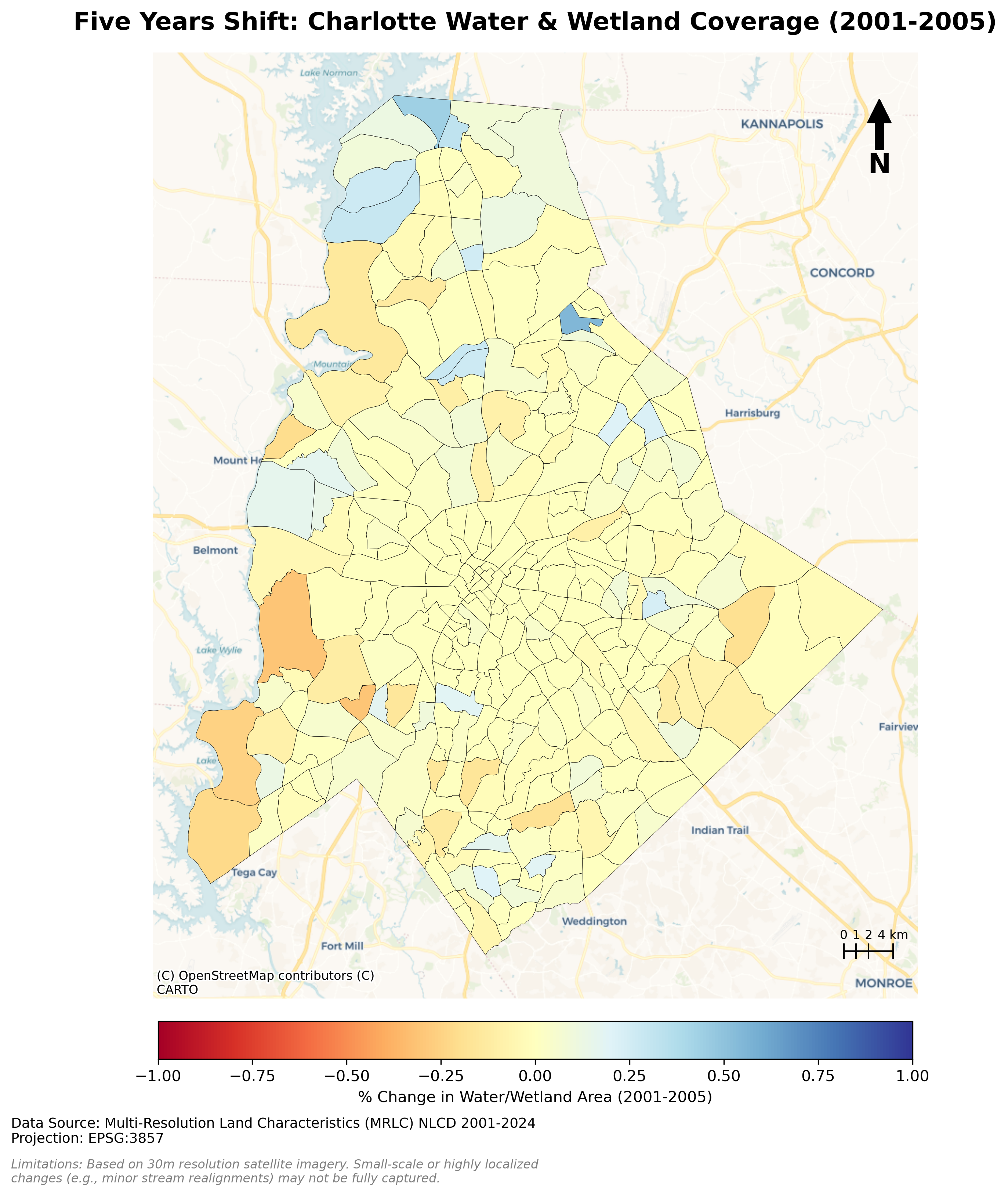
Charlotte Five Years Waterbody Shifts (2001-2005)
Description...
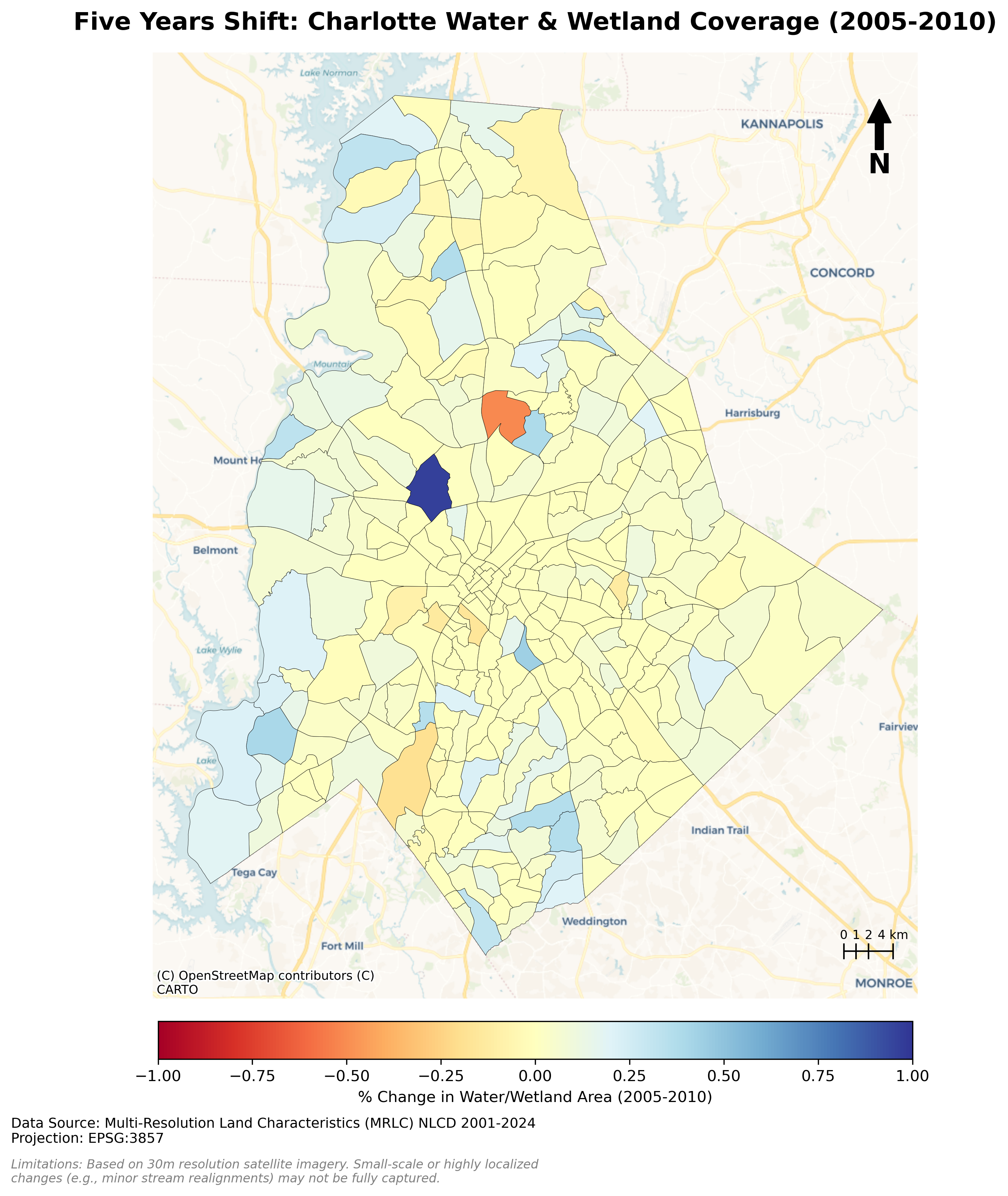
Charlotte Five Years Waterbody Shifts (2005-2010)
Description...
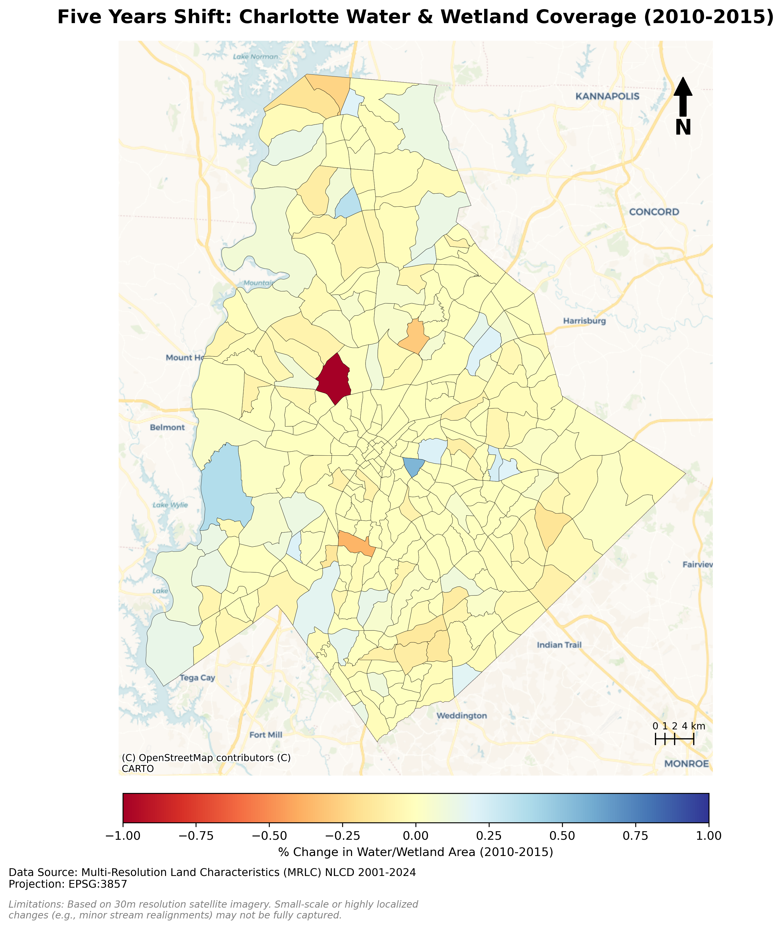
Charlotte Five Years Waterbody Shifts (2010-2015)
Description...
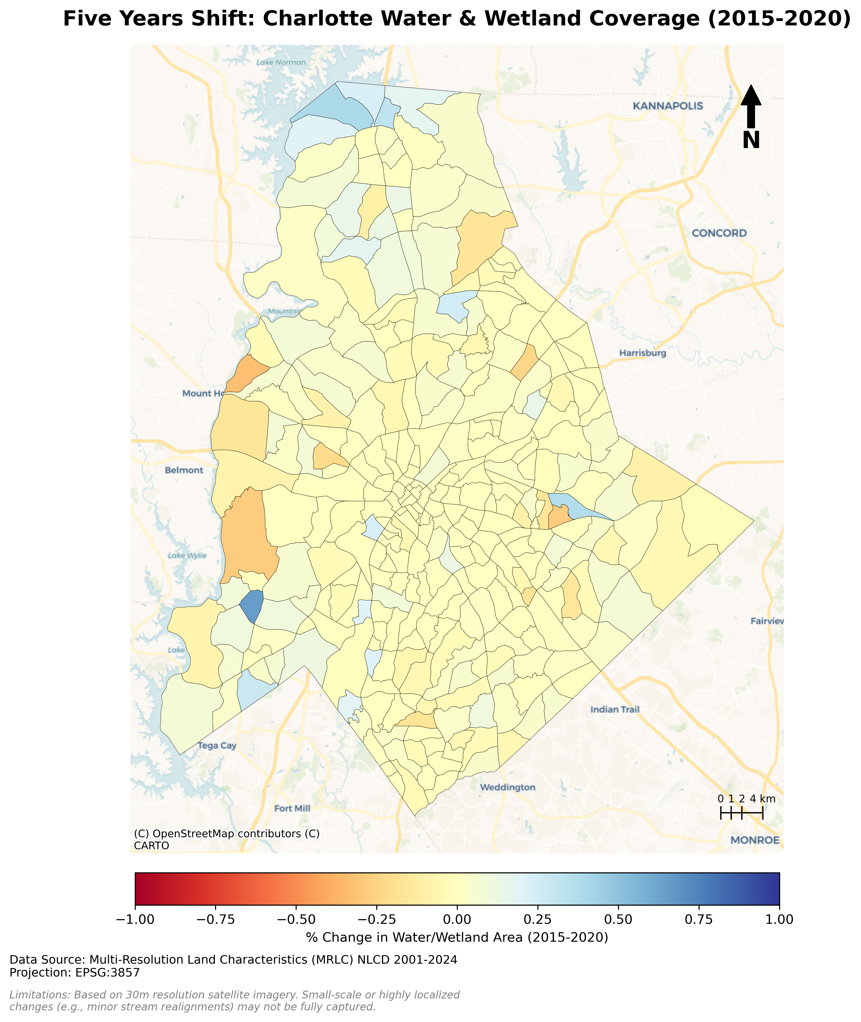
Charlotte Five Years Waterbody Shifts (2015-2020)
Description...
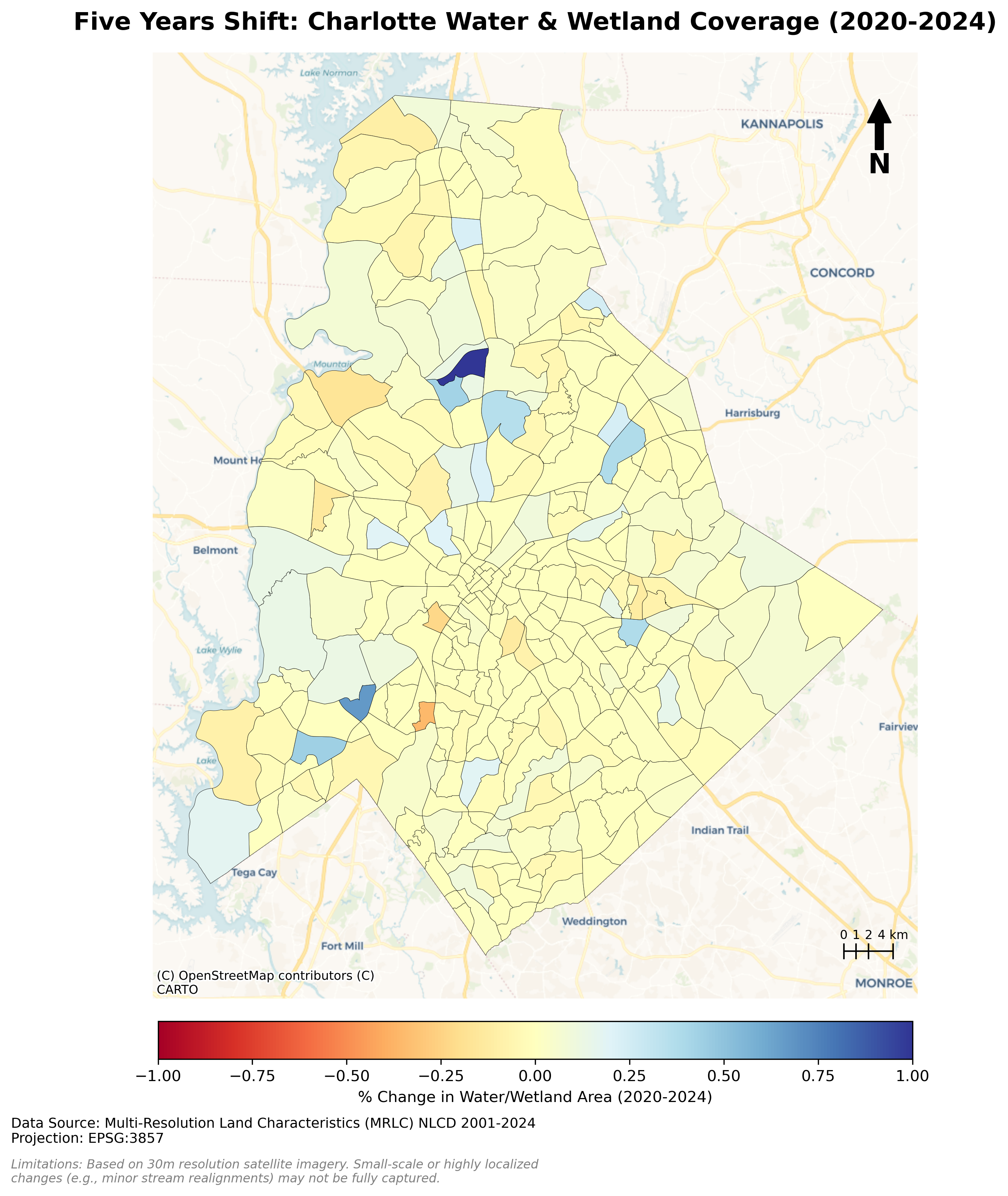
Charlotte Five Years Waterbody Shifts (2020-2024)
Description...
Title
Description...
Week 8
Title
Description...
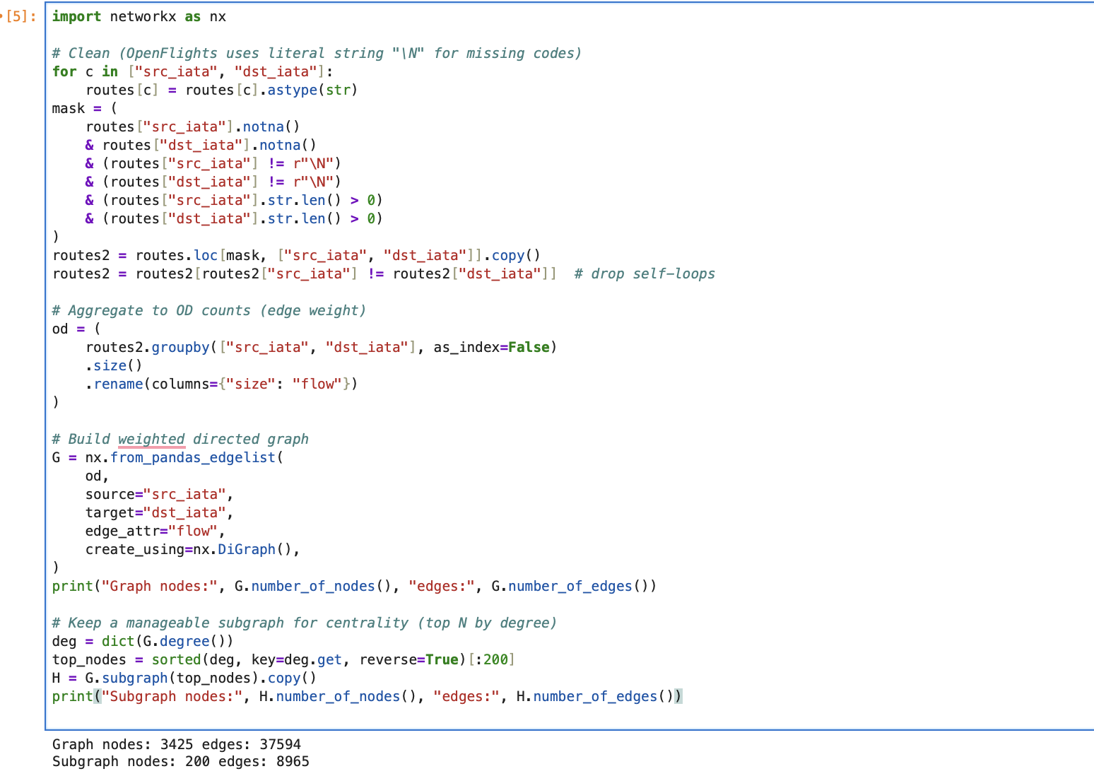
Title
Description...
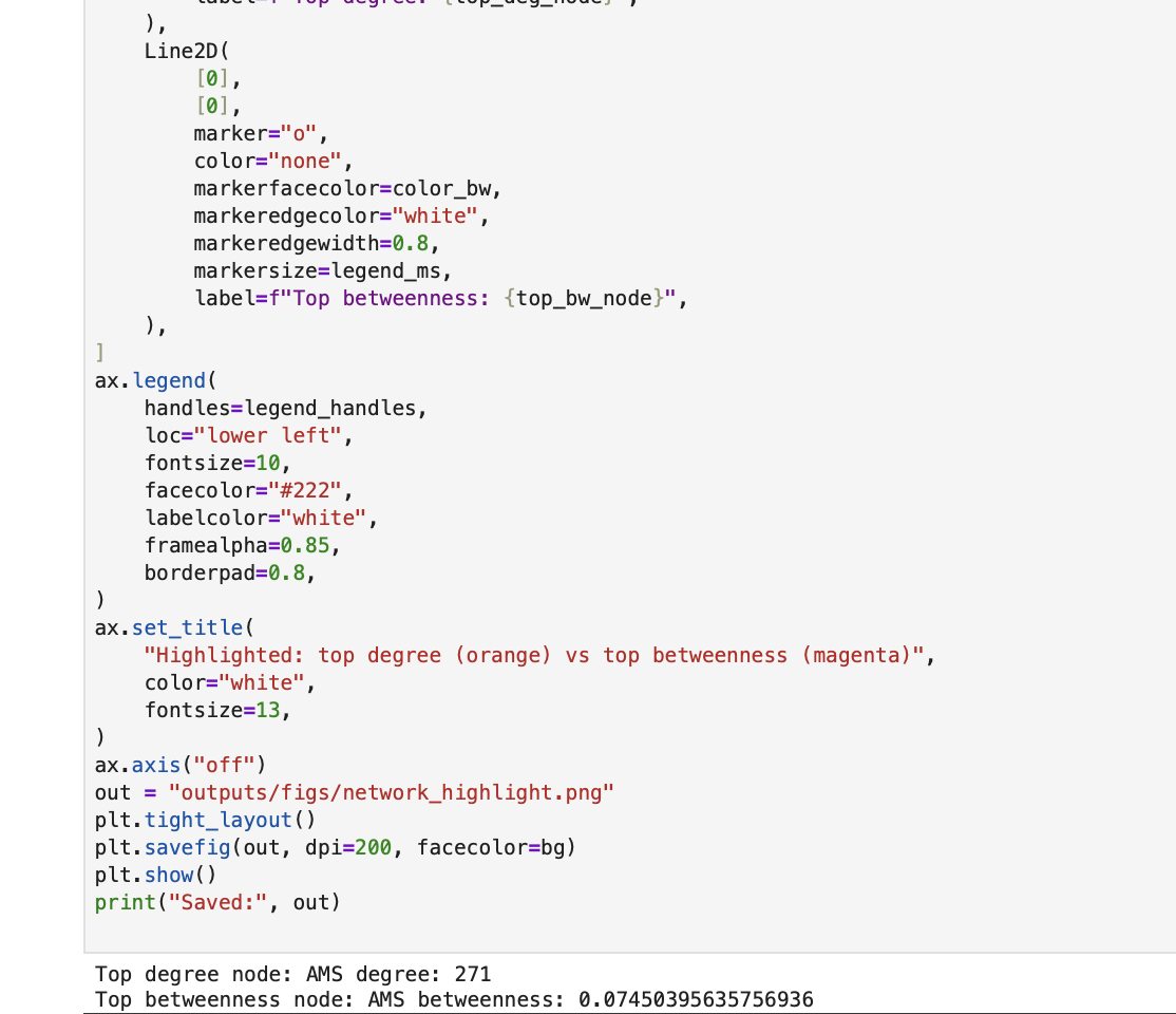
Title
Description...
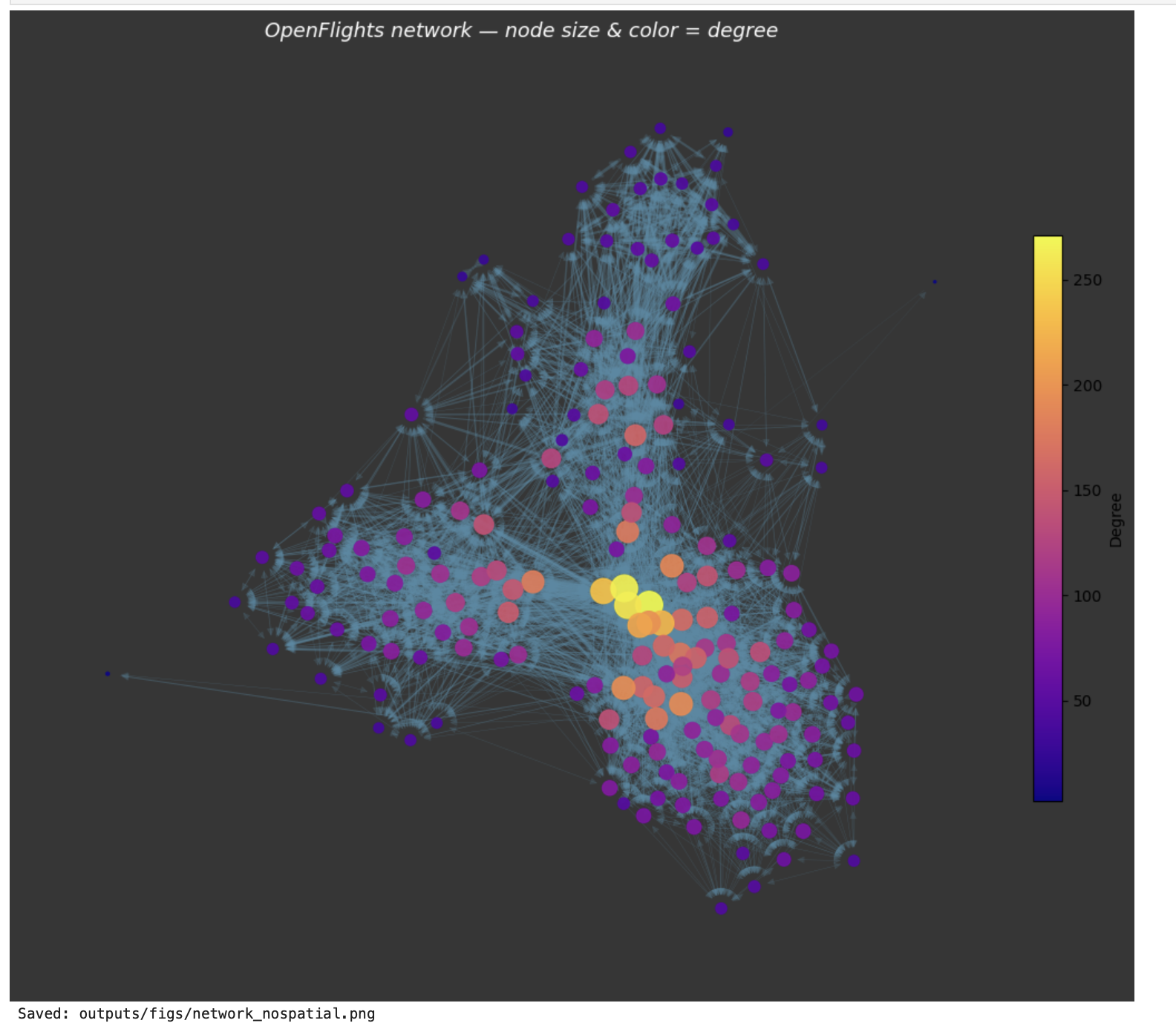
Title
Description...
Title
Description...
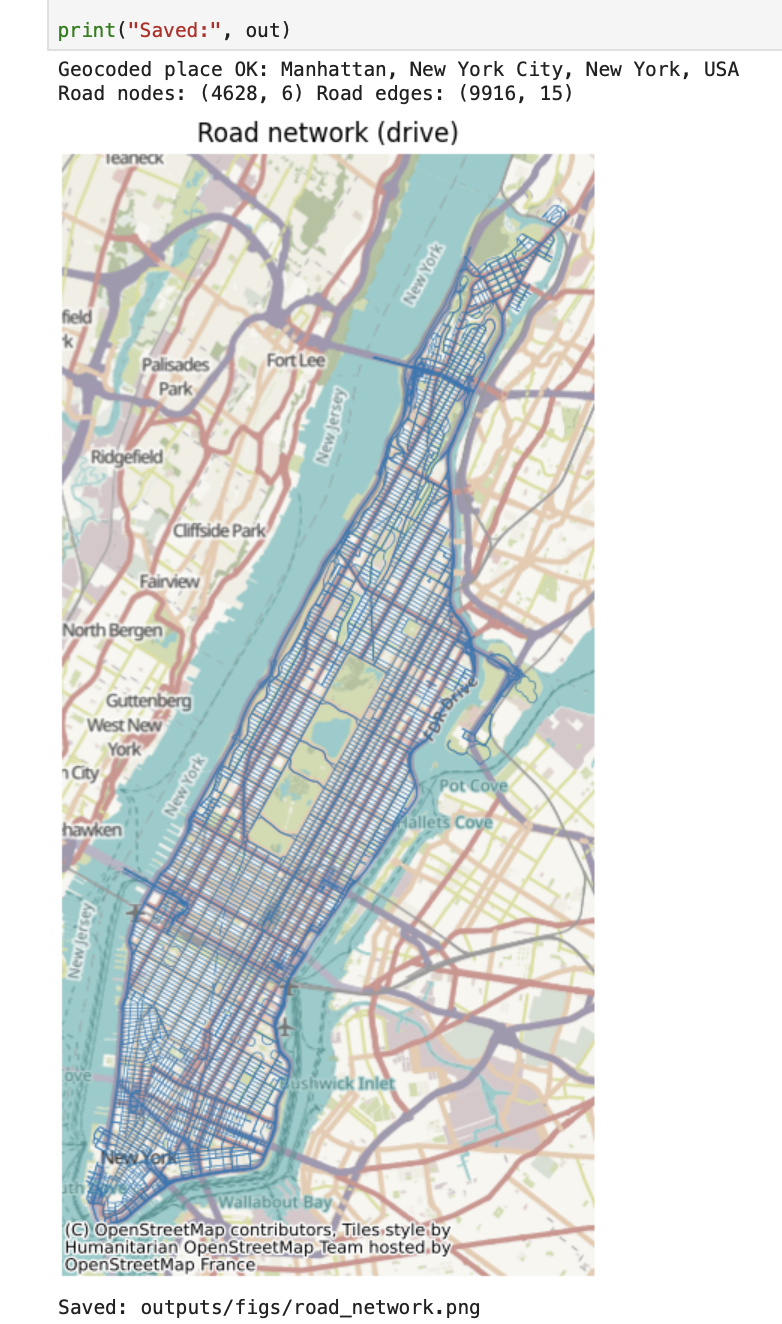
Title
Description...
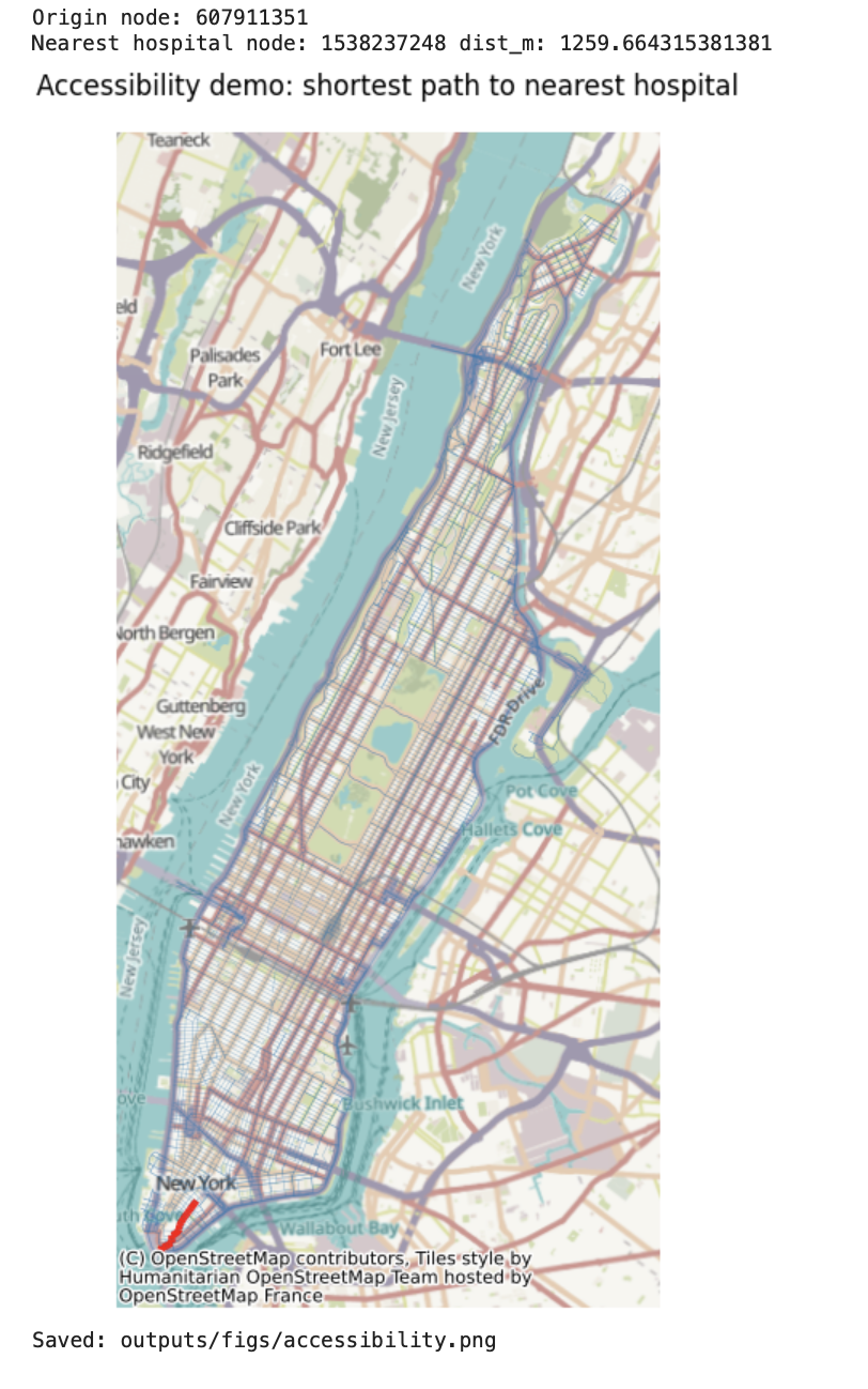
Title
Description...
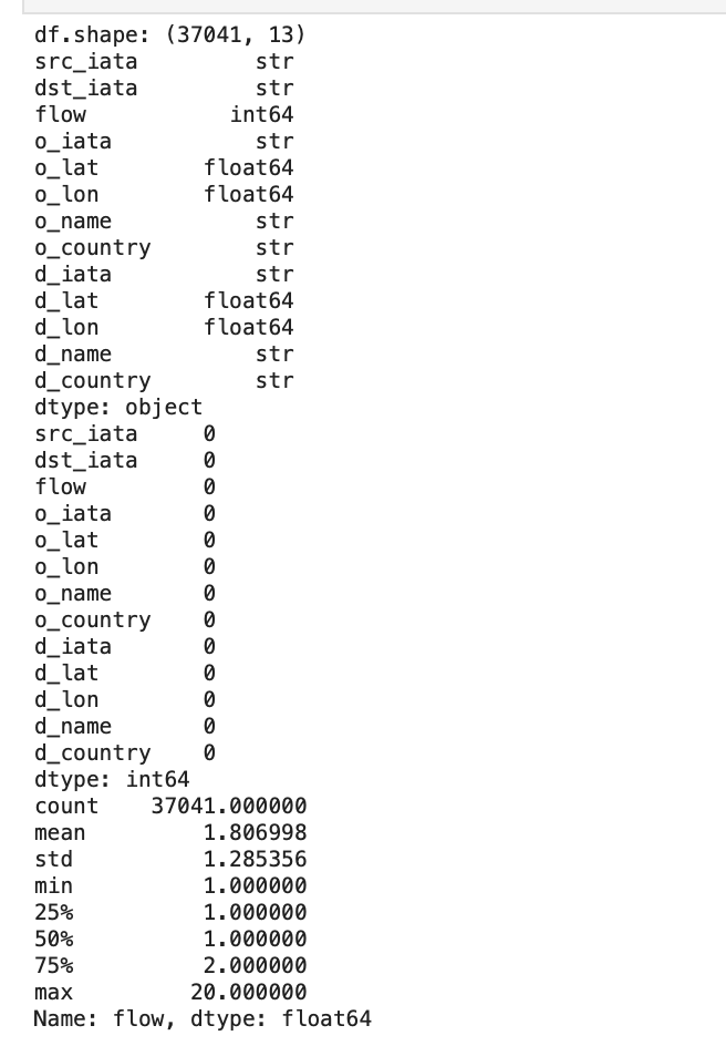
Title
Description...
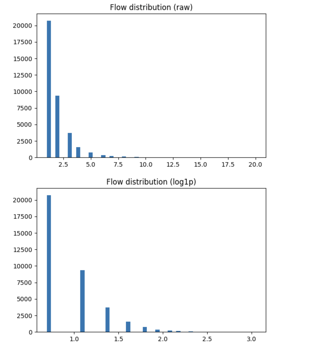
Title
Description...
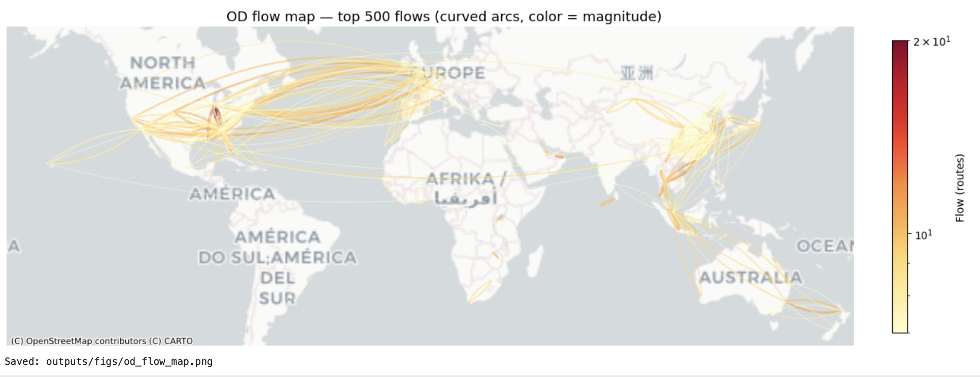
Title
Description...
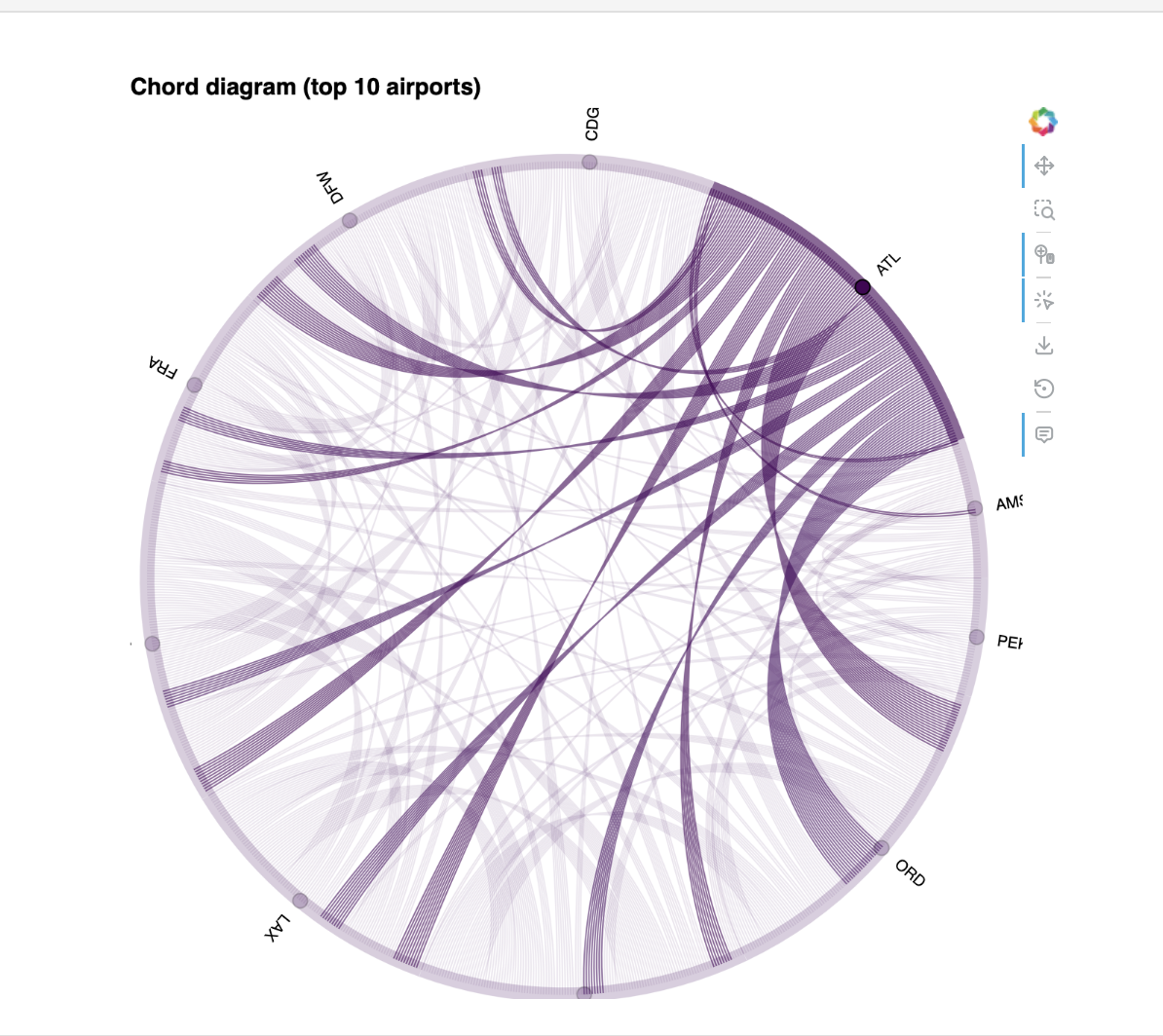
Title
Description...
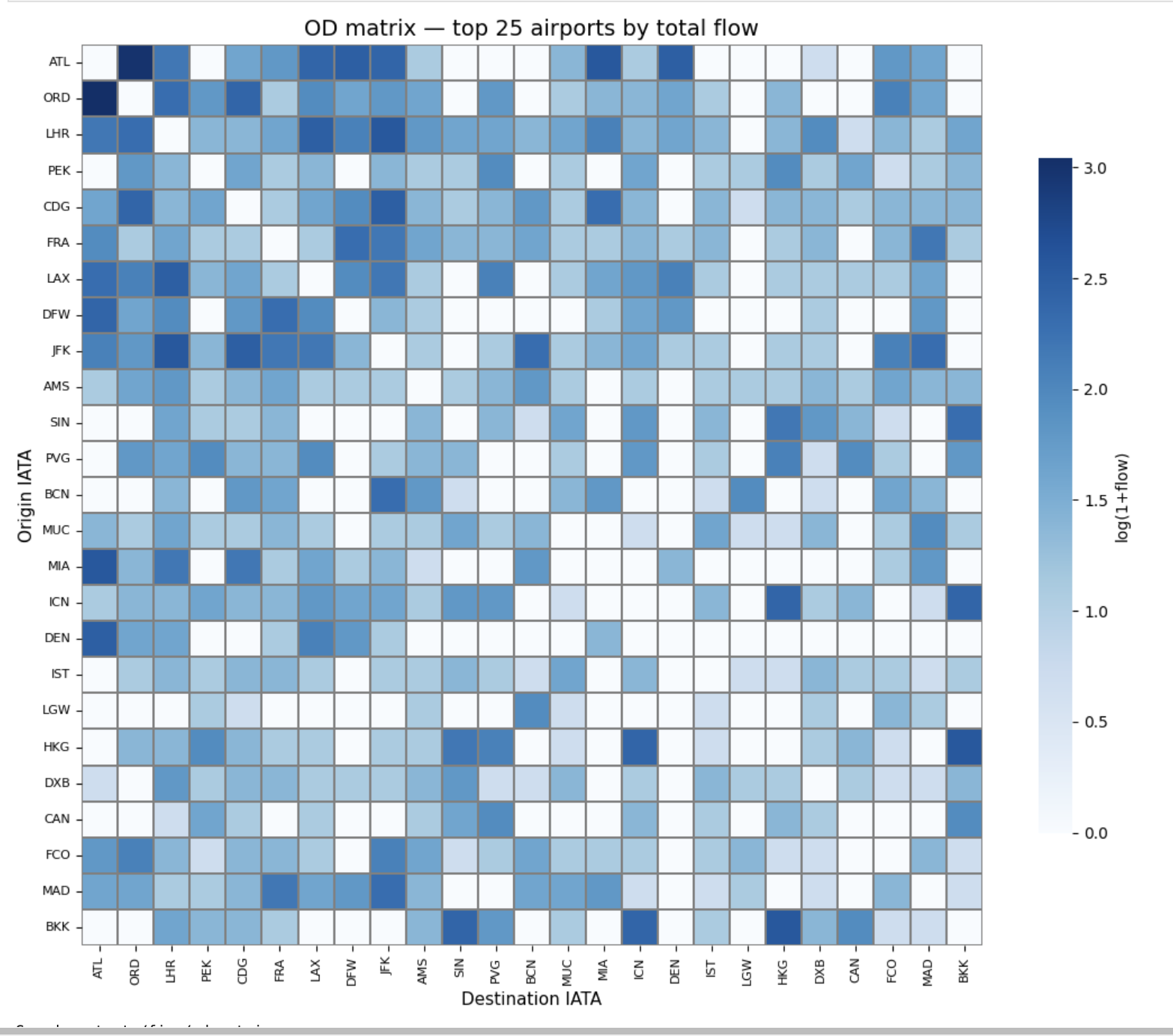
Title
Description...
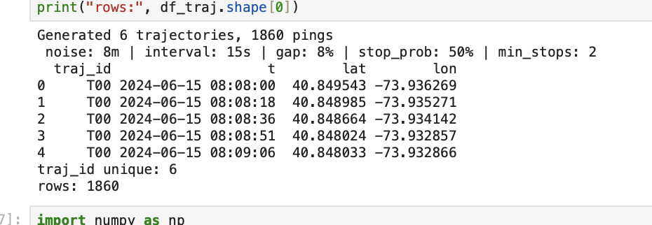
Title
Description...
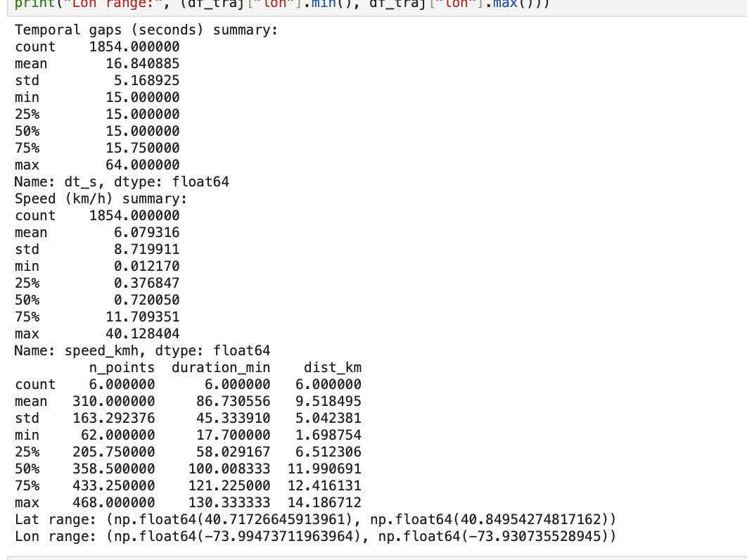
Title
Description...
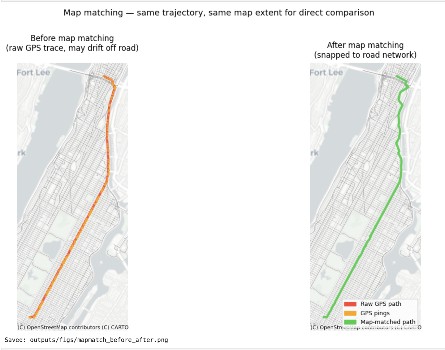
Title
Description...
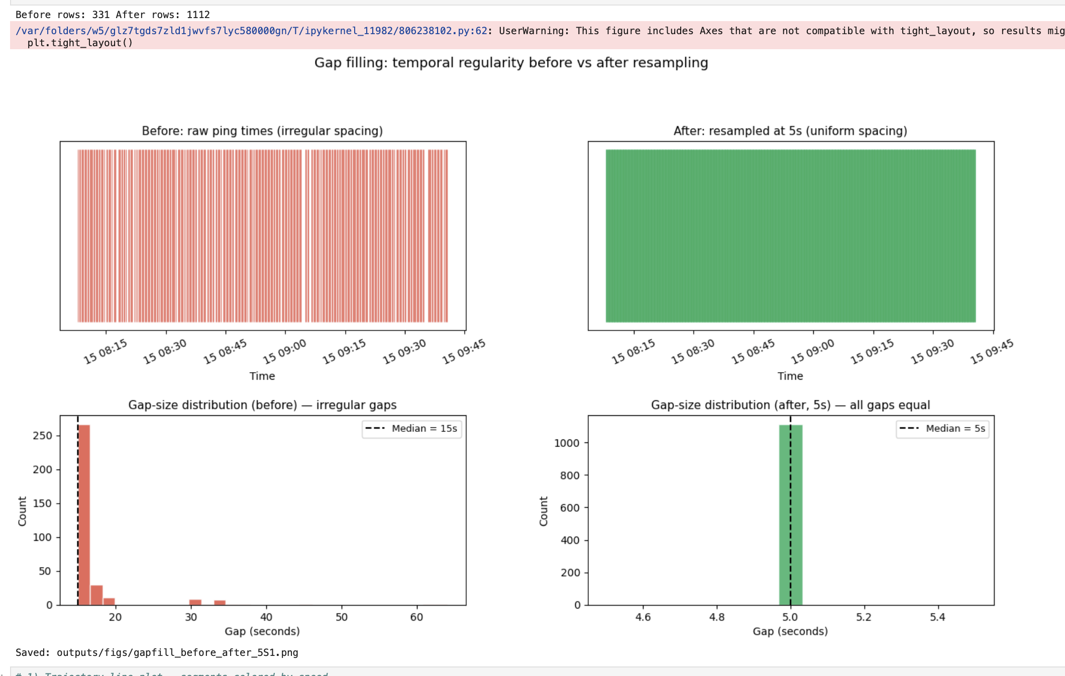
Title
Description...
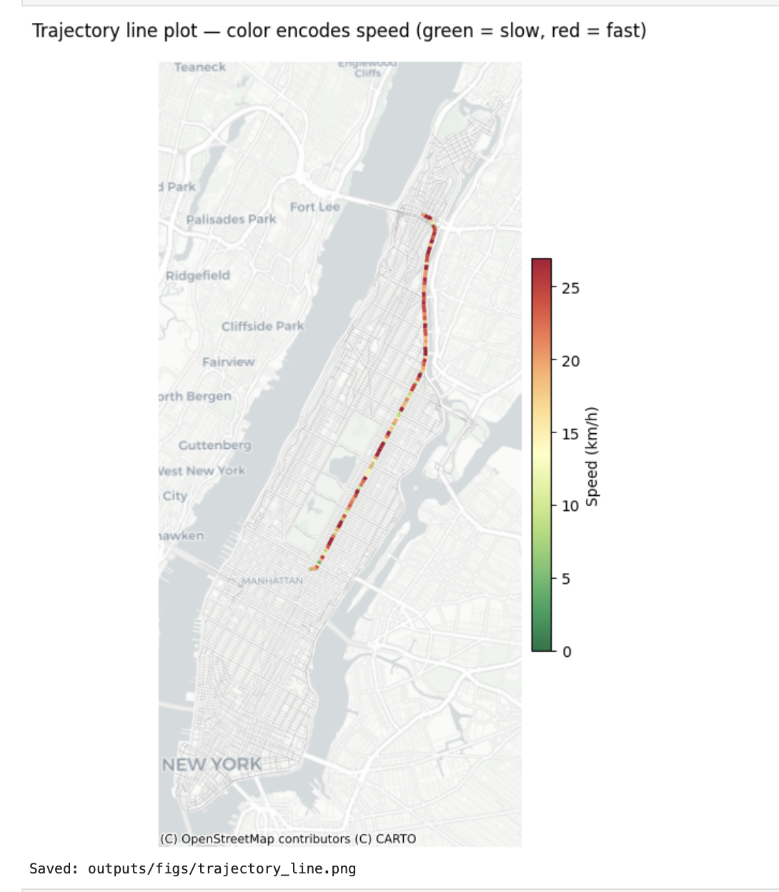
Title
Description...
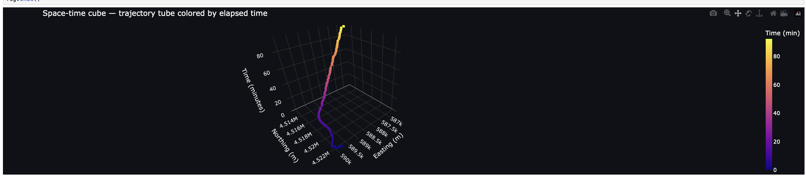
Title
Description...
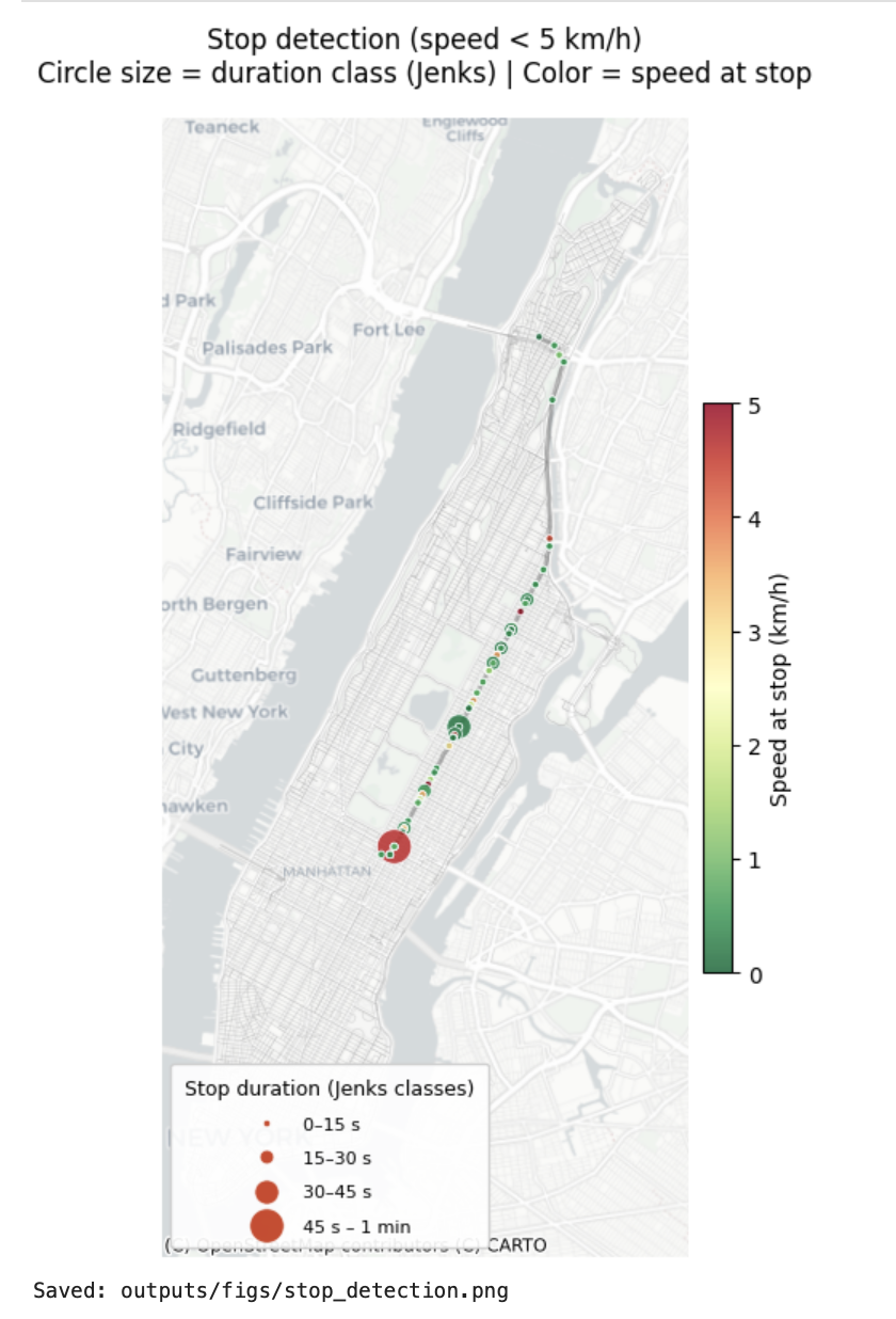
Title
Description...
Title
Description...
Title
Description...
Title
Description...
Title
Description...
Title
Reflections...
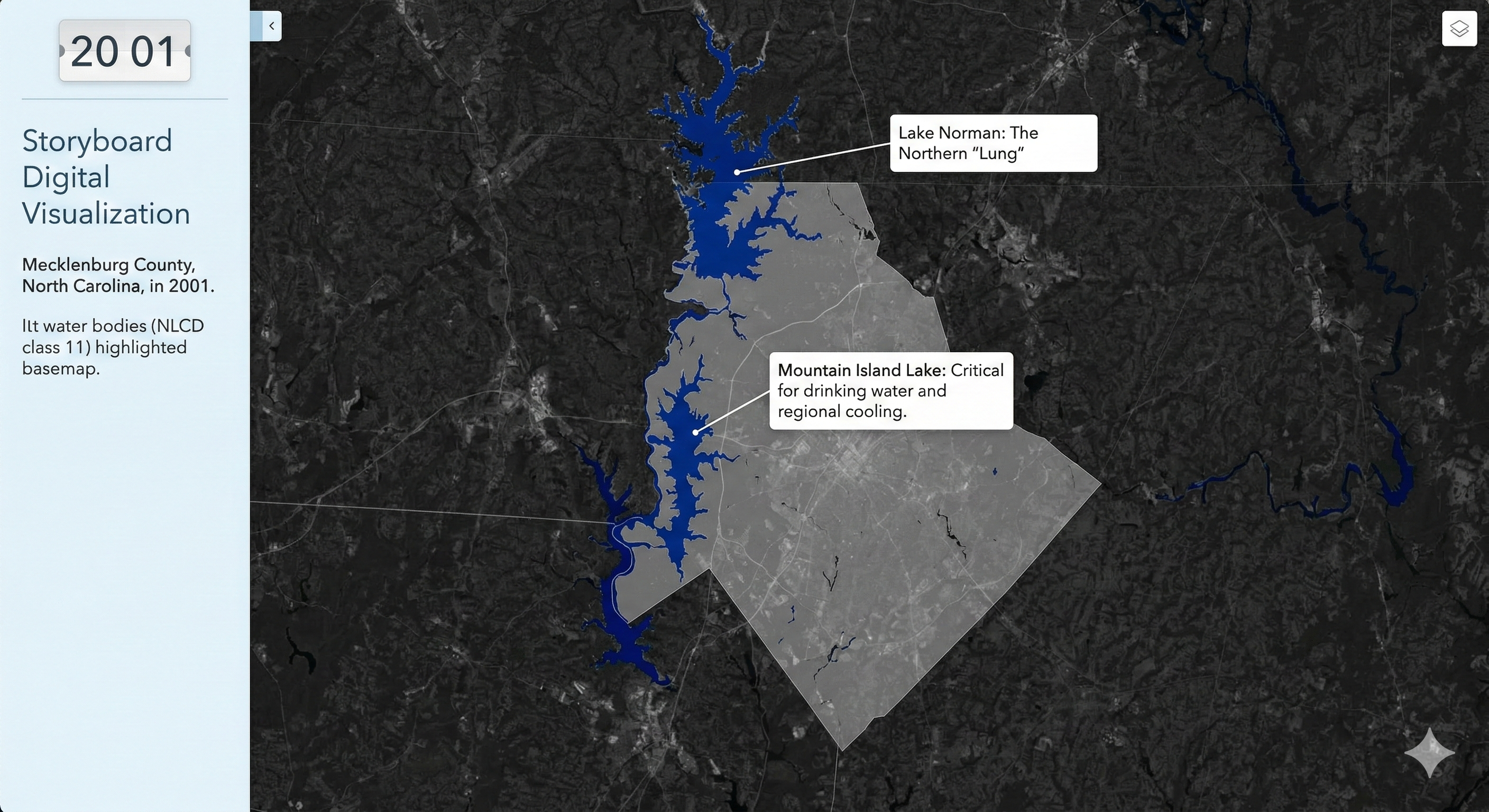
Frame-1
Description...
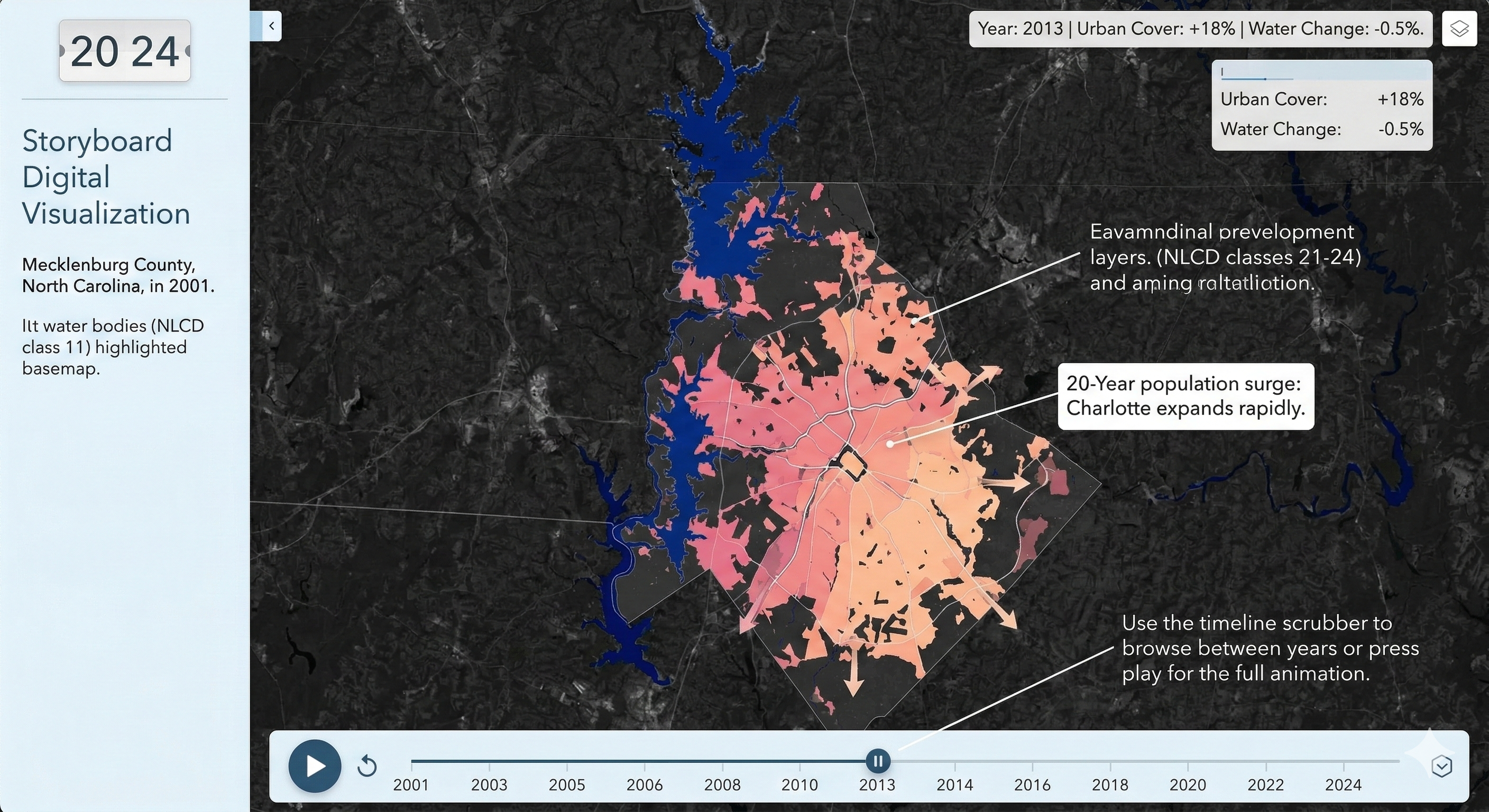
Frame-2
Description...
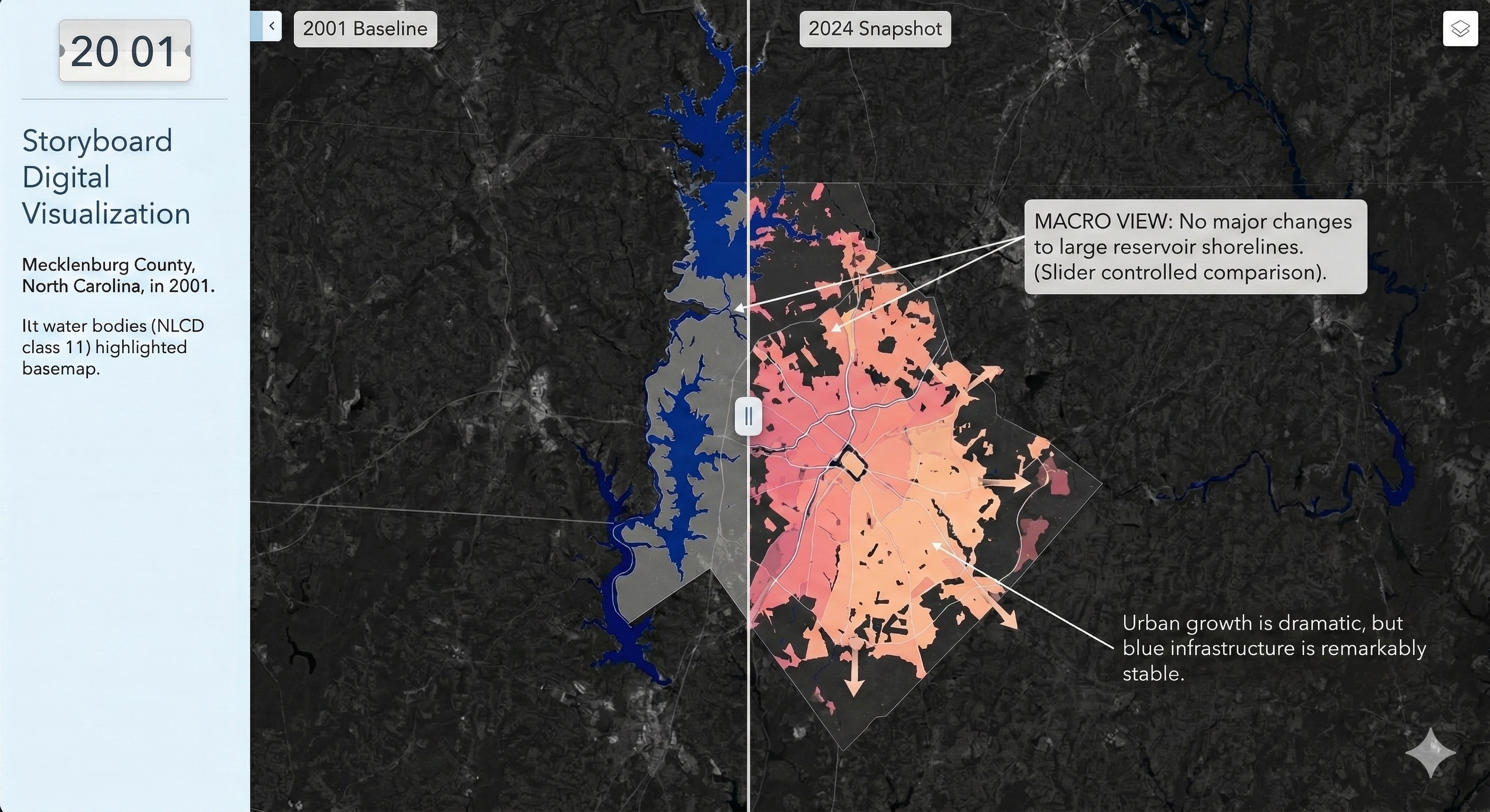
Frame-3
Description...
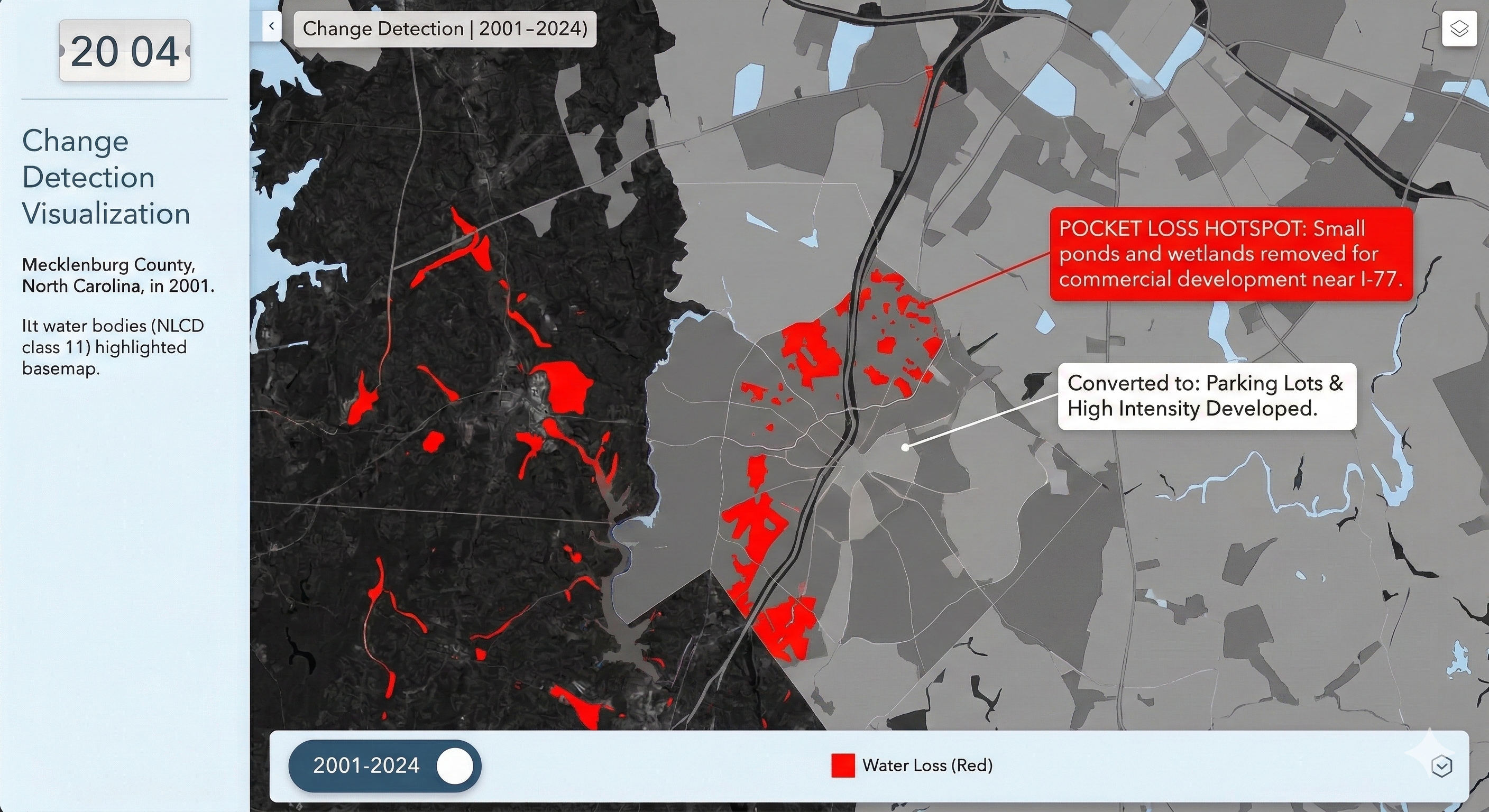
Frame-4
Description...
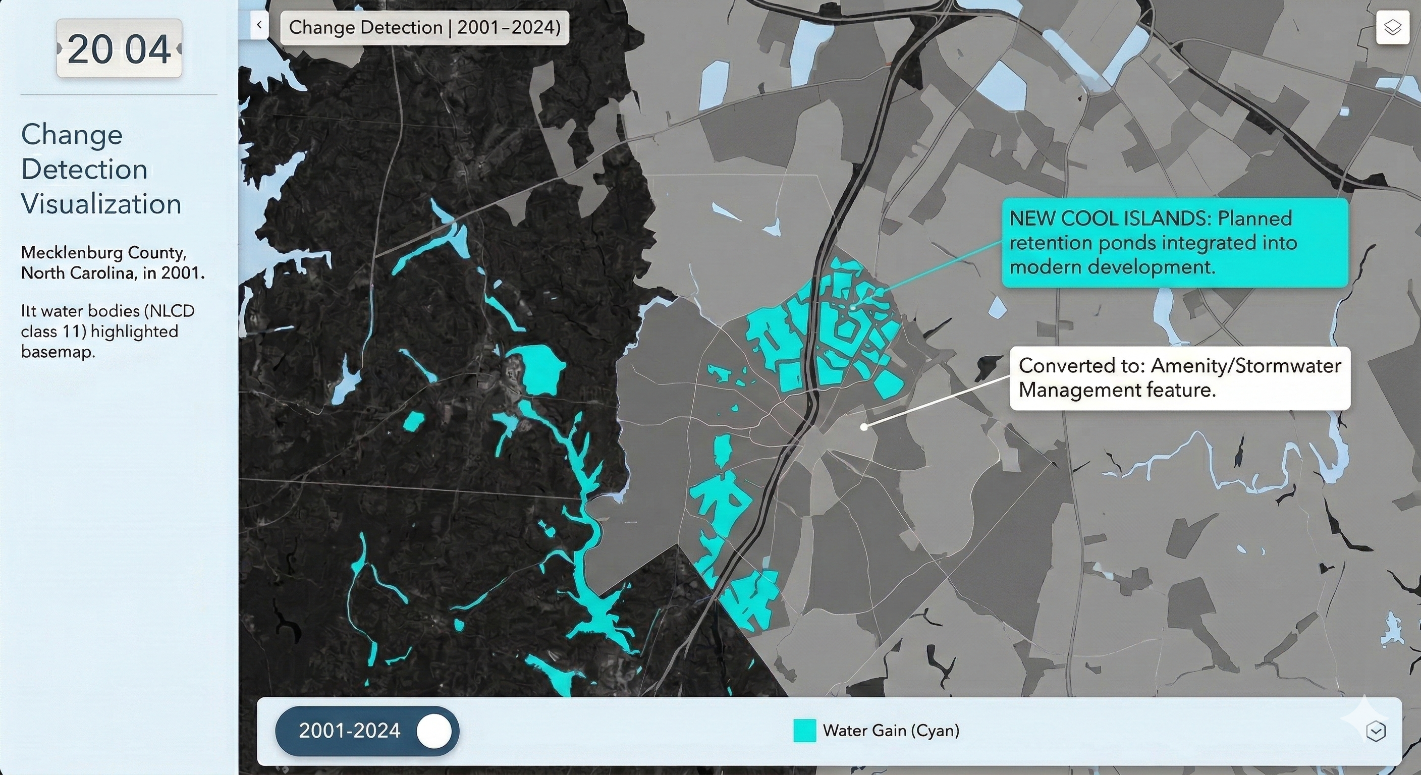
Frame-5
Description...
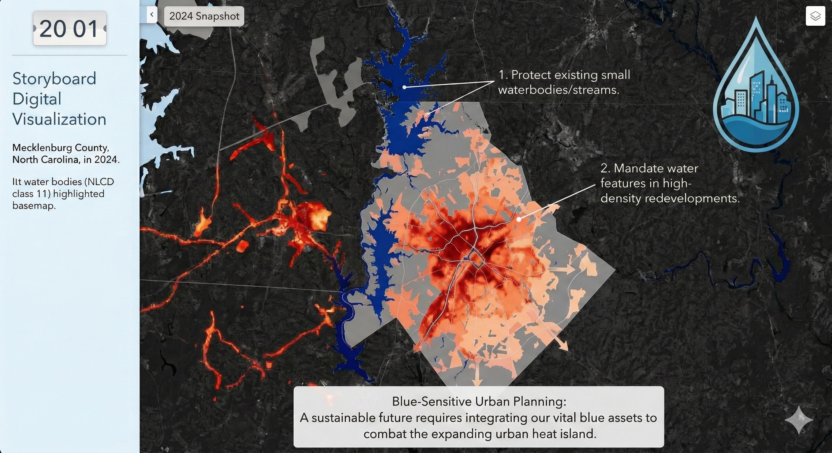
Frame-6
Description...
Animation
Description...
Title
Description...
+ Add New Week
Interactive Maps
+ Add New Map Section
About Me
I have completed my bachelor and master degree in Urban and Rural Planning Discipline at Khulna University also got my second master degree in MS in Earth Sciences from University of Memphis. At present, I am pursing my Doctoral Degree in PhD in Geography at the University of North Carolina at Charlotte.
I love to work with geospatial data. I want to unfold different real worlds problems with the help of geospatial and statistical methods. In this Github page, you will find different real worlds problem that I have been tried to solve with the help of Python programming language and it's packages.
Education
- PhD in Geography, University of North Carolina at Charlotte, Jan 2026 - Present
- M.S. in Earth Sciences, The University of Memphis, Jan 2024 – Dec 2025
- Master of Urban and Rural Planning, Khulna University, Jul 2022 – Jan 2024
- Bachelor of Urban and Rural Planning, Khulna University, Jan 2017 – Mar 2022
- Graduate GIS Certificate, The University of Memphis, Apr 2025 - Dec 2025
Jayanta Biswas
Major: PhD in Geography
Expectation: Learn how to make good maps using open-source data and coding.
Visualization Tools: ArcGIS Pro, QGIS, PowerPoint, Illustrator
Intended Use: Academic Journal and Dissertations
